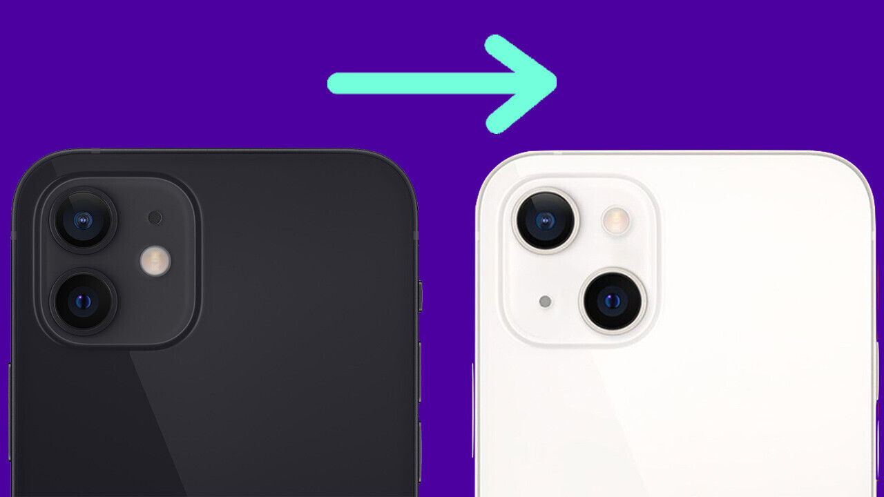
Aesthetically, the iPhone 13 is similar to last year’s model — apart from one key element: the camera placement.
The iPhone 12 had vertically stacked lenses. On the iPhone 13, these are now diagonal. So, here’s the question we’re going to answer today: why?
In my mind, there are two key reasons Apple has changed the iPhone 13 lens placement — and you can split these into technical and marketing.
The technical reason for the diagonal camera layout on the iPhone 13
I’m beginning with this because I believe it’s the biggest reason for the design change.
Now, one of the new features introduced with the iPhone 13 and iPhone 13 mini is something called “sensor shift image optical stabilization.”
This appeared in the iPhone 12 Pro models last year and is effectively a mechanism that moves the lens to help you get steadier shots. Think of it as a counter to the slight movement your hands make while you’re taking a photograph.
When Apple announced the iPhone 13, they showed the sensor shift image optical stabilization in action:
It’s plain to see that, comparatively, the sensor shift image optical stabilization hardware is large. In fact, it takes up a huge chunk of camera bump.
It’d be technically impossible to fit the mechanism in while keeping the vertical camera layout of the iPhone 12. Making the lens placement on the iPhone 13 diagonal is an elegant solution.
The other option would be changing the location of the camera bump altogether, potentially to the middle of the phone. But this would not only alter the iPhone 13’s aesthetics, but it would also make a lot of accessories useless too.
That, friends, is the technical reason Apple has made the iPhone 13 cameras diagonal.
The marketing reason for changing the camera position on the iPhone 13
While I think this argument has legs, I don’t think marketing was a direct force for the change. Instead, it’s something that likely supported the shift.
Basically, the iPhone 13 is very similar to the iPhone 12. The upgrades, including things like a smaller notch, brighter screen, and a bigger battery, aren’t exactly attention grabbing,
These aren’t bad updates per se, but they’re expected, not lusted after.

Really, the biggest point of differentiation for the public at large is the new diagonal camera layout. It’s a clear way to signal that you’re in possession of the latest device and is an excellent marketing tool to encourage people to upgrade.
This is also partly the reason why the change has been mocked. For those outside the tech bubble, changing the iPhone camera layout seems like solely a cheap trick to increase sales. Which is a half truth.
Ultimately, the new camera placement on the iPhone 13 is a technical solution that also delivers some marketing ammunition. Which is either lucky, clever, or, well, both.
There we have it! Two solid reasons why Apple has changed the position of cameras on the iPhone 13.
Get the TNW newsletter
Get the most important tech news in your inbox each week.


