One of the most noticeable differences between today’s phones and those of five years ago is the screen-to-body ratio. Bezel sizes have dropped and we now have a lot more screen.
The other week I looked at how this had changed on iPhones, but I’m currently intrigued about other phone manufacturers. Specifically, I wanted to learn about the screen-to-body ratio of Google Pixel phones over time.
Before we go on though, a definition. The screen-to-body ratio is simply a number that shows what percentage of a phone’s front is screen compared to, well, not screen. The bigger the number, the bigger the relative screen size.
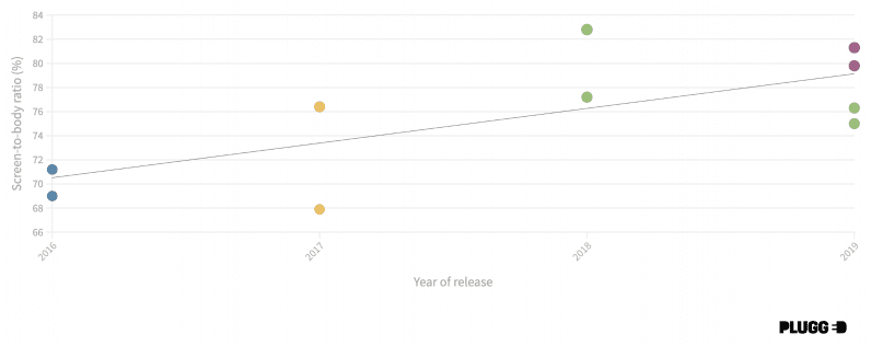
Without further ado then, let’s take a gander at this graph looking at the screen-to-body ratio of Google Pixel phones!
A quick note: if you’re on mobile you may not be able to see the interactive graph above, so try requesting the desktop version of the site instead. It’s pretty important to be able to click on the points and see what specific device you’re looking at.
Anyway, if that’s still not possible, here’s a regular image of the graph!
The methodology
There wasn’t anything particularly controversial or tricky about the numbers, we simply pulled the data from either Wikipedia or GSMArena.
In the graph, you can see different colors per phone range. The blue is the original range, the yellow the Pixel 2 models, the green Pixel 3, and the purple the latest iterations.
The only questionable decision was my choice to include the 3a and 3a XL as part of the Pixel 3 range, not a separate category. That’s why you see those green dots in 2019.
What have we learned about the screen-to-body ratio of Google Pixel phones?
Well, the clearest thing to note — especially when compared to the iPhone — is just how young the Google Pixel range is. I mean, I’m kinda surprised the Pixels have been around under four years. (Yes, no need to email, I know Google released other phones before this).
This then goes some way to explaining the fact we don’t see a stratospheric rise in the screen-to-body ratio of Google Pixel devices. Its lowest is 67.9% with the Google Pixel 2 in 2017, before reaching its highest ratio of 82.8% with the Pixel 3 XL the year after. A solid rise, certainly, but not jaw-dropping.
For comparison, the iPhone went from 50.9% with the iPhone 3GS back in 2009 to its peak of 84.4% with the iPhone XS Max in 2018.
Overall though, the screen-to-body ratio of Google Pixel phones is broadly comparable to Apple’s devices — but that’s a different article for a different day.
Anyway, something else you’ll notice when you look at the graph is the fact the screen-to-body ratio actually drops between the Pixel (69%) and Pixel 2 (67.9%). While this is confusing on the surface, the rationale is quite simple: the Pixel 2 has the same 5-inch screen, but a body that’s slightly bigger. This, most likely, is to fit in the improved chipset and other components.
In fact, this is quite a common occurrence. There’s a similar drop off with the Pixel 3 XL (82.8%) and the Pixel 4 XL. (81.3%).
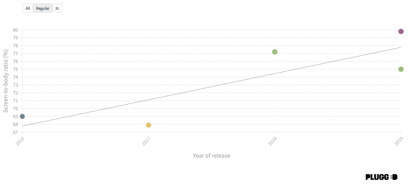
On that note, it’s interesting to actually separate the trajectory of the regular phones (AKA the Pixel 3 etc.) from the larger versions. This is something that’s far easier to do with the interactive graph above, but I’ll drop the images here just in case.
Here’s the screen-to-body ratio of regular Google Pixel phones:
And of the XL ones:
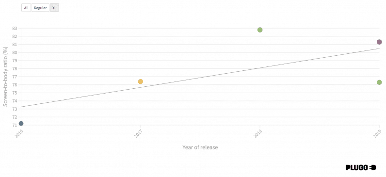
You’d expect for each Pixel range to follow the rough same pattern of screen-to-body ratio, but it’s clear from the graphs that the relationship between them isn’t that simple. It also seems that the increase of the ratio was sharper for the regular Pixels than the XL, which isn’t what I thought would be the case.
We may as well sum up what we’ve learned: the screen-to-body ratio of Google Pixel phones has gradually improved, but maybe in not the clearcut and linear way you’d expect.
Maybe I’ll even update this when the Pixel 4a is released. Maybe.
Get the TNW newsletter
Get the most important tech news in your inbox each week.

