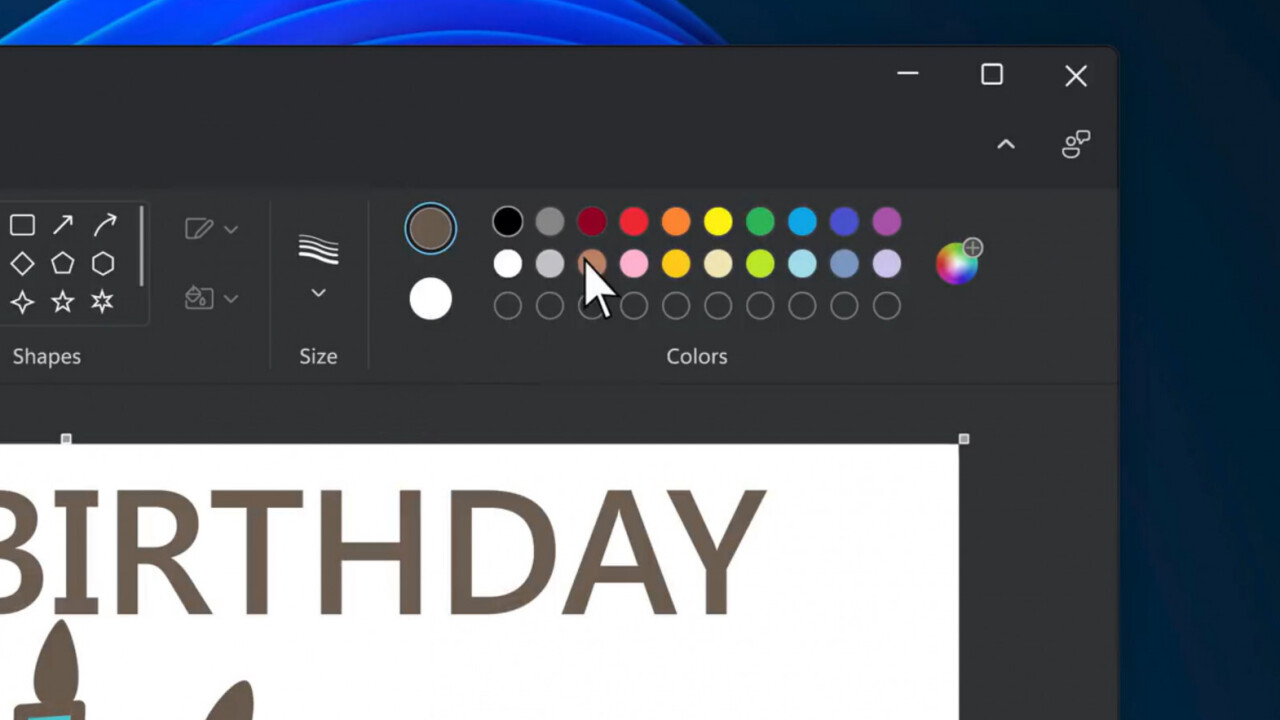
Microsoft has totally redesigned Paint for Windows 11. Kind of.
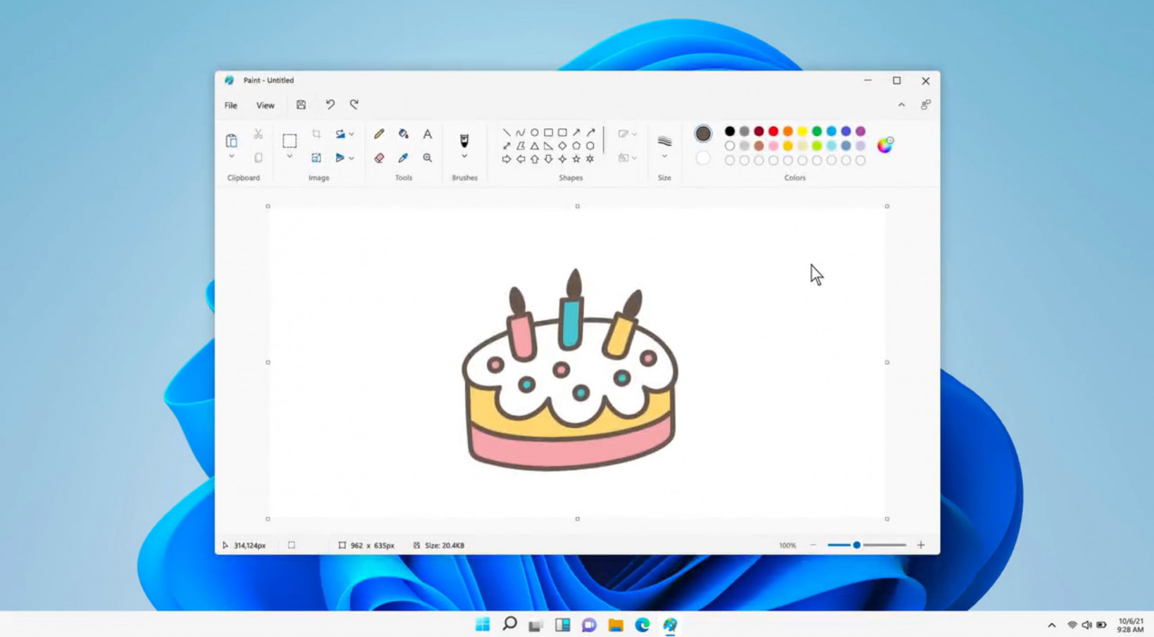
Microsoft Chief Product Officer Panos Panay tweeted a look at the new Paint. While at first glance the UI looks quite different from the version of Paint in Windows 10, a closer look shows very little has really changed:
Here’s another @Windows 11 first look. This is the beautifully redesigned Paint app, coming soon to Windows Insiders. Can’t wait to see your creations! #Windows11 #WindowsInsiders pic.twitter.com/jiKyfqQFUV
— Panos Panay (@panos_panay) August 18, 2021
Depending on who you ask, that’s a good thing. For reference, here’s what Paint looks like in Windows 10:
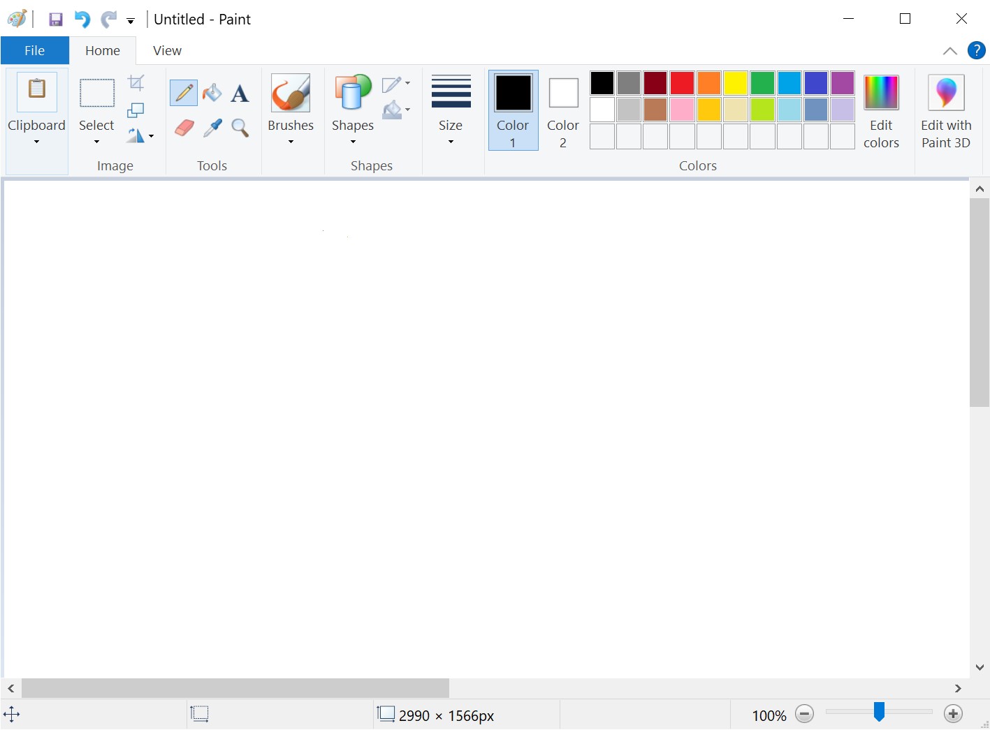
As far as I can tell, the only new features are a dark mode and the ability to change text alignment. Otherwise, to use the obvious pun, it seems to just be a fresh coat of paint with some items moved around.
Well, if it ain’t broke… don’t fix it? People weren’t huge fans of Paint 3D, after all, which was originally meant to replace classic Paint. People got pretty mad about it. Now, Microsoft isn’t even including Paint 3D in Windows 11 (indeed, the button to launch Paint 3D is gone from the Windows 11 version).
Still, I can’t help but feel a little fixing would have been nice. Perhaps Microsoft thought it wasn’t worth going through the effort of updating Paint when there are myriad free apps for anything more complicated than the most basic functionality. But I wouldn’t mind having a half-decent image editing tool built right into Windows for those times I don’t feel like waiting for Photoshop to load.
For now, Paint isn’t changing much at all. We’ll let you know if we spot any other differences once the app makes its way to Windows 11 Insider builds.
Get the TNW newsletter
Get the most important tech news in your inbox each week.

