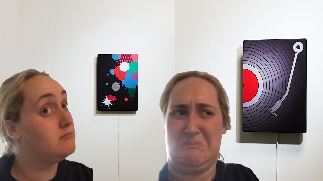
I have a dilemma. I both love and hate Ikea’s latest audio gadget, its picture frame speakers.
Over the past few years, Ikea has been working with Sonos to produce a range of Symfonisk speakers. The philosophy behind these have been bringing audio into everyday items. And, when I first heard about the just-announced picture frame speakers, I gushed with excitement.
The idea of populating my house with them made me tingle. Imagine it: music pouring from every wall, a veritable cathedral of sound.
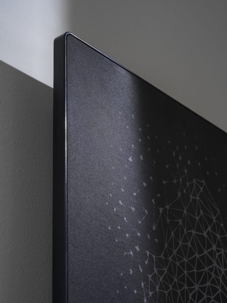
Alas though, friends. Alas. On closer inspection, Ikea’s picture frame speakers aren’t really picture frame speakers at all. Instead, they’re more like wall speakers with detachable fronts.
Have a look here to see what I mean:
In my mind’s eye, I expected an actual picture frame speaker. By that, I imagined a product where the frame itself is covered in small speakers that are hidden by a grill of some kind. This would leave a space in the middle for me to slot my own art in.
That’s not the case though.
Simply put, the technical limitations of building a speaker like this would’ve created something that (probably) looked and sounded bad. Size and shape are vital to creating good sound, after all.
I understand why Ikea and Sonos made the Symfonisk like they have, but I still feel disappointed. Swapping grilled fronts is an elegant design solution for a picture frame speaker, but it’s an an appalling artistic one.

I’d like to get this clear: I’m not having a crack at the artists involved here. Ikea wants its picture frame speakers to fit in as many houses as possible — this means there are severe limitations on what artists can do. Creating work that’s both inoffensive and interesting is nigh-on-impossible.
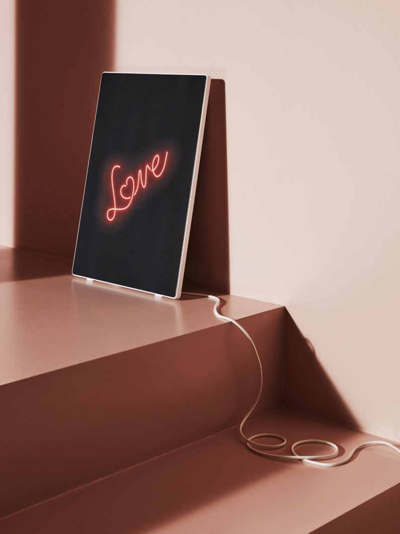
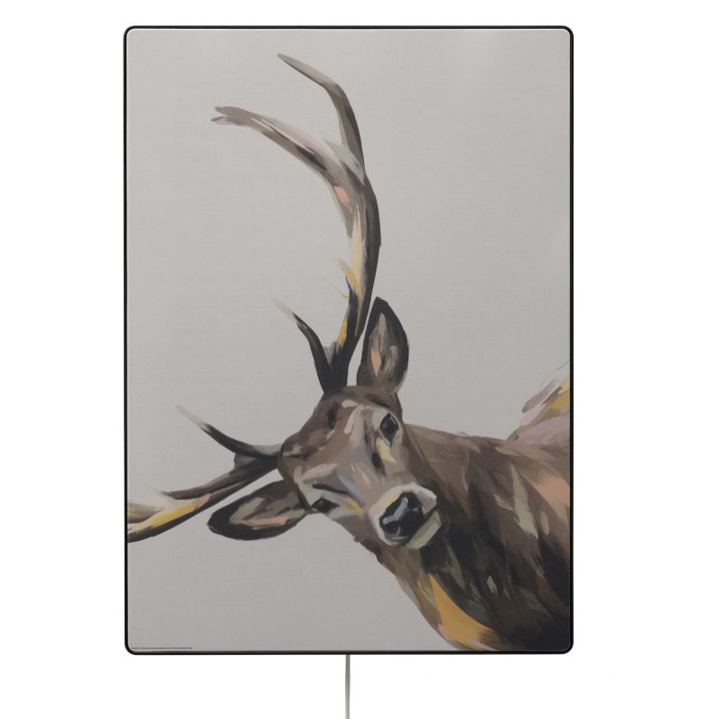
Which is why we’ve ended up with designs like this:

And this:

For the sake of balance, some of the other designs aren’t quite as bad as these. But they all share one common thread: an unpleasant blandness.
Yes, Ikea has stated it will release more interchangeable fronts over time, but I can’t imagine the aforementioned approach of offensive mediocrity will change.
There is one cause for hope though. If Ikea or a third party could create fronts where you can upload your own image, then this Symfonisk could become genuinely great. Imagine if the company partnered with a platform Society6 or Deviantart to expand its offering.
I would like the option to just upload images, but this comes with its own issues. The first is picture quality: you can guarantee folks would be uploading some low resolution shitfiles. The second is I can’t help but think this approach would end up screwing artists somehow. Why pay for something when you can just download it?
A partnership with a proper art platform though? Yes please.
I don’t want to be too harsh on Ikea and Sonos though. The Symfonisk picture frame speaker is genuinely badass. It’s a fantastic idea that I’m glad made it off the drawing board and into the world.
The problem is the image I have in my head of a picture frame speaker — one that allows me to choose my own art and blast tunes — isn’t what I see in front of me now. And that’s okay, but also a little sad.
Get the TNW newsletter
Get the most important tech news in your inbox each week.


