We’ve already devoted too many words to the new 14 and 16-inch MacBook Pro’s notch, yet it continues to haunt us. After accepting the reality of the unnecessarily large camera cutout, we were soothed by the confidence that Apple would at least make sure macOS and its apps properly dealt with the notch. This is Apple we’re talking about, and Apple doesn’t make design mistakes like that, after all.
Yeah, about that…
One of the biggest questions people had about the Notch™️ was how macOS would actually handle the odd screen cutout. Would the macOS simply ignore the notch, and have the cursor slide behind it, or would you be forced to move the cursor around it? Would long lists of menu items ‘jump’ over the notch, or would they be obscured by it?
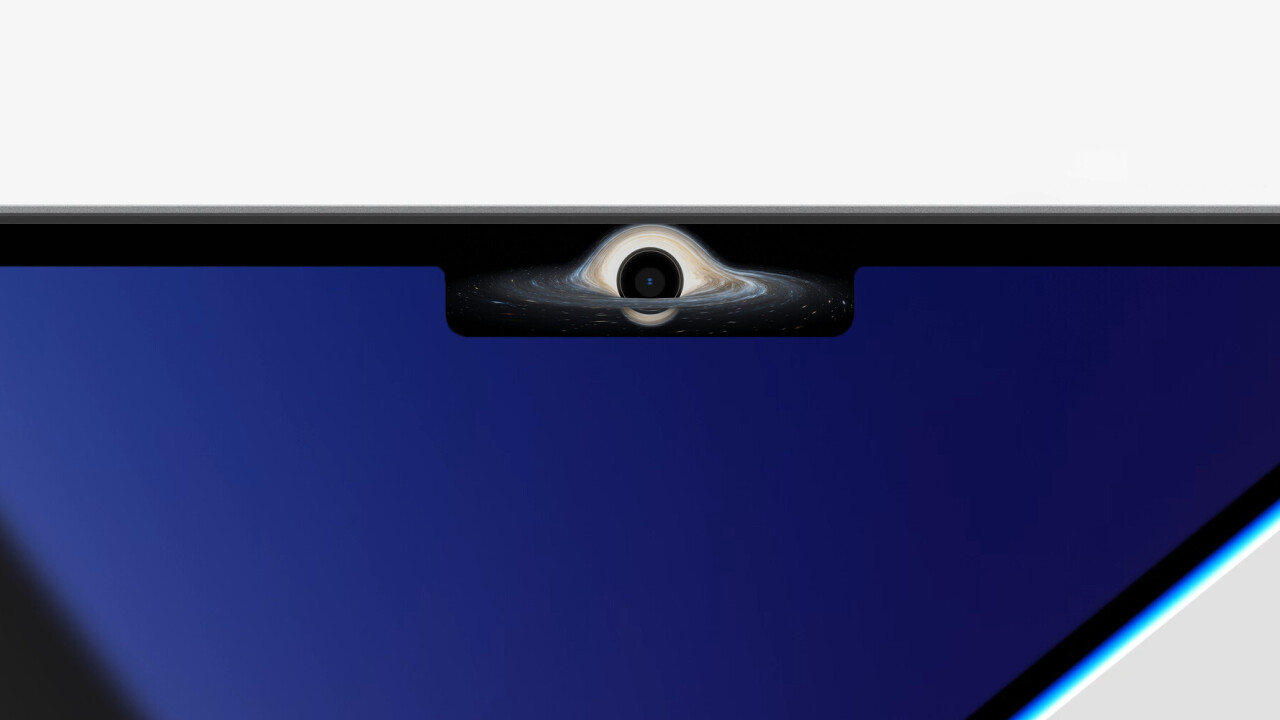
As it turns out, the answer is “all of the above.” The notch appears to be like a black hole, causing all sorts of strange phenomena to happen as you approach its event horizon.
YouTuber Quinn Nelson of Snazzy Labs highlights the issues succinctly. Take this example when using a tool like iStat Menus — it simply gets obscured by the notch:
WTF HAHAHAHA HOW IS THIS SHIPPABLE? WHAT IS THIS?! pic.twitter.com/epse3Cv3xF
— Quinn Nelson (@SnazzyQ) October 26, 2021
Yikes. For its part, the folks behind iStat Menus say they are using a standard NSStatusItems implementation, so it doesn’t seem they are doing anything particularly weird to cause this behavior.
In a second tweet, Nelson demonstrates more strange behavior, such as the inconsistency of the notch in different apps.
On the desktop, your mouse simply slides behind the Notch. In DaVinci Resolve, the mouse sometimes instantly jumps across the notch. Other times, you’re forced to maneuver around it. And when using an app like Resolve, which has a ton of menu options, the lack of available space means your status icons will be obscured. Among other issues:
WHO DESIGNED THIS?! ? pic.twitter.com/ADVqmfdqV2
— Quinn Nelson (@SnazzyQ) October 26, 2021
But wait, there’s more! In some situations, your mouse can even get ‘stuck’ behind the notch:
PSA you can literally get the curser stuck behind the notch pic.twitter.com/jhVaGFBWDb
— Ian Zelbo (@RendersbyIan) October 26, 2021
And though the default behavior is to hide the notch in full-screen apps, even some regular apps are causing the entire display to ‘shrink’ in an attempt to ignore the notch:
Iterm scares the notch on my new Mac away. Start iterm it goes away. Quit iterm it comes back. pic.twitter.com/b1KcxPeSUR
— Bryan Liles (@bryanl) October 26, 2021
Note that the display isn’t just shrinking vertically, but also horizontally, making some of that beautiful new real estate go completely to waste.
I’m not gonna lie, as a Windows guy, I’m experiencing a little schadenfreude. This is the type of thing I’d expect to happen on a third-party Windows laptop with a wacky design, not to an Apple product with its reputation of seamless integration of hardware and software.
(Then again, Apple is also the company that made a mouse that you can’t use while charging, so perhaps I set my expectations too high.)
Based on the complaints about the notch so far, it seems that developers will have to update their apps to properly deal with the cutout. But I find it extremely weird that Apple didn’t build in behavior at the OS level to prevent such inconsistent and clunky behavior. Why not make every app simply wrap its items around the notch? Why doesn’t macOS have a way of highlighting when your cursor is behind the cutout? Why not make extra menu items scrollable or shrink the text?
It’s only a matter of time until most of these issues get resolved, but for all the power behind the new MacBook Pros, it’s a little disappointing that Apple would launch them with such a lack of polish.
Get the TNW newsletter
Get the most important tech news in your inbox each week.


