The iPod turns 20 this year. That device changed tech as we know it, starting Apple’s resurgence and eventual dominance of the tech industry. But while everyone reminisces about grinding their thumb joints to a powder swirling around the click wheel, I’m looking back fondly at Microsoft’s superior competitor.
I am, of course, talking about the Zune.
Okay, I might not be able to objectively argue that the Zune was better than the iPod, but I do think it holds up better in 2021. I may be in the minority here, but from where I’m standing, the Zune was just the better music player — one ahead of its time.
Its matte, soft-touch hardware was weird but unique
Brown.

The 💜 of EU tech
The latest rumblings from the EU tech scene, a story from our wise ol' founder Boris, and some questionable AI art. It's free, every week, in your inbox. Sign up now!
That’s not the color most people would come up with for launching a new device into the world, but it’s the color Microsoft chose.
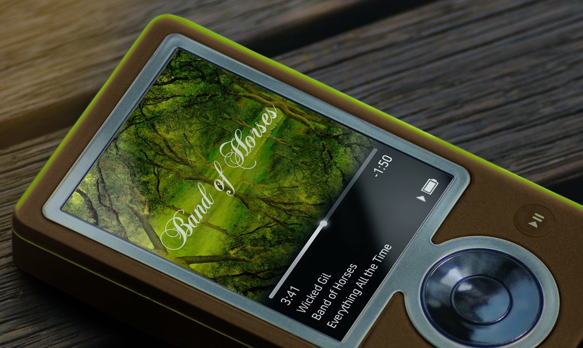
Though I was partial to the blue-on-black colorway, I ended up with the brown design. And somehow, I still dug it. It was so different from the litany of glossy fingerprint magnet devices, including the iPod. The Zune had a soft-touch finish that rejected fingerprints and felt genuinely nice to hold.
It also had one of my favorite little design choices to date, with a double shot, semi-translucent layer of plastic that caught the light and made the device seem to glow from certain angles. In the case of my brown unit, this translucent plastic glowed green.
It’s hard to describe but the effect is still one of the coolest design choices I’ve seen, and one I’d love to see more often.
Mind you, I’m just talking about the original Zune. The later metal and glass Zune HD is one of the most beautiful gadgets ever made, as far I’m concerned.
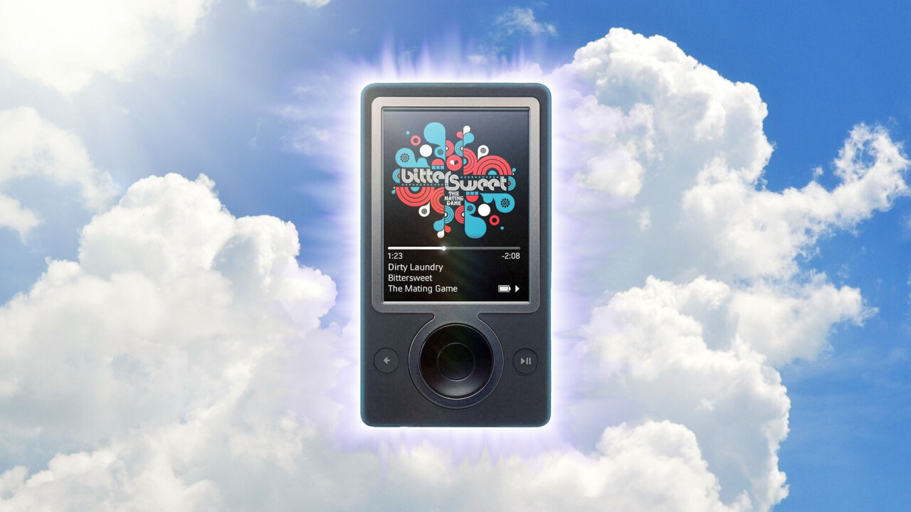
That big ol’ screen
Having a 3.2-inch screen was a big deal for a 2006, pre-iPhone device. While it wasn’t a touchscreen, the screen took up the majority of the device’s face, and it rotated horizontally in order to allow you to better see pictures and videos.
It offered a far superior experience to the 5th gen iPod’s tiny display 2.5″ display, which only really worked in the vertical orientation. The Zune predicted the screen-centric focus of our modern-day life.
Fun fact: When I had my college interview, I brought my Zune and showed off a video I’d made for history class that I was pretty proud of, in a way that we now take for granted with our mobile devices. I probably wouldn’t have gotten in if I’d shown the video on an iPod, just saying.
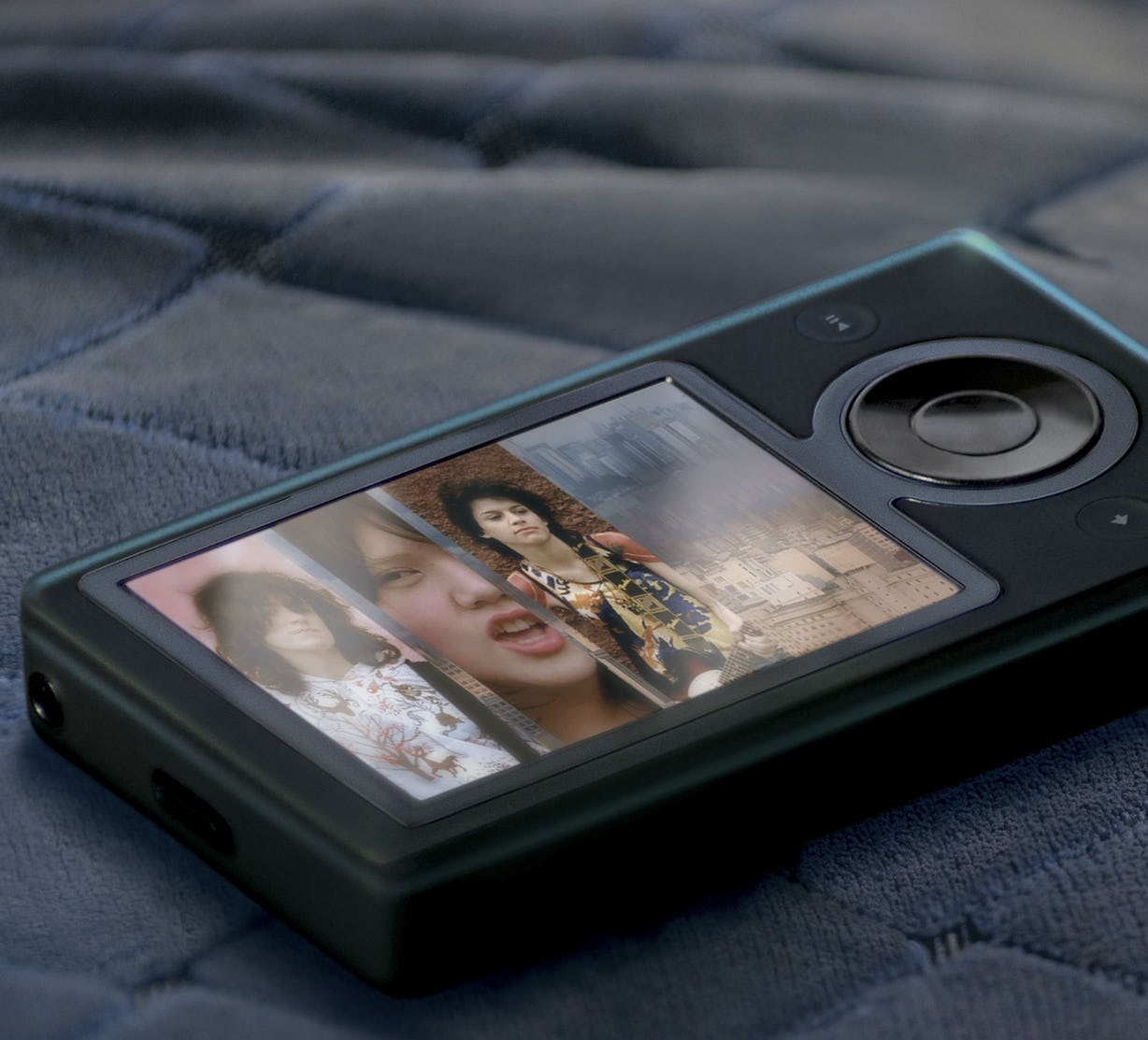
The UI was stunning — and introduced the world to flat design
I’m always a little fascinated by people who fondly remember the iPod. While the click wheel was revolutionary at launch, the UI itself was basically just scrolling and clicking through bland menus ad infinitum. Perhaps I was too young, but I hadn’t lived long enough with bad MP3 players, but I never got the hubbub about the iPod’s interface.
The Zune’s original 2006 UI was comparatively colorful, dynamic, and modern. It let you — gasp — set a wallpaper. By the time the Zune rolled around, the iPod’s interface felt outdated, and Apple hadn’t done much to change it over several iterations other than adding a color screen and higher resolution graphics.
But it was the V2 update introduced in 2007 (alongside the second-gen Zune and its nifty touch-sensitive ‘Zune Pad’) that really stepped it up.
It is also the well-known first device to start the modern flat design aesthetic that now permeates the tech industry. Microsoft’s ‘Metro’ design language, which still influences Windows 11 and Xbox debuted here.
Microsoft did away with the glossy skeuomorphism of other devices for a dynamic UI that emphasized text, legibility, movement, and functionality over shiny graphics. Rather than a simple list of text, the Zune’s UI used horizontal movement and depth in a way rarely seen before. I mean, tell me which one of these two you think looks better.
ipods def had a better input metod (clickwheel is scroll speed adjustable) but damn the zune def wins out on UI creativity and actual screen usage
idk if i should frame this as “zune did a good job” or “ipod UI is very lackluster” pic.twitter.com/uYj3Tu1fgx
— am tiny online (@balkanfur) February 23, 2021
(If you say the iPod, you’re lying.)
It wasn’t just pretty looks either — the UI was incredibly functional and easy to understand. It offered more control over playlists and made better use of the display real estate.
Heck, I’d go so far as to say the Zune UI still looks as good or better looks better than modern versions of Android and iOS. Even the animations were remarkably smooth for their time:
After powering on the Zune HD I decided to check out the 10+ years old Zune and gosh! It has my old mp3s and games are still working! Feels like I can pass on my legacy to my kids now pic.twitter.com/aoe44vJScK
— Olivier Bloch (@obloch) December 9, 2019
It was ahead of its time
Looking back on the Zune, I can’t help but feel it was the right product at the wrong time. Launching many years after the iPod, it didn’t have the chance to penetrate the market as thoroughly as competitors, and a rushed release didn’t help. The syncing process was a mess compared to the iPod’s. And just a year later, the iPhone was released, beginning the slow death of MP3 players.
Still, after the kinks were sorted out, the Zune and its follow-ups simply offered a more engaging experience than you could find on almost any MP3 player (and I tried a whole bunch of them!), one that still looks good today. While the iPod may have had the perfect input method for its specific use case, it’s the Zune that holds up better to modern scrutiny.
The iPod may have been the cool kid on the block, but the Zune will always hold a place in this nerd’s heart.
Get the TNW newsletter
Get the most important tech news in your inbox each week.