Boris is the wise ol’ CEO of TNW who writes a weekly column on everything about being an entrepreneur in tech — from managing stress to embracing awkwardness. You can get his musings straight to your inbox by signing up for his newsletter!
Once upon a time, I was the CEO of an online birthday calendar startup (yup, that used to be a thing). I was also the lead designer, developer, and salesperson, and support helpdesk employee, since I was the only one working there.
I sort of inherited the company after it was built by a company which wanted to see it develop independently. The startup received some funding, and I was asked to run it from there. It all seemed simple enough at first.
The concept was that people would start a calendar, add a few friends, receive an email invite, and start their own calendars. It was viral marketing (or just a Ponzi scheme) and a social network all rolled into one. But I ran it from 2000 till 2001, so maybe it was too ahead of its time.
My own goal was simple: make the interface work so fluidly that each person invited at least two more people. If I succeeded at that, we would see exponential growth, and the company would be a success.
…but I never reached that goal. As simple as the interface was, and needed to be, I could never get it simple and attractive enough to reach that seemingly simple goal.
One day I was looking at the statistics and noticed people weren’t even adding birthdays to the calendar. This was the goal because when you entered someone’s birthday, you would also enter their name and email address, and an invite would get sent out.
I was completely stumped why no one was adding birthdays — the core function of the calendar — so I decided to do some user testing.
I observed a group of anonymous testers (also known as my mother, sister, and girlfriend) to see if I could figure out where they would get stuck. It was an intensely sobering experience, since they navigated the site in terribly unexpected ways, ignoring my subtle and not so subtle interface hints and guidance. I had a hard time suppressing my instincts to just yell out, “WHY THE HELL ARE YOU NOT CLICKING WHERE YOU’RE SUPPOSED TO CLICK?!?!”
Almost every tester in my carefully selected test group turned around and said, “I don’t understand how to add a birthday.”
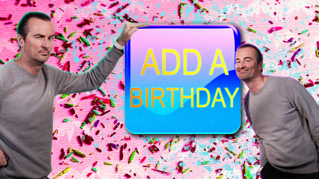
Now, this might not seem that interesting, but the interface we’re talking about was a weekly calendar view, with a large rectangular button that spanned the full width of the screen that said, in capital letters, “ADD A BIRTHDAY.”
The reason they didn’t see that button was that they didn’t expect it there. What they expected was for the calendar to work like any other calendar: you click the spot where you want something to happen, and it happens. In this scenario, people wanted to click on the calendar, on a specific day, and add the birthday — just like you’d do with a physical calendar. Mine didn’t work that way.
The button I had could have been red, blue, and yellow and flickering and jiggling, and they still would’ve overlooked it.
That was my first-hand experience of how difficult it is to design a user interface. People assume things work a certain way, and then act on that assumption. If they think a particular setting is under a particular menu, and it isn’t there, they get annoyed instantly.
I often lose my keys, phone, wallet, glasses, and basically anything that isn’t tied to something. And one way to deal with that is to put the thing you found back in the first place you started looking for it.
So if you’re working on some sort of interface design — or dealing with customers or users in general — make sure to put important things where people look for them.
Can’t get enough of Boris? Check out his older stories here, and sign up for TNW’s newsletters here.
Calling all techies
Sponsored content
Webinar: How to quickly deploy and monitor applications and infrastructure on AWS

Get the TNW newsletter
Get the most important tech news in your inbox each week.


