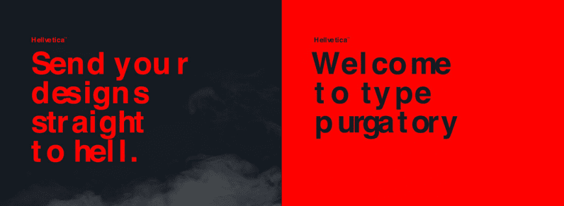
Halloween is just around the corner and while most celebrations are pretty harmless — drunken costume parties, skeleton decorations, the maiming of innocent pumpkins — there are some people in this world that just take things too far.
Creatives Zack Roif and Matthew Woodward have unleashed an abomination upon this world: Hellvetica, a disfigured Helvetica with truly torturous kerning.

Kerning, which adjusts the spaces between letters based on how they’re shaped, is usually applied to make the text more pleasing. Hellvetica, however, turns it into its anti-thesis by randomizing the spaces between — resulting in nauseating devil script.
What makes this atrocity is even more blasphemous is it distorts Helvetica, which is considered by many to be the world’s most iconic and beautiful font. It’s been used in a myriad of timeless designs, such as the New York City’s subway system. Here you can see Roif’s take on it with Hellvetica:
Another great specimen. pic.twitter.com/qd53NjqsiL
— zacks ʙᴀᴅ ᴊᴏᴋᴇs (@zckrf) October 28, 2019
It’s clear Roif and Woodward want to see the world burn… but after having downloaded it and played around with it a bit, I’m starting to be convinced by their anarchist ways (also the ‘kern in hell’ pun helped tip me over the line). Beauty and order are overrated, it’s time to wreak havoc on our rigid online world! Also, why should I alone suffer through reading a text in Hellvetica?
I encourage everyone to band together and use Hellvetica on Halloween. Are you a designer working on a new ad campaign for an insurance broker? A teacher updating a course syllabus? Or perhaps cardiologist writing out prescriptions? Doesn’t matter, kern it all.
Wreak havoc and feel free to tweet the results to us @thenextweb.
Get the TNW newsletter
Get the most important tech news in your inbox each week.


