Walking up the stairs to Highlight‘s offices in San Francisco you pass by a bigger startup, Zimride, and then end up a just a single table with two chairs. In one is Paul Davison, who puts you at ease instantly by welcoming you in and getting you to talk about how you meet people.
I’ve seen this story before. When Twitter was getting going it was a small team of folks, not much bigger. When I first saw Instagram it was two passionate entrepreneurs sitting around a low-cost table at Dogpatch labs in San Francisco.
But don’t be disarmed by Paul’s soft-spoken ways, he, and his competitor, Glancee‘s CEO, Andrea Vaccari. These two guys are competing for the often famous “King of SXSW.”
People Discovery at SXSW
You remember the 2007 SXSW, right? Twitter dominated that. In 2009, Foursquare and Gowalla did. In 2011, group texting did. This year’s SXSW will be dominated by this new genre of “people discovery services.”
What do these two do? Well, you could watch the two videos I’ve shot of these two to see a demo, but basically these two show you information about people who are close to you.
Now, you could say that other apps, like Banjo or Sonar do the same thing. That would be true, and in Banjo’s case, they have 600,000 users, more than 60x the estimated users of Highlight.
But don’t be fooled. These two apps are very different. These also are very early stage apps. In other words, they will work great in places like San Francisco and SXSW, but if you are using them in a rural town they won’t work well. But that was true of Twitter and Foursquare when those two first came out, too (and most people told me I was an idiot for using both, but now have largely gotten on board).
What makes Glancee and Highlight different and better than Sonar or Banjo? Well, Sonar shows you locations around you and all the people checked into those locations via Foursquare.
Requiring people to check in, instead of just always showing you a new list of who’s near you, is quite different and not nearly as useful or fun (although I still use these other apps, in addition to the new ones). Banjo is more of an aggregator and shows you people too far away to really be fun or actionable, not to mention it feels much colder and there isn’t the messaging capability that the two newer apps have.
Why am I hyper bullish on these two?
Because there are three use cases that are still unsatisfied at SXSW:
- Finding people to hang out with.
- Learning more about the people who are standing next to you at parties.
- Knowing when your friends are nearby.
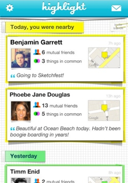
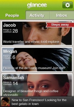
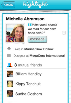
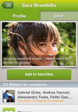
Turn on Highlight or Glancee and you’ll see people within a few feet of you (in my experience Highlight is best at this, and even shows where the other person is located on a little map). These apps then show you stuff about the people around you. Friends in common. Interests in common. Oh, yeah, Facebook is required for both of these apps to work.
Already most of you have written off these apps, right? You should. For now. Why? Because they only are valuable if people around you are using them. At SXSW there will be a ton of people. Why? Both of these apps are spreading through the San Francisco “tech bubble” influencer networks very quickly. Last night when I signed in I saw a half dozen VCs just within a block of my location on Higlight. These apps are being picked up by tech industry insiders faster than any other app I’ve seen in recent memory.
That’s remarkable, because they really don’t have many viral features. They don’t spam your Facebook news feed. They don’t tweet on your behalf. I can name a bunch of apps that are horrid in that regard. Heck, even Microsoft’s Bing now autospams my Facebook feed. These apps are totally silent. Why? Because they know that they really need to earn your trust because they are completely over the freaky line.
The freaky line
What’s the freaky line? The line at which people get freaked out by what the service does.
This is actually why these apps won’t be matched by Facebook or Google or any big company. Imagine if Facebook turned on a feature like Highlight. It instantly would be derided as being way over the freaky line – they’d change the ‘privacy contract’ that we have with those older companies so much that they just wouldn’t be able to keep anyone happy. But a startup is different.
Last night I spent four hours with Highlight’s Davison learning about his coming plans and also talking about the stats he’s seeing. Anecdotally I am seeing people stay logged into Highlight all day long. That matches what Davison’s server logs are showing “I don’t even believe my own stats” Davison says, but it’s easy to see that real people are on and using it. I’ve messaged a bunch of people on the service and they always get answers.
So why will these two apps be so hot at SXSW? Well, when you’re walking down Sixth Street in Austin, new names will pop up on Highlight. You can see their titles. Their hometown. Their interests, er, Facebook likes, and how many they have in common with you. Where they are. Which friends you have in common on Facebook. Then you can message them with something like “I noticed you like the Next Web, I’d like to meet you, can we do that?” I’ve done this dozens of times walking around San Francisco and it hasn’t failed yet to get a meeting.
Which one is better? Well, they both are planning major updates in the next week or so to ensure their status as “The SXSW app of 2012,” but today they both have some advantages over the other, even though so far I like Highlight slightly better.
Pros for Glancee
- Glancee is available on both iPhone and Android. Highlight is only on iPhone.
- Glancee has nicer photos of each user.
- Glancee doesn’t show any maps of where people are (that’s both an advantage, because it doesn’t freak people out about privacy as much, but it’s also a disadvantage to Highlight because that’s one of my favorite features).
- Today Glancee is better on battery life because it doesn’t need to be so exact on GPS location.
Pros for Highlight
- Quicker UI. Sometimes Glancee takes quite a few seconds to pop up with people tiles. Highlight is almost always faster and that speed makes the app more addictive and something you can flip open more times during the day.
- Little maps show you where you met someone. Really great for going back in time. “Where did I first meet Paul Davison?” can be answered in Highlight, not in Glancee.
- Simpler and nicer UI. Glancee’s current version has three tabs across the top (next version has two) but they still look ugly compared to Highlight’s UI.
Anyway, these are two apps that are the ones to watch at SXSW. We’re talking about other apps to use over on Google+ here and here, so we’ll keep tracking the hottest apps and report on how things went in Austin.
Oh, and if you bump into me because of these two apps, remember to look at my interests first so we’ll have something to talk about. “Hey, Scoble, you like Skrillex too?” Yeah, I do. Let’s go play!
➤ Glancee
Get the TNW newsletter
Get the most important tech news in your inbox each week.
