The choice of color to represent information in scientific images is a fundamental part of communicating findings. However, a number of color palettes that are widely used to display critical scientific results are not only dangerously misleading, but also unreadable to a proportion of the population.
For decades, scientists have been pushing for a lasting change to remove such palettes from public consumption, but the battle over universal accessibility in science communication rages on.
A color map is a palette of multiple different colors that assign values to regions on a plot. An example of a misleading color map is rainbow, which generally starts with blue for low values, then passing through cyan, green, yellow, orange, and finally red for high values. This color combination is neither diverging, which would allow us to visually perceive a central value, nor sequential, which would make organizing values from low to high intuitive.
Color brings life to data
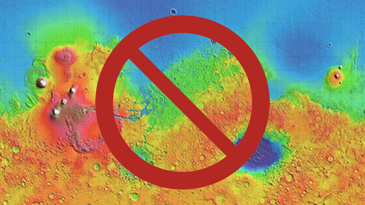
Using color bar graphs can allow scientists to transform their collected data into something meaningful to be shared widely. This could be the first direct impression of a black hole, the mapping of votes cast in political elections, the planning of an expensive rover route on Martian topography, the essential communication of climate change or the critical diagnosis of heart disease.
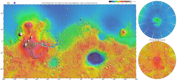
Despite the clear importance of color, scientists often choose the default palette setting of the visualization software that is being used.
Distorted data
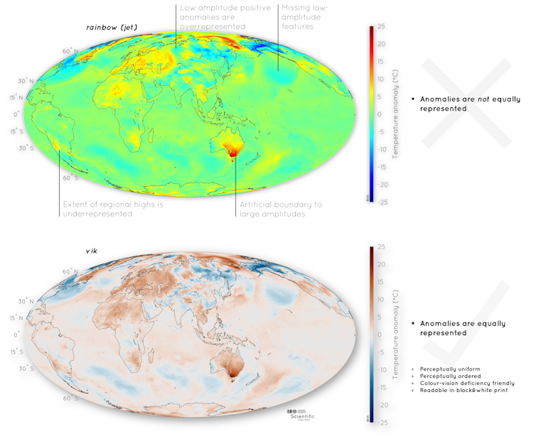
Rainbow — or jet — color palettes are often the default setting on software, but the beautiful sweep of blue to red is misleading when displaying scientific data.
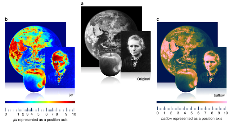
Fundamentally, the change between the colors in the palette is not smooth. For example, the change between blue and green and then between yellow and red occurs over a short distance. Vik and batlow, are examples of even color palettes, where the colors change smoothly across the color bar.
To put this into context, having a palette that changes between colors wildly is like having a position x or y axis with numbers that are not evenly spaced. In jet color maps, this would be the equivalent of having numbers one to four close together and eight to 10 far apart. Such an uneven color gradient means that certain parts of the palette would be naturally highlighted over others, distorting the data. The RGB colour space based on which such uneven color gradients are created is mathematically simple, but not in tune with how we perceive colors and see the differences between them.
Inaccessible science
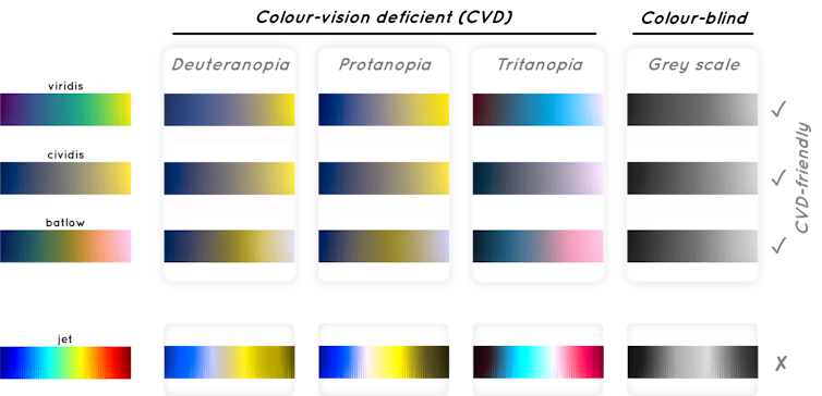
Another issue with an uneven color palette like rainbow is that data presented using these colors may be unreadable or inaccurate for people with a vision deficiency or color blindness. Color maps that include both red and green colors with similar lightness cannot be read by a large fraction of the population.
The general estimate is that 0.5 per cent of women and eight percent of men worldwide are subject to a color-vision deficiency. While these numbers are lower and almost disappear in populations from sub-Saharan Africa, they are likely significantly higher in populations with a larger fraction of white people as, for example, in Scandinavia.
It is needless to state that scientific results should be able to viewed by as many people as possible, and such color-vision deficiencies should be taken into account.
The winding road to the end of the rainbow
The issues with jet, rainbow and other uneven color palettes have been known for years. Although certain fields of science have made significant changes to best practices on color policy, other areas have stuck with their default settings.
As researchers interested in more effective data communication, we outline approaches that scientists can make to communicate their findings more efficiently: avoid using jet or rainbow default color palettes; if it is necessary to use red and green, make sure they are not the same luminosity for accessibility; and use a palette that changes evenly between the colors.
There is growing recognition of the challenges associated with rainbow palettes. Some academic publications — like Nature Geoscience — have adopted a more even color palette policy for new submissions. The Intergovernmental Panel on Climate Change has color-blind friendly guidelines for figures.
Software packages such as MATLAB and Python have removed rainbow as their default colour palette for data visualization features. However, old habits die hard and vigilance is still required — it is important to call out poor color choices when noticed (otherwise the trends keep repeating).
Better science communication, better outcomes
The importance of accurately sharing scientific data in an accessible manner cannot be understated. Uneven color gradients are often chosen to artificially highlight potential danger zones, such as the boundaries of a hurricane track or the current virus spread.
Decisions based on data being unfairly represented could produce, for instance, a Martian rover being sent over terrain that is too steep as the topography was inaccurately visualized, or a medical worker making an inaccurate diagnosis based on uneven color gradients.
Accessible science for all starts with moving away from defaults. This can start with students learning to pick even color gradients for term projects, to international publishers rejecting papers for misleading figures. One day, it may even include the Meteorological Service of Canada moving away from dramatic uneven palettes to highlight weather changes.
Fundamentally, using an inaccurate color map is equivalent to a wilful misleading of the public by distorting data, and this has significant potential consequences.![]()
Article by Philip Heron, Assistant Professor, Environmental Geophysics, University of Toronto; Fabio Crameri, Researcher in geophysics, University of Oslo, and Grace Shephard, Research fellow, Geology and Geophysics, University of Oslo
This article is republished from The Conversation under a Creative Commons license. Read the original article.
Get the TNW newsletter
Get the most important tech news in your inbox each week.
