
In an unexpected announcement yesterday, Sony unveiled DualSense, the controller for the upcoming PlayStation 5 — and this thing looks absolutely gorgeous.
The controller sports a new elegant aesthetic that blends a black and white color scheme into a clean, minimalist design, with a hint of blue around the center touch pad. As many have pointed out, it looks like the lovechild of the black DualShock and the white Xbox One S controllers. I don’t disagree.

No matter how stunning, though, people have been rushing to Reddit to show off their own concept art for the new DualSense — and there are some pretty solid alternatives.
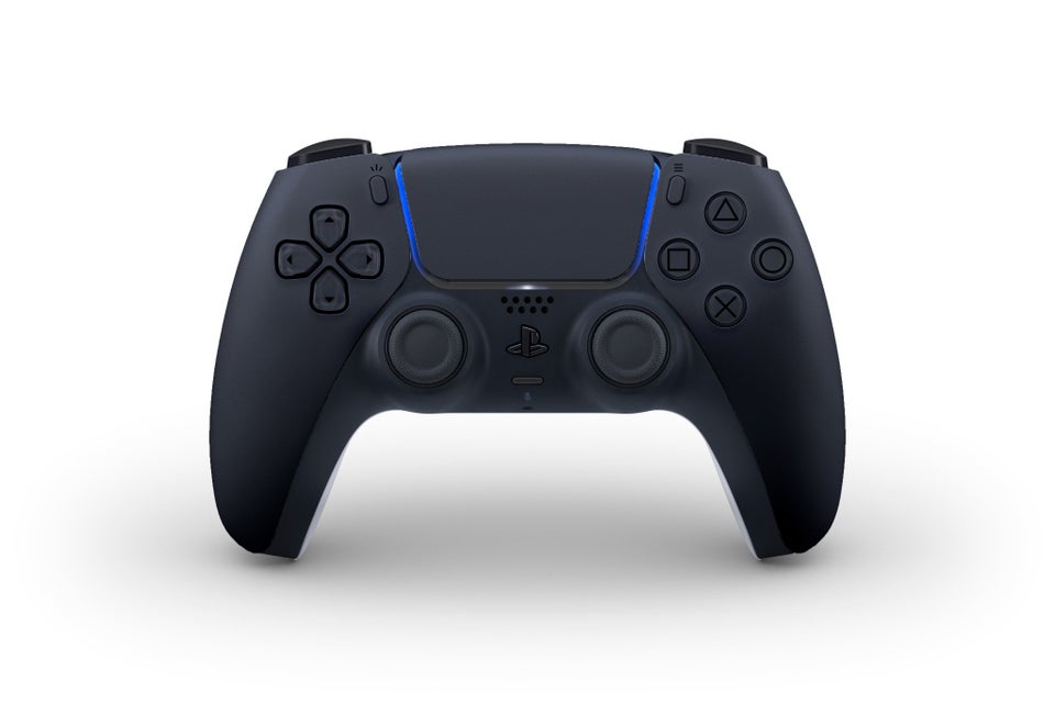
One of the most common revisions is an all-black color scheme:
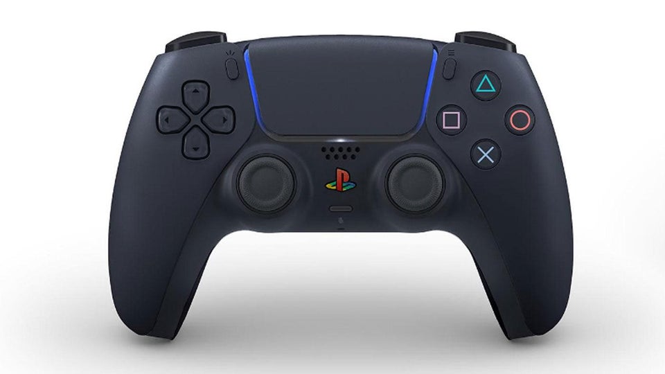
There’s even an all-black version that brings back the iconic color buttons and logo:
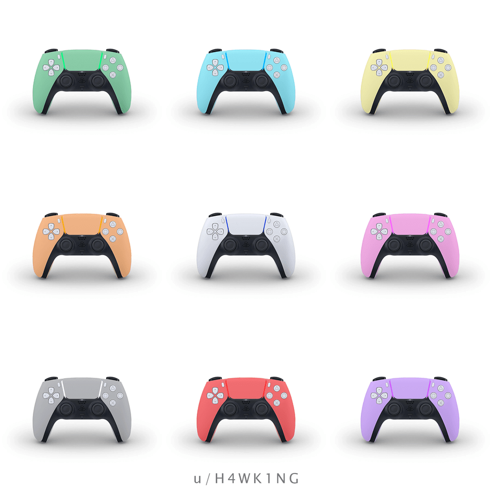
Other users have reimagined DualSense in additional color styles, including aqua, yellow, green, and red.
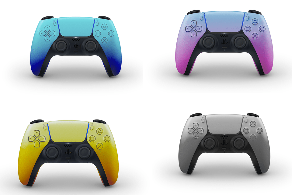
If solid color doesn’t do it for you, don’t worry: There’s also a variation with gradient colors that your eyeballs might find more appealing:
Then there’s the retro controller spin:

Not a huge fan of this one personally, but I can see why it might strike a chord with some old-school gamers.
Needless to say, some redesigns are conceptually ballsier than others. Take this modular concept, for instance. It retains the original color scheme, but reimagines the handles as swappable. Pretty cool, I hope Sony is paying attention to this one.

Then we’ve got the themed DualSense concepts, which so far include designs inspired by popular titles like Spiderman, Super Mario, The Last of Us, and God of War among others.
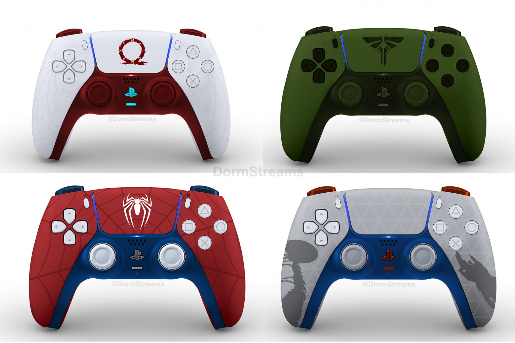
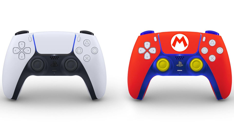
There’s even one inspired by Sanrio:
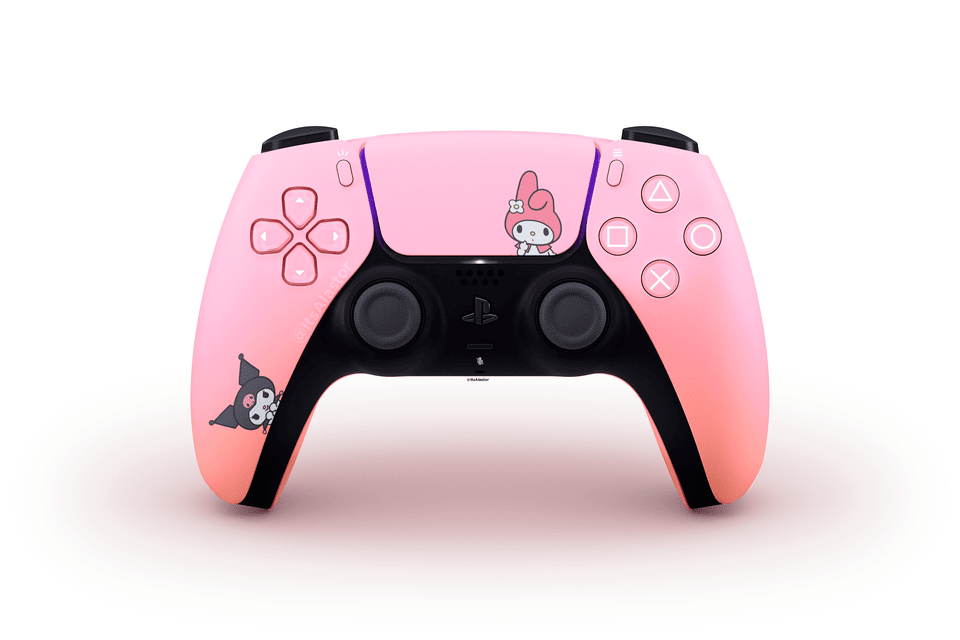
If you’re itching to browse through other concept art sketches for DualSense (or you’ve got your own to showcase), make sure to pay a visit to the DualSenseConcepts subreddit. And don’t forget to let us know which one’s your favorite on Facebook and Twitter.
Get the TNW newsletter
Get the most important tech news in your inbox each week.

