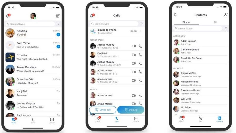
Microsoft today announced it would be walking back previous updates to Skype, and returning to the basics of video calling and messaging. Essentially, it’s finally dropped the hokey makeover it forced on users last year. While it’s nice to see Microsoft eating a proper amount of crow over that, it’s still not enough to induce me to return to an app that was giving me fits long before that point.
Over a year ago, Skype decided to switch over to a fuchsia-and-teal layout, filled with colorful squiggles, confusing features, and the much-maligned “Highlights” — which was basically Snapchat Stories. In case you’d forgotten, Skype was probably the last, and most unexpected app to jump on the Snapchat-copying bandwagon Facebook was driving at the time.
Users called it out for this unnecessary and unasked-for change in scathing reviews, saying they “hated it” and it “makes no sense.” Let’s just say I concurred. Peter Skillman, the director of design for Skype and Outlook, summed up the prevailing opinion on the redesign when he said:
This past year we explored some design changes and heard from customers that we overcomplicated some of our core scenarios. Calling became harder to execute and Highlights didn’t resonate with a majority of users.
To that end, Microsoft is essentially pulling the app back to its pre-reboot design. It’s cutting out things such as the squiggly notifications, saying they “weren’t core to getting things done.” The deuce you say! The justifications for things such as Highlights appeared to be: “Well, everyone else is doing it.” I think Skype has made itself a pretty good case study for why not everyone needs (or is capable enough) to copy Snapchat.
But here’s the thing: As annoying and ugly as that update was, that wasn’t what made me quit using Skype — not really. I’d been having problems with the app and desktop site — which used to be my sole way of keeping in contact with my long-distance boyfriend — for a long time.
The lack of structured group chat for one thing — trying to arrange gaming sessions with friends I had on Skype was a nightmare and a half. I was also subject to near-constant call drops. For a long time, I thought it was my internet, until I shifted to other video-calling software and realized I was just having this issue with Skype. Also, notifications were inconsistent, delayed, and would occasionally spam from both devices on which I was logged in — meaning I sometimes had to manually log into and out of Skype on each device multiple times a day just to avoid being buried in notifications.
All of those things combined sent me scuttling for Discord earlier this year with only the occasional backwards glance. The Snapchat-flavored update and the upset over that were just a pink smokescreen for Skype’s real issues, none of which were addressed in Microsoft’s plan to return to “simplicity and familiarity.”
So it was an annoying app before, it’s probably still an annoying app now, and it just underwent a period where it was a really annoying app. I’m glad to see Skype get rid of its pretensions to being Snapchat, but there are still underlying problems that need to be addressed.
Get the TNW newsletter
Get the most important tech news in your inbox each week.


