
Systems thinking is often heralded in different circles as a competency that’s worth investing in. Having a wider lens and being able to model the systems that influence inputs, outputs and the patterns of behavior for people using the products we build is how we can deliver real value.
Most product designers tend to default to design systems as a proxy for systems thinking. They’re not entirely wrong. The ecology around building design systems does require maintainers to think systematically. They need to deeply understand the core needs of the product team, to deliver reusable component libraries coupled with accompanying guidelines, processes, and documentation.
However, this doesn’t mean that building a design system is the only natural outcome of thinking in systems. Far from it.
Beyond buttons
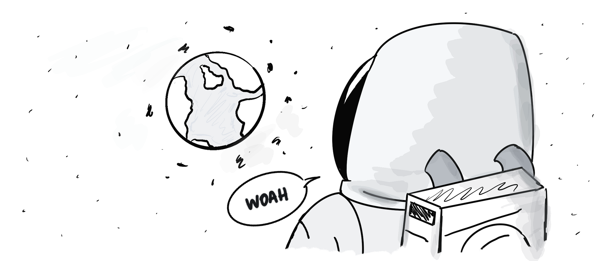
As of writing, few people in history have had the surreal experience of being able to witness the Earth from space in person. Astronauts often recall the overwhelming experience they felt when looking at the fragile blue ball they called home. Their front row seats enabled them to see the world through a different lens, one where all life was interconnected and every system they’ve come to know was working in concert.
Astronomy author Frank White called this experience, ‘The Overview effect’.
Whilst not nearly as life-changing of an experience, zooming out from our narrowly focused product domains and realizing every design decision’s ripple effect in the ecosystem we operate in, can have a similar effect. Designing software often requires us to situate ourselves at both a macro and micro level. Yet, sometimes there’s a tendency to over-index on the latter at the expense of a broader set of goals.
As a result, we risk becoming distracted with the details when we can’t afford to do so. The tools, products and service experiences we’re shaping today are responsible for far more than just the daily metric movements relative to the bottom line. They inhabit already complex systems such as political landscapes or socioeconomic hierarchies and sometimes unconsciously introduce new dynamics that have outsized impacts.
We are surrounded by systems that we’ve directly or indirectly shaped or been a product of.
That being said we’ve done very little to represent any of them. By doing so we can peel back the layers and uncover patterns, boundaries, behaviors and even points of leverage where we can infer our influence. The good news is that we have an underdeveloped muscle which we ought to flex more often that can help us out.
Tools of the trade
We often picture systems in a linear fashion where A leads to B. Needless to say this is a reductive way of describing relationships and causality, as it overlooks the fact that each node may disrupt or restore the balance in uniquely different ways. In other words, systems are messy.

Instead of A leading to B, it’s more likely you’ll find something like, A can cause B and C given a set of conditions, both of which reinforce D which restarts the cycle. Now trying to articulate all that through text isn’t exactly the best way to explain what’s actually going on. That’s where system diagramming can come in handy. Below are a few examples.
Behavior over time graph
You’ve probably already seen this type of diagram being plotted somewhere on an office whiteboard. This graph helps us see patterns and interrelationships that emerge over a specific period of time. We can use it to observe how and why something is happening.
Let’s use something we’re all too familiar with as an example — product debt. Two things that we can use as variables in our graph are the cost of building features which keeps rising exponentially as the product matures, and customer value delivered which is inversely proportional due to fragmentation and debt that the team is spending time wrestling with.
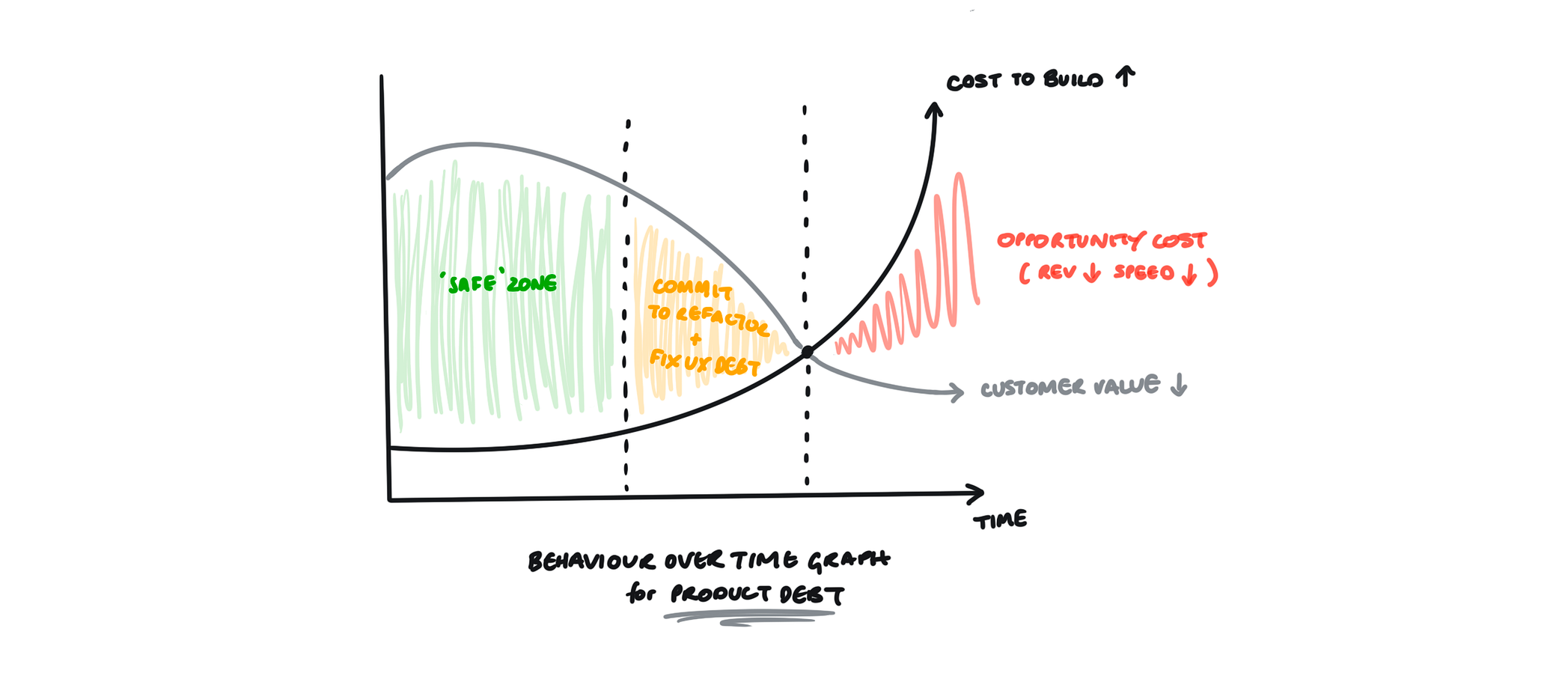
Despite ancillary efforts to revive that delivery curve from declining further, it most likely wouldn’t be enough to curb the overhead. The intersection point between the two curves signals the necessity for a cadence of refactoring or even a commitment towards building a design system.
Quadrant matrix
This is another common diagram, that also has likely donned a few whiteboards. It is mainly used to represent the strength of relationships between several different items. You’ve likely seen it being used to chart the impact versus effort of doing something in a bid to inform the decision-making process.

Let’s say you’ve finished up a moderated usability testing session and you’ve come away with a few insights. To start applying what you’ve learned you’ll need to rank your findings against a few different dimensions namely repetition and impact. Using a quadrant matrix will help you synthesize the raw data you’ve collected and visually make sense of what issues were the most severe and iron them out through iteration.
Iceberg model
The iceberg model is a tool that can be used to show the four levels of abstraction within a specific setting that can allow us to uncover the root cause of why something is actually happening the way it is. It helps us go beyond the observable events that anyone can notice, and help us realize the patterns that might have contributed to those events, the structures that have influenced those patterns and the underlying mental models that keep those structures in place.
Often times when we try to address a problem, we do it on an event level which in turn leads to suboptimization. It’s not enough to swap things around, change information flow or incentives. You’ll need to expand the perception and shift mental models to have leverage and upend the system.
Let’s take a real-world example of a product team that’s trying to meet a deadline. An event would be that the team doesn’t ship in time. The natural tendency is to be reactive and start to find people to blame. Instead of playing the blame game start looking at the trends that might have led to this.
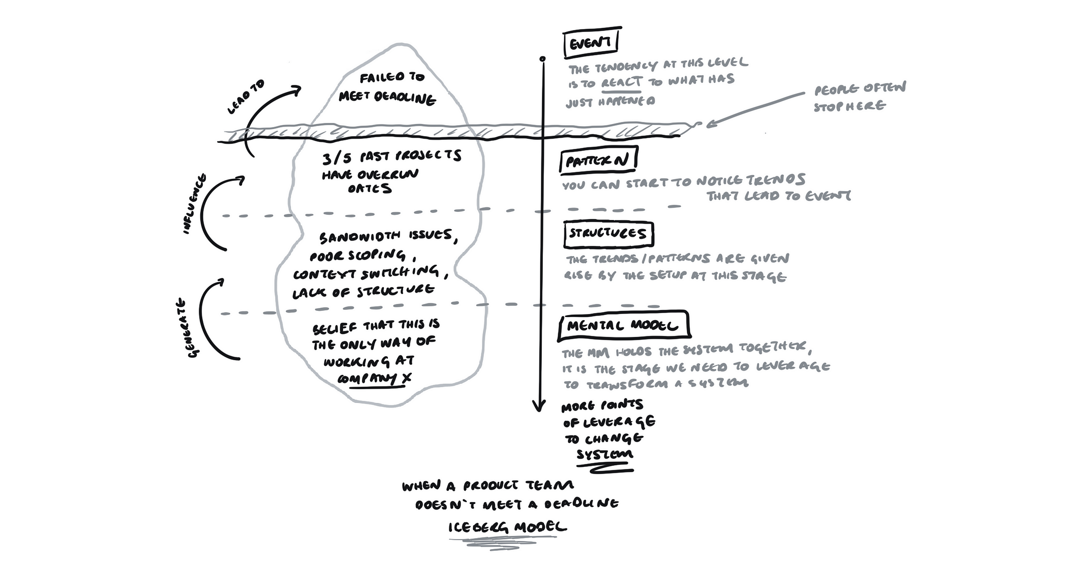
A pattern might be looking at recurring evidence like the team’s collective track record and finding that three of the last five things they’ve worked on have had overrun dates. The structures that might be causing these patterns could be bandwidth issues with engineers and designers needing to context switch due to commitments outside the team.
What’s keeping this system in place is the mental model each team member holds, which might normalize the balancing act of being first responders instead of establishing a cadence coupled with some boundaries.
Reinforcing feedback loops
However intentional it might have been, you’ve probably designed a reinforcing feedback loop. As the name suggests, these kinds of loops have self-reinforcing behavior where the actions of one variable reinforce another. I’d be remiss to not mention the Hooked model as an example of a reinforcing loop that optimizes user stickiness and engagement.
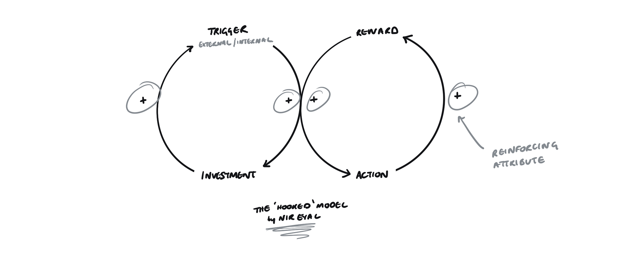
Unsurprisingly, reinforcing feedback loops are used and abused. Most consumer products with some kind of social component and a healthy network effect have reinforcing feedback loops baked into the fabric of the core experience. Products like TikTok have predictive models, computer vision and matrix factorization algorithms each built-in to perfect the content recommendation loop and have our attention.

Even though it has a cold start problem, after only a few seconds of watching and a series of swipes TikTok has collected enough data points and spun that loop so many times, that the content suddenly becomes unmissable. The diagram above illustrates this example.
Balancing feedback loops
Instead of creating a snowball effect, balancing feedback loops counter an input with an opposite output. These loops can correct an oversupply or undersupply, indicate that a plateau has been reached or restore the lost stability back to the system. Like reinforcing feedback loops however, the outcome of balancing feedback loops might not always lead to positive outcomes depending on prior inputs.
Some teams seem to jump the gun when it comes to bridging the gap between their customer success representatives and the customers. Access to an agent is either obscured by a messy navigation system or else it’s available at all times even when unnecessary. Both are examples of a balancing feedback loop.

The former being the increase in customer frustration in trying to flag an issue by jumping through a few hoops which leads to an inevitable decrease in experiential and customer satisfaction measures. The latter shows a complete disregard for the time spent in answering repeatable queries which increases given there is no FAQ-like system in place which in turn leads to customer success agents availability decreasing, diminishing the likelihood of being a first responder for high-value accounts.
External factors, gaps, and delays in causal loops
In the ever-increasing complexity of the systems we build towards, loops rarely ever have equally defined units of input or output. There are usually things that happen in between or outside of the model that have an effect. What better way to represent concepts like gaps and delays than an unpredictable complex landscape like healthcare, specifically the use of software in aiding care decisions.
Electronic Health Records or EHRs are real-time robust systems used in hospitals that contain the medical history of a patient. Their goal is to ultimately chip away at the mundanity of paperwork and enable a meaningful patient to physician interaction. If you zoom out far enough, the most basic loop you can make out is the one where the effects of introducing an EHR into a previously paper-run practice become visible.
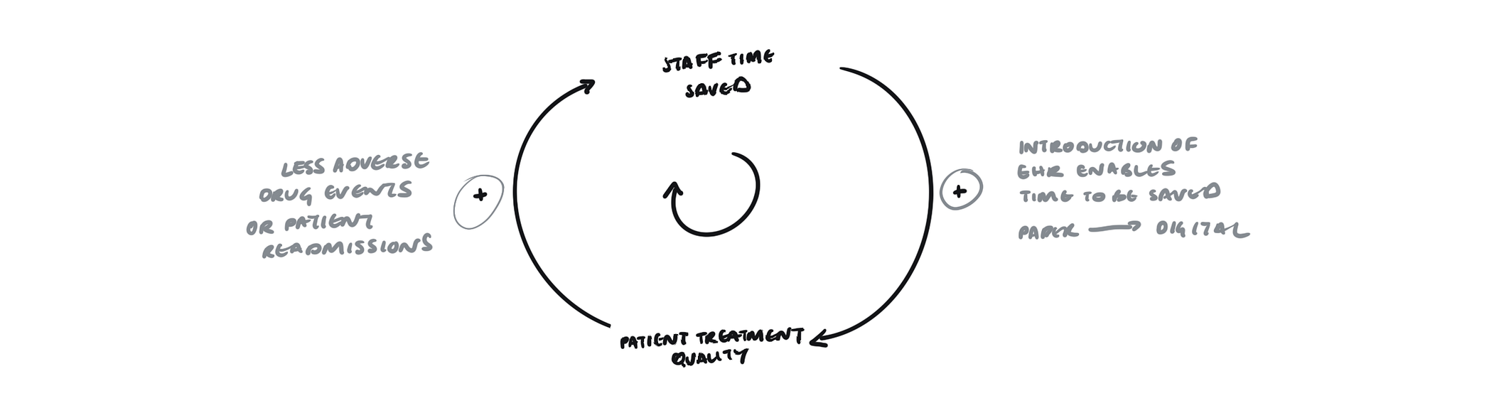
As can be seen in the diagram above, the impact of introducing an EHR into the mix has saved staff time which in turn has increased the patient treatment quality. As a result, the better the treatment quality, the more time will be saved in preventing adverse drug events or readmissions.
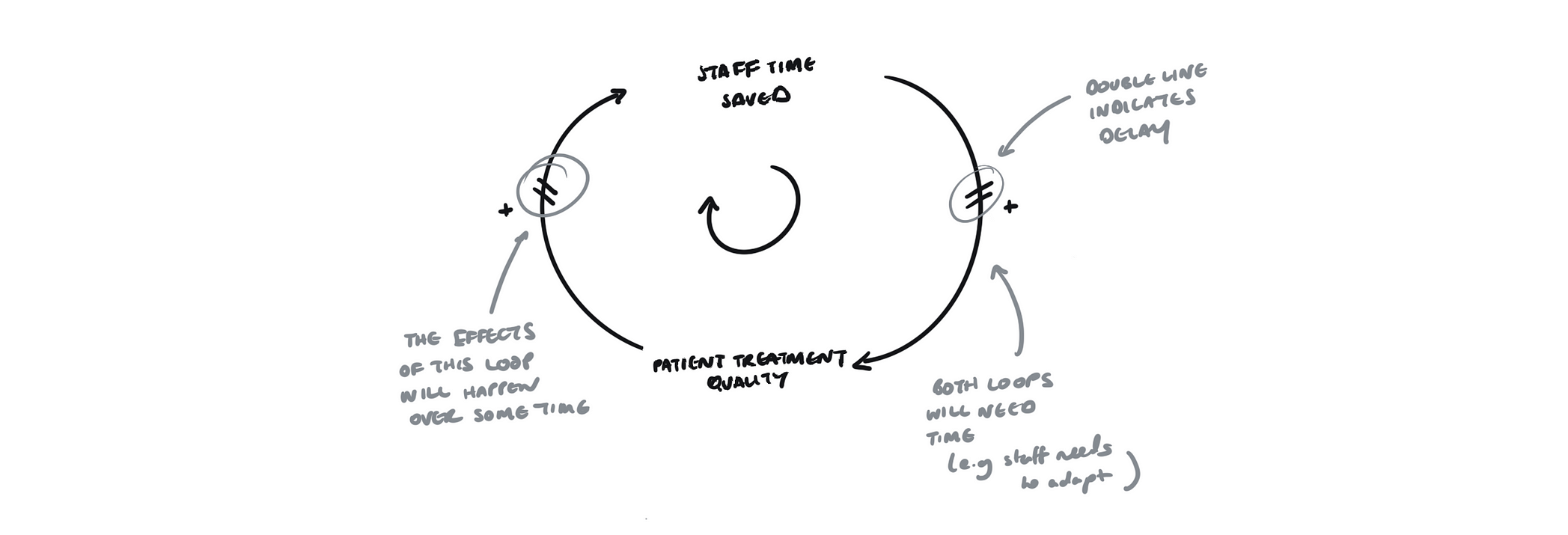
Now that’s not going to happen overnight, the staff on hand needs to be gradually onboarded onto the new system and get familiar. That’s why this feedback loop will likely have delays which we can represent by marking the arc with a double line.

Our feedback loop is still looking a bit too convenient. Let’s introduce another component, such as an update to the EHR software. That in itself might eat up some of that time the staff is saving since there might need to be retraining. That’s called an external factor. Gaps can also be another feature of causal feedback loops. A gap can exist between the actual quality and the actions we’re taking to improve that quality.
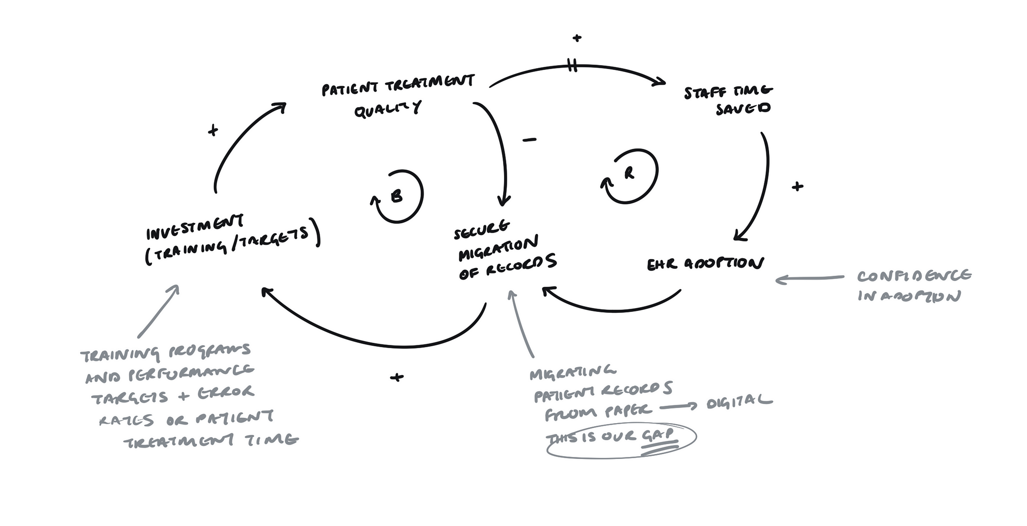
In our example for patient treatment quality to improve, the gap in between, as shown in the diagram, is the secure migration of the patient records from paper to digital records. This, in turn, enables more confidence to adopt and inevitably invest in the software beyond just procurement, but also designing training programs for practitioners and defining performance targets such as decreasing error rates or patient treatment time.

These are just a select few of the tools available in your systems utility belt. Needless to say, there’s an abundance of other ways you can visualize systems. If you’re trying to bring clarity to a post mortem, you can use a cause and effect diagram to isolate what went wrong during a project. A stock and flow diagram can help you simulate the impact of your design decisions, whereas an onion model or hierarchy can help us see top-down or bottom-up causality, and chart the flow of influence.
Each of these visual aids helps us see things we couldn’t have possibly seen through a block of text, especially when co-created with people outside our discipline. They enable us to align viewpoints, understand root causality, synthesize, generate options and even simulate design decisions within our product experiences and organizations. Quite frankly, being able to produce these artifacts is a superpower.
That superpower, however, shouldn’t go unchecked. Systems can also be consciously designed to manipulate, cheat and sometimes even harm people. This underscores our responsibility to make we have a full understanding of the chain reaction our design decisions cause beyond canvas and code.
Just like the astronauts whose new perspective of our planet engendered a new sense of responsibility for the environment, we can use whatever palette of system diagrams to shape, tug or prune systems in small but impactful increments and become catalysts for sustainable and ethical change.
This article was originally published on UX Collective by Justin Farrugia, a product designer, occasional developer, and practicing writer interested in systems and strategy. Farrugia is the designer behind sideprojects like Nate, a subscription management app for Android and Soundbite, a new kind of podcast app that’s currently in the works. Currently at Casumo, an online casino, building entertainment products that enable responsible play. You can read the original article here.
Get the TNW newsletter
Get the most important tech news in your inbox each week.