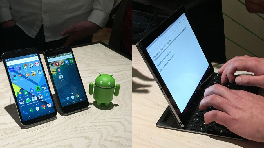
At an event today in San Francisco, Google released so many refreshed products that it was hard to keep your head from spinning. But at the core of the announcements was the release of its latest top-of-the line Android phones: the Nexus 5X and 6P.
When it comes to no-fuss, high-end expressions of Android hardware, it’s hard to deny Google’s position as king of the hill. From the way these phones look and feel, it’s safe to say Google is staying there for some time.
We got a chance to take a look at them, as well as a sneak peek of the Pixel C, Google’s attempt at a full-featured tablet to compete with the likes of the Microsoft Surface.
Meet Google’s new Top-of-the-Line
Developed in partnership with LG and Huawei, the 5X and the 6P have a lot of the same features packed into two different sizes, so fans of both the 2013 Nexus 5 and the 2014 Nexus 6 will find a form factor to suit their needs.
The size differential is noticeable, especially if you’re someone with tiny carnival hands like myself. The 5X screen is 5.2″ in length, while the 6P screen is 5.7″ — pushing it into phablet territory. To put it in perspective, the 6P inches out even the iPhone 6S Plus in size.
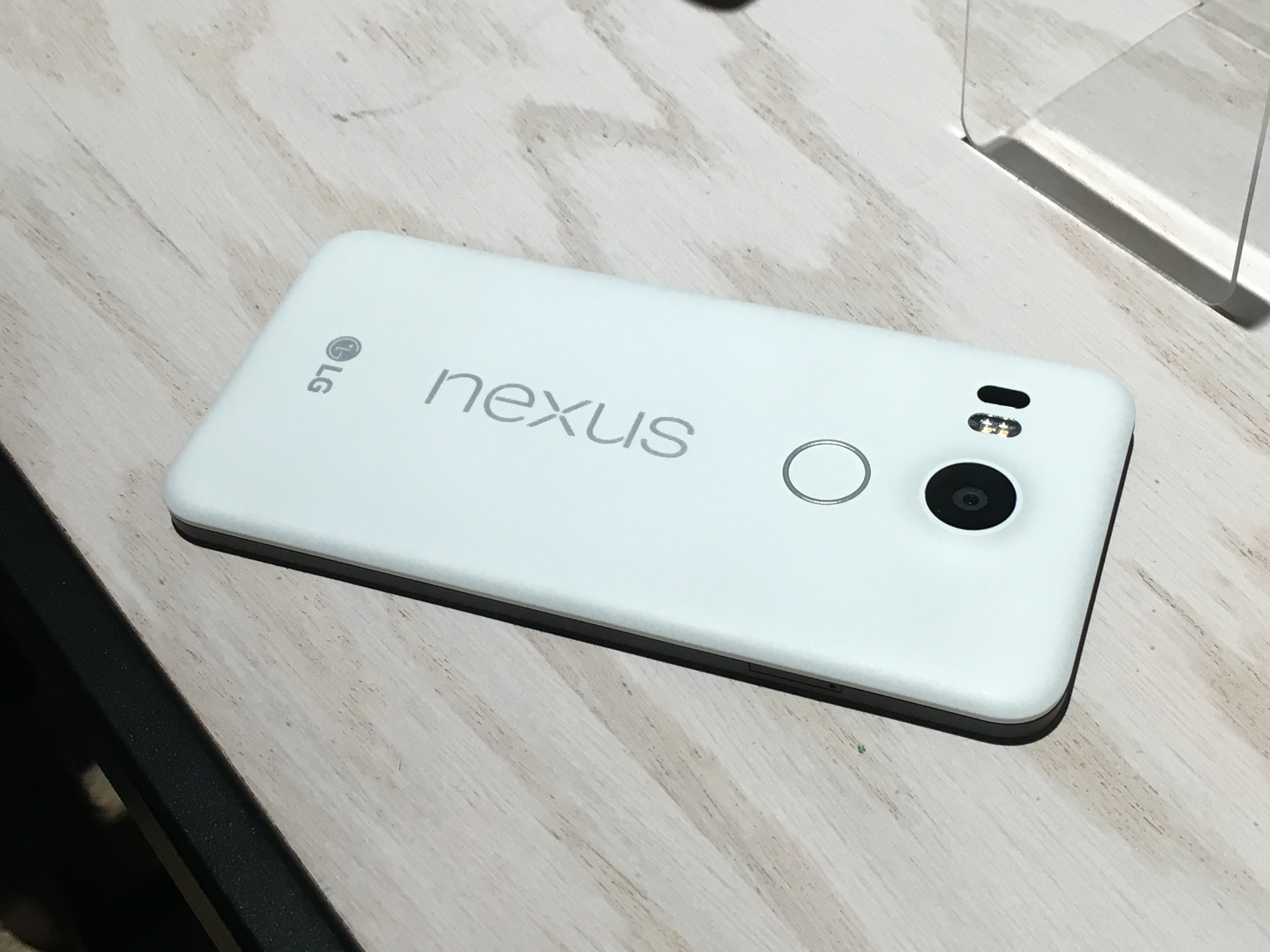
The size comes into play when considering the new touch integration, Nexus Imprint, which is actually located on the back of the phone. Designed to be unlocked with your pointer finger, I struggled more to get to the 6P.

But if you get there, it should be reliable: Google promises both phones can recognize a finger in less than 600 milliseconds and will learn fingerprints over time to drive down the false rejection ratio.
They may be bigger, but the phones are also thinner than previous Nexus models, lying flush with the table. They both have chamfered edges, which can be a magnet for dings, but minimal bezels.
The phones also look gorgeous. While the 5X has a full-HD LCD display with 423 ppi, The 6P manages a 518 PPI quad HD display. Both capture great colors and are crisp in their fonts, so there won’t be any disappointments there.
Both have USB C ports, which Google boasts will charge the phones in a fraction of the time.
The most noticeable minus in look and feel is the 5X’s plastic body. It feels like a betrayal to how nice the phone is, and I can imagine the white model in particular being a magnet for errant jeans die and smudges.
Unsurprisingly, the 6P’s all-aluminum body is much better, sidestepping the other 5X’s matte plastic feeling. There’s something about the shiny metal of that phone that articulates the true power that’s locked within the phone. With the plastic, it lacks that impression, and feels powerful.
They Work Nice, Too
Beyond the look, both the 5X and 6P deliver similar performances with minimal differences under the hood.
The 5X runs on a Qualcomm Snapdragon 808 hexa-core 64-bit processor, which is similar to what LG uses in its G4 phone. Meanwhile, the 6P runs on a Qualcomm 810 Snapdragon hexa-core 64-bit processor, which is a little better at handling heavy gaming or HD video.
To the naked eye, the difference in performance is marginal. There may be a performance difference when pushing the limits of the phone with high-end video or gaming, but it’s unlikely that the average user will notice.
They also sport identical rear camera specs: a 12.3 MP rear camera capable of 4K video capture. On the front camera, the 6P edges out the 5X by providing an 8 MP camera versus a 5 MP one.
As my colleague Napier Lopez likes to say, more MP doesn’t mean better photos, but Google claims 1.55μm-sized pixels are among the largest in any smartphone camera – which should mean better low light performance.

Nexus 6P
Android Marshmallow gives users plenty of control with what they do with the phone, especially with its permissions and voice control. The deep integration with apps is also nifty — and something iOS users will likely covet.
Google Now on Tap is also available on both phones, providing context for experiences and conjuring up cards for what you need. This has been in test form for sometime with Lollipop, but this seems like the polished product version.
Both phones also have motion-sensing capabilities, to know when its being used and when it’s left idle. This is two-fold: First, there’s a delight in seeing your phone flash on when you pick it up without tapping the screen. Second, the new Doze mode — which puts the phone into deeper sleep when left unattended — likely leads to an extended battery life.
If you really love a clean, pure Android experience, you can’t get better than the Nexus. Both of these phones are fun to use and make the best of these new features.
Pixel C Potential
There was also a limited hands on with the Pixel C, the tablet designed to go toe-to-toe with the Surface and iPad lines.
The tablet is aluminum, immediately separating it from plasticky tablets that are common in the Android market. The body houses a 10.2-inch display with a resolution of 2560 by 1800 and 308 ppi. For its size, it’s surprisingly thin — kind of like the piece of paper it is modeled after – at only 7mm.
The rear camera is 8 MP, while the front is 2MP — not particularly exciting if you like Skyping from a tablet with friends and family.

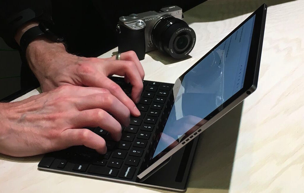
The Pixel C interacts nicely with its magnetic keyboard, switching easily to different positions. The keyboard was also nice and easy to tap upon, with very little lag and a satisfying click.
It runs Android Marshmallow, which looks even prettier with all of that screen space to fill. It looked a lot more like a laptop than a tablet when supported by its keyboard, which was pretty thrilling.
Google didn’t offer up much beyond a light demo and mechanical hands-on, but it’s easy to see exactly what the company is thinking. A cheaper alternative to other big workhorse tablets, the Pixel C could capture the bit of market share compared to its most expensive brethren.
Get the TNW newsletter
Get the most important tech news in your inbox each week.


