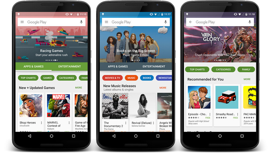
Google has updated and refreshed the design of its Google Play store marketplace for all things Android, and if you have not already seen the new version on your own device, you will soon.
This is not an update you can install yourself, but is rather being switched on from the server. And by all accounts, it’s proving to be a gradual process.
The new design intends to make the app easier to use so that you can more quickly find what you’re looking for. Not coincidentally, it should also be more streamlined — with animations and scrolling effects imparting a more modern and inviting look. New buttons appear throughout the app, replacing the previous scrolling tabs, according to those who now have it (I do not, just yet).
The store now has two main sections: Apps & Games and Entertainment. Within those categories, separate buttons lead to specific content like top charts, games, categories, family and editors’ choice.
The Entertainment category contains pages for music, movies, TV shows, books and newsstand subscriptions.
➤ Redesigned Google Play Store now rolling out to Android devices [Techspot]
Get the TNW newsletter
Get the most important tech news in your inbox each week.


