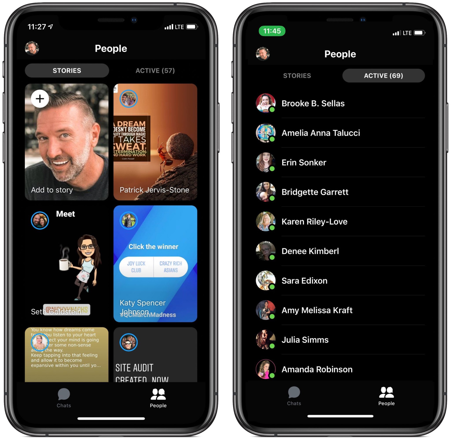
Facebook Messenger is getting a facelift with a simpler, more streamlined design. Granted, we already knew that given the changes were on the way given they were announced way back in 2018, but today we got our first glimpse at what the final product might look like, courtesy of TechCrunch. The big picture: The Discover tab is disappearing, and chatbots are being curtailed.
How many times have you actually used the Discover tab? If you’re like me, probably not much at all; I’d frankly all but forgotten it was there. Instead, you now simply have one tab for your chats, and another for People which highlights your contacts’ Stories. I’m not much of a Stories person either, but I guess they’re popular or something.
Chatbots, while not completely removed from the app, are being hidden away. It’s a stark contrast from only three years ago, when Facebook touted chatbots as the future of Messenger. But in the time since, they’ve usually provided little more than canned responses to the most basic inquiries.
According to the report, chatbots will still be accessible if you look for them on purpose, via a business page, a QR code, or simply searching for a business. But you won’t businesses lose much of the ability to promote their chatbots by killing the Discover tab.
For an idea of what this will all look like, here’s an image provided to TechCrunch by social media director Jeff Higgins:

On the one hand, I appreciate the simpler design and paring down of unnecessary features; Messenger had rapidly become one of the most bloated chat apps available. On the other hand, it’s becoming increasingly difficult to differentiate Messenger and WhatsApp, something that will be even more so when end-to-end encryption comes to general Messenger chats.
Either way, the new design appears to be rolling out now – it’s showing up on at least two TNW staff member’s phones; it shouldn’t be much longer until the simpler design arrives on your own device.
Get the TNW newsletter
Get the most important tech news in your inbox each week.


