Despite some cool product drops, last week’s Apple Event was really about the notch.
If you’ve been living under a rock (oh, how I envy you), Apple announced its revamped MacBook Pro range on Monday. Overall, these appear to be excellent machines, but there was one major drawback: the display now has a notch.
Yes, an actual notch. Like the damn iPhone.
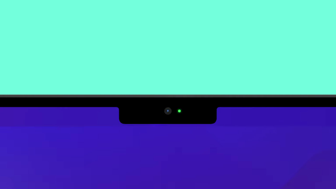
Unsurprisingly, this caused a bit of an uproar. People aren’t too happy about their screen space being violated this way.
Thankfully, Apple responded to this outcry and reassured everyone that the MacBook Pro notch is actually super duper smart.
Shruti Haldea — the Pro Mac Product Line Manager at Apple — appeared on the Same Brain podcast to discuss the new machines and the conversation turned to the notch.
You can watch the podcast on YouTube here (the segment in question begins around the 10:20 mark). In it, Haldea talked specifically about the 16-inch notebook. She mentioned that the machine still has a 16-inch active area on the diagonal — and the display remains a “16:10-inch window.”
What Apple has done, Haldea stated, is grow the display and move the menu bar “up and out of the way.” This, she believes, is a “really smart way to give you more space for your content.”
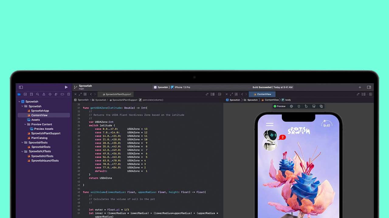
On one hand, she’s right. I’ve definitely softened on the MacBook Pro notch since its announcement. The argument of getting more usable real estate is a good one. And, if you go full screen, the notch is blacked out and about the same thickness as the bezel on earlier MacBooks:
Yet, all this is very ‘Apple.’ The company is saying how smart and clever and “seamless” this design is without ever actually acknowledging the downsides of this design decision.
The notch is ugly. It’ll also be a hassle for people (like myself) who have a lot of apps in the menu bar. And even though I don’t want FaceID on my computer, at least including it would give the notch a concrete selling point.
Of course though, none of this was discussed on the Same Brain podcast, which effectively encouraged Apple to repeat its keynote in different words. But who needs accountability, huh?
Really, the best way to sum up the MacBook Pro notch is as a clever solution to a non-existent problem. Folks are fine with bezels.
But, to counter that, let’s not forget that Apple says its MacBook Pro notch is actually really smart thank you very much. Amen.
Get the TNW newsletter
Get the most important tech news in your inbox each week.

