Amongst all the big product announcements Apple made at its April event, the company also ushered in a new era for its podcast offering. Specifically, it introduced subscriptions and a redesigned Podcasts app.
Today, we’re talking about the latter. Why? Because the Apple Podcast app redesign is a violation of our human rights; a plague upon this fair and pleasant land.
Okay, that’s a bit much. But the redesign is annoying. Anything that gets tweaked should be better to use, right? Well, that hasn’t happened with the new Apple Podcasts app.
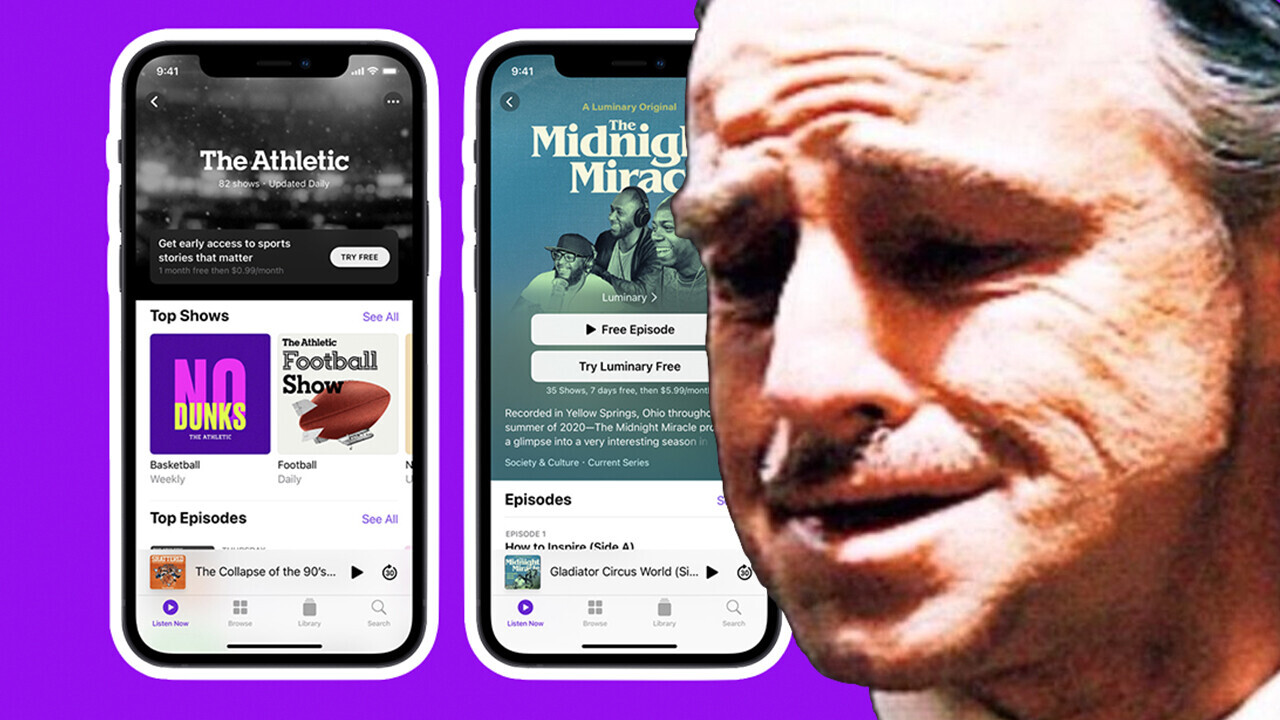
The most obvious and least offensive change is visual. The overall shape of the app remains much the same, but the show pages have been redesigned so they look far more modern.
Here’s an example from Apple’s marketing materials:
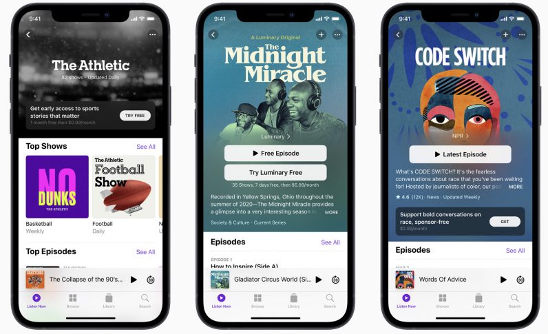
I don’t mind this — the Apple Podcast app was due a facelift, and at least this makes it a more unified browsing experience.
No, my problems with the redesign are far more functional. Let’s look deeper.
One of the things Apple changed in the refresh was the fact you no longer “subscribe” to podcasts, you “follow” them instead. I get this change. If you’re trying to launch an actual, paying subscription model, “follow” makes way more sense to separate your paying and non-paying users.
The issue with this — on my Podcasts app at least — is that this change removed all my download preferences.
There are a number of podcasts I listen to that pump out a gamut of episodes, a fair chunk of which I have no intention of listening to. Interview-based shows are a good example. In these instances, I turn off the auto-download to stop my phone being clogged up.
Since the update, every damn show is now set to automatically download.
Having to go through my library and update settings is irritating, but I can accept it. This hasn’t happened to everyone else I’ve chatted to, so I can write it off as a bug.
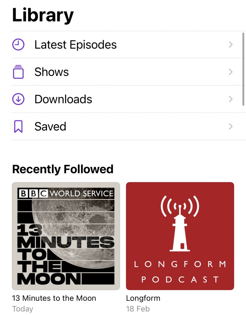
But there’s one bit of the Apple Podcasts app redesign I simply cannot deal with: the change to the latest episodes section.
The true horror of the Apple Podcasts app redesign
I think the way I listen to podcasts is pretty normal. I find a list of all available episodes in my library and scroll down until I land on one I fancy listening to.
Over the years, Apple has made this a little harder by hiding the menu behind further layers. But now? It has massacred my poor section.

Prior to the update, the latest episodes section was just that: all the latest episodes. Since the update, I was only shown a handful.
After a short moment of digging, it turns out Apple put a time filter on this section. The default appears to be one week, but the bigger problem is that the largest filter you can put on is a month.
Why?
Surely it’d be simple to just list every unplayed episode? As it used to do? I like to curate podcasts as they come in, marking episodes I have no intention of listening to as played, so I have a stream of content I’m interested in. Now this is limited by how long ago that show was released.
It sounds minor, but these small design decisions make a big difference when you’re managing a ton of content across several shows — a topic I’ve written about before. Effectively, the Apple Podcasts app has gotten worse for no reason whatsoever.
And lord, don’t even get me started about the state of syncing different episodes across devices. It’s a mess.
You’d think if Apple was going to take the Podcasts app seriously, it’d focus solely on user experience. Instead, the whole redesign seems to have been concentrated on funnelling people into new shows that Apple wants them to pay for.
Surprising? Of course not — Apple’s only about that money. But still, ugh.
Get the TNW newsletter
Get the most important tech news in your inbox each week.