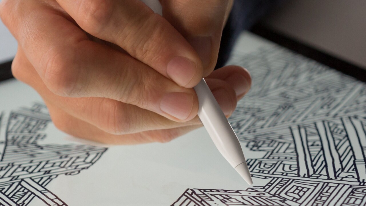
Apple announced a giant new iPad Pro yesterday that comes in at a gargantuan 12.9 inches along with a new accessory called the Apple Pencil which just happens to be a stylus made for graphic designers or document editing.
Naturally, the world went crazy citing the two times Steve Jobs famously said that “nobody wants a stylus” and if you see one the creator “already failed.”
Almost every news site has a story today about how Steve Jobs would’ve never allowed such a thing. It’s super fun and smart to joke when someone famous is wrong, right!? People love smart people being wrong.
The thing is, citing that famous presentation where Jobs unveiled the original iPhone as a reason that having a stylus is stupid is wrong and takes Jobs’ own words out of context to both the time and the technology available.
Mobile phones were very different around the time that the iPhone announcement in 2007 was made. You either had a dumb phone — like the Nokia 2280 — with buttons, or you had a ‘pocket PC’ that featured either a stylus or keyboard for entering text. Nobody had perfected multitouch screens at that stage and Apple defined a new category.
I’m sure you’d agree that using a stylus with a phone isn’t much fun — though Samsung seems to like them — but even then, both the touch screens and styluses that Jobs is talking about have been vastly improved since that day eight years ago.
Styluses were popular in 2007 because they made up for the inferior resistive touch interfaces which were bad at anything other than precision touches. Mobile interfaces were tiny and hard to click on, because they were designed entirely for operating with a stylus — they “blew it.”
Microsoft also tried to push for the use of the stylus as the primary input method when it launched its own tablet PCs with Windows XP, which Jobs also derided in another video (above). They also “blew it” because again, the stylus was required to perform the high-precision interactions that Windows at the time required — it was a cursor-first operating system and using it with a fingertip was a nightmare.
Steve Jobs’ famous crusade against styluses was not because he hated them, but because they were used as the primary way to interact with devices. All of Apple’s competitors were designing their interfaces around the stylus, with tiny, precision elements that needed a pointing device to actually use them. That’s how they blew it.
Apple in 2015 looks very different. It’s no longer Steve Jobs’ company, it’s Tim Cook’s, and he’s moulding it in his own way.
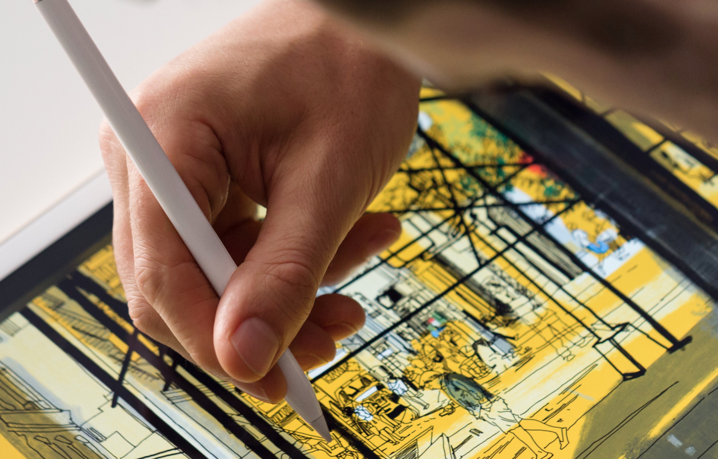
The company didn’t introduce the stylus because it needed a better way to interact with its tablets or thought it would improve how they’re used, it did it because there’s a niche set of people who would vastly benefit from a highly accurate stylus for art, drawing or just doodling.
When you look at Apple’s messaging around the stylus, you can see that it’s angled at exactly those kinds of people. It isn’t included with the iPad Pro and is being sold as a $99 extra.
Apple spent a lot of time developing the Pencil to allow high-precision interactions; it re-engineered the display to allow an insane amount of accuracy for a digital pen and tracks the pen 240 times a second as it moves across the screen.
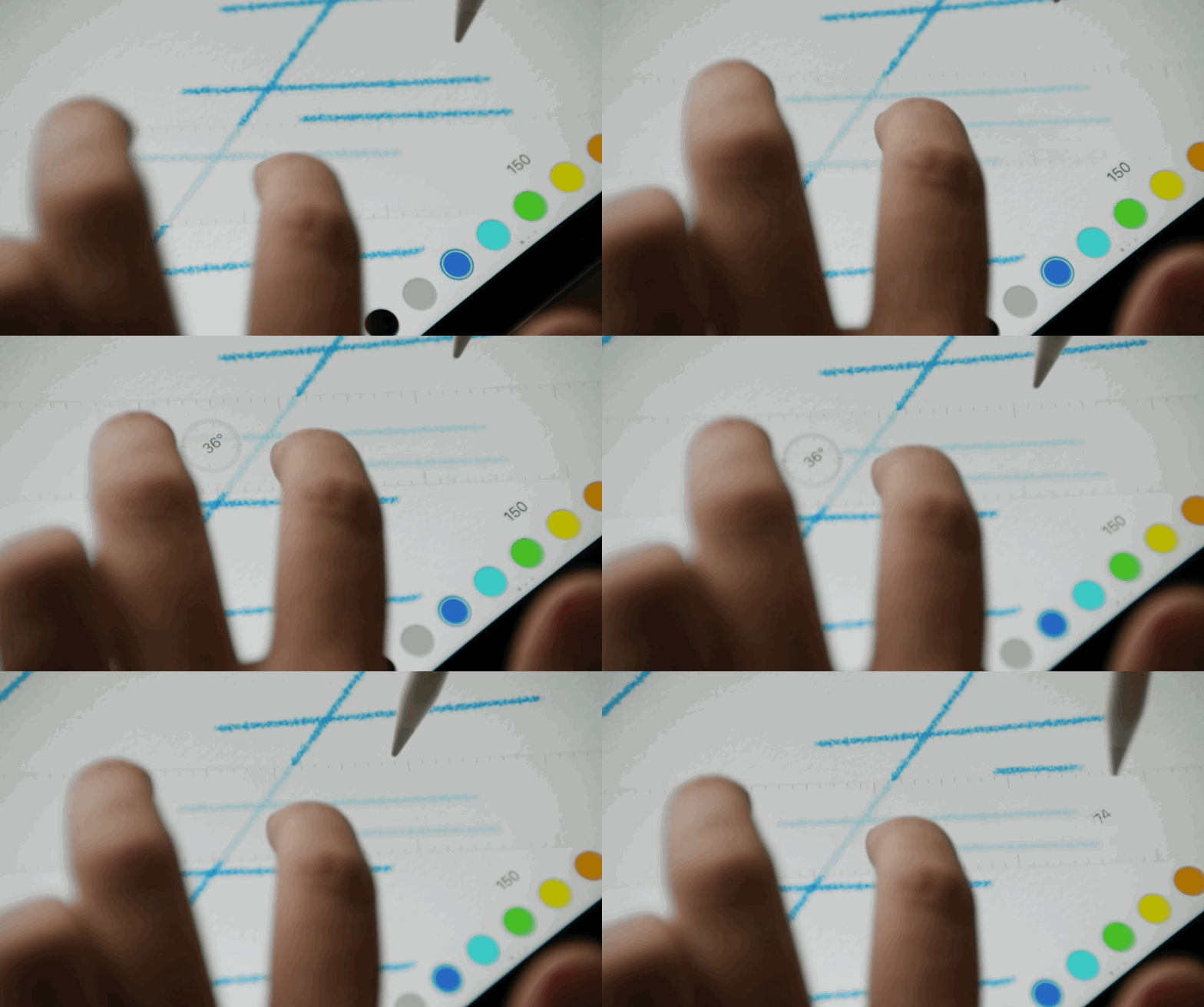
The Pencil can detect pressure, tilt, orientation and more to create different strokes and, rather uniquely, can be use simultaneously with your finger for something like holding a virtual ruler.
What you’re not supposed to do with Apple Pencil, is use it to get around the iPad. In the Pencil design video, Apple’s Chief Design Officer Jony Ive emphasised this point, saying that “touch is the primary method of interaction with the iPad.” The only activity you see people doing in the video with the Pencil is drawing on the iPad Pro.
Saying that Apple “blew it” is misguided — it just opened up a whole new market for designers, artists and other creatives who have previously been spending hundreds to thousands of dollars on art precision tablets and styluses anyway.
It’s interesting, because the iPad Pro starts at $799, but many equivalent ‘professional’ graphics tablets run into the thousands of dollars for a similar offering.
The new stylus isn’t there for messing around with the interface, it’s there for drawing, annotation and notes — it positions the iPad as a true creation device, instead of something you consume content on. Steve Jobs would’ve been excited about this stylus, not disappointed, because it stands for everything he admired about Apple.
It’s insane to compare Jobs’ words in 2007, talking about a phone, to Ive talking about a new way to use an iPad in 2015.
Apple didn’t “blow it” — it just created a whole new, exciting device that creatives around the world can embrace.
Get the TNW newsletter
Get the most important tech news in your inbox each week.
