
So you like our media brand Growth Quarters? You should join our Growth Quarters event track at TNW2020, where you’ll hear how the most successful founders kickstarted and grew their companies.
This article was originally published by Built In.
In 2016, I recognized that I wasn’t achieving my goals, learning new skills, meeting new people, getting in shape, or focusing on my mental health not because I wasn’t motivated, but because I wasn’t tracking it. Peter Drucker said “what gets measured gets managed.” This maxim became the cornerstone that I used to transform my life. With that quote in mind, I decided to outline my goals and then break them down into simple habits that I could achieve in bite-sized amounts daily.

I began tracking my learning, fitness, and mental health with a piece of grid paper and the days of the week. I tracked my habits religiously for years and saw my life incrementally transform into one where I no longer saw the goals I wanted to achieve as unobtainable. I saw every objective as something that I could achieve by staying consistent and chipping away at it day by day.

After years of tracking my habits on paper because I couldn’t find a product that met my needs, my co-founder Wilson and I resolved to upgrade my habit tracking. We built a free web app and Chrome extension called Confetti — a colorful daily habit tracker that launches confetti for every completion to celebrate your daily accomplishments.
In my four-plus years of product design, this is the first product I’ve designed from start to finish entirely on my own, which taught me a lot. In this article, I’ll be sharing those insights, UI & UX lessons, and things I wish I’d done differently.

1. Define features for launch
At the outset, my co-founder and I had a rough prototype that I designed for the three main screens. We didn’t have the foresight to envision all the ideas and revisions that would morph the direction of our product though.
We eventually took a step back and decided that we needed a launch date and a core set of features for our MVP. We created a board on Notion and started managing what features were must-haves and which ones were nice-to-haves. For example, sign in, sign up, and onboarding were must-have features. We decided, however, that re-ordering habits was a nice-to-have.
[Read:
We settled on these features based on what we believed would make the product fully functioning and easy to use. By prioritizing a core set of features and setting a launch date, we alleviated ourselves from distractions and becoming overwhelmed with ambitious features. This also gave us an incentive to build must-have features first so we could tackle the nice-to-haves.

2. There are a lot of flows and states
When designing this product, I was frequently reminded that every edge case needed to be solved, and every hole needed to be filled to complete the experience. Building a product from the ground up was a double-edged sword: envisioning the entire product with my own imagination was thrilling, but I was often operating outside my comfort zone.
I’m accustomed to working on existing products in my current role at the product design agency Skookum. I typically work within the constraints of an existing product, which has its own unique set of challenges. Usually, though, I don’t have to create everything from scratch. Generally, I’d be working on a product that already has a design system, established design language, various components, UI states, and so on. Without this infrastructure, I frequently had to account for several edge cases, flows, and states that a user may encounter in our product.
The signup flow, for example, had default, disabled, active, filled, error, and hover states. In addition to sign up, I also needed a password reset experience with similar UI states and six screens:
- Enter email
- Reset email sent
- Email notification design
- Enter new password
- Error
- Success
All of this got confusing very fast, which leads me to my next point….

3. Make a user flow
I quickly encountered an organizational problem. Because I created this product in my free time, I made the mistake of neglecting to follow my traditional approach, which led to problems down the road.
My standard workflow generally starts with a user flow to define the different paths a user could take and outline the necessary screens. I neglected that approach initially because I made the incorrect assumption that this would be a very simple product with only a few screens. As I started designing the numerous states and screens, however, the user flow became chaotic, and I had difficulty pinpointing the holes in the experience.
I eventually stopped kicking the can down the road and created a user flow in Whimsical. This allowed me to decipher which screens were missing and where someone would go when they clicked certain options.
It’s easy to forget how all the states and screens fit together and how one state impacts another. I found solace when I organized my screens in a user flow diagram and could visually see the missing screens and states. Creating a user flow was critical to maintaining the structure and organization of the product as it grew.
4. Interactions should inform UI
It’s true that you shouldn’t start adding animation to your project until you’ve completed the UI design. But actually adding animation or micro-interactions and planning how elements will be affected by animation is not the same. Considering the animation, motion, or micro-interactions while designing the UI saved me from unnecessary adjustments to the interface when interactions were included later in my process.
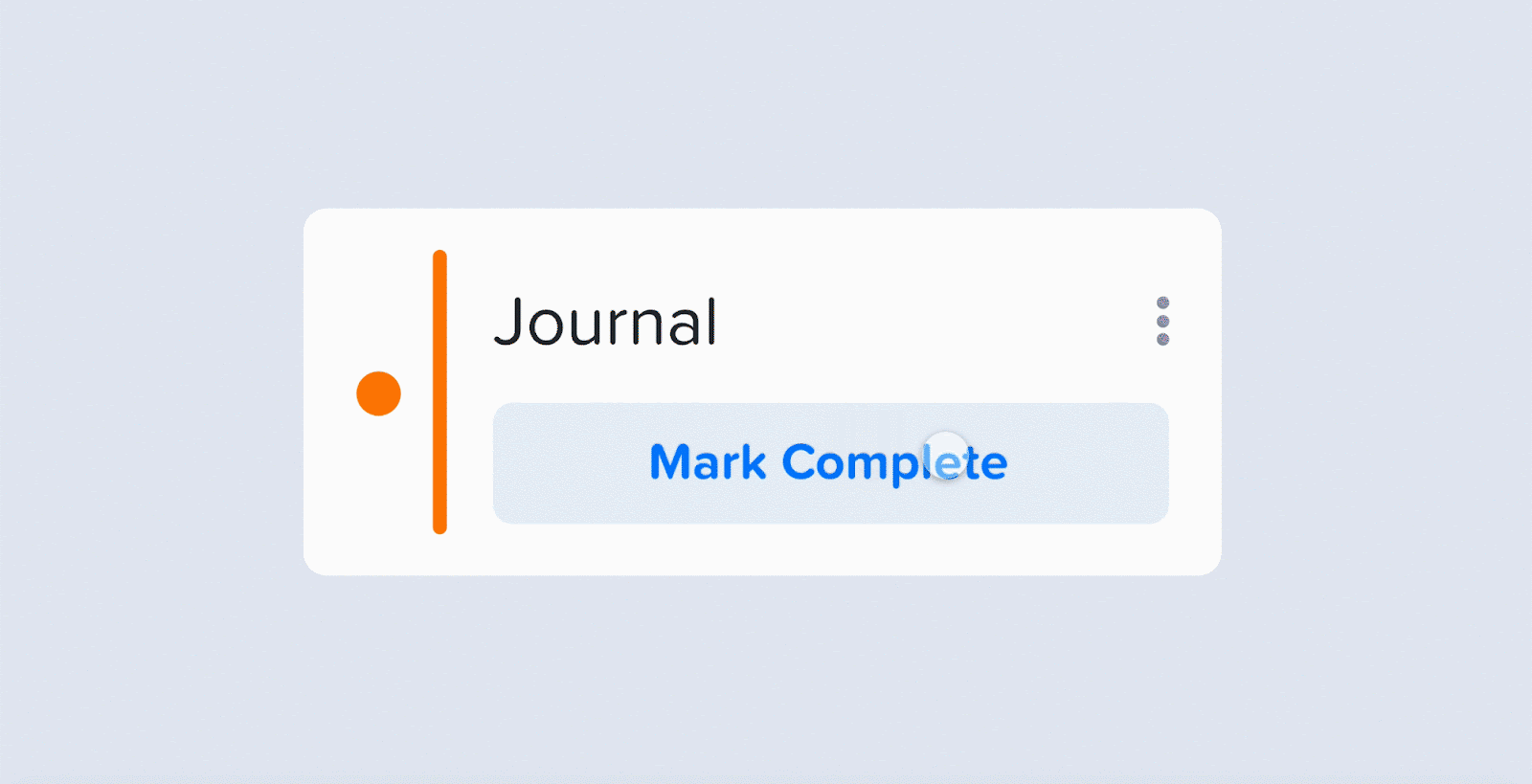
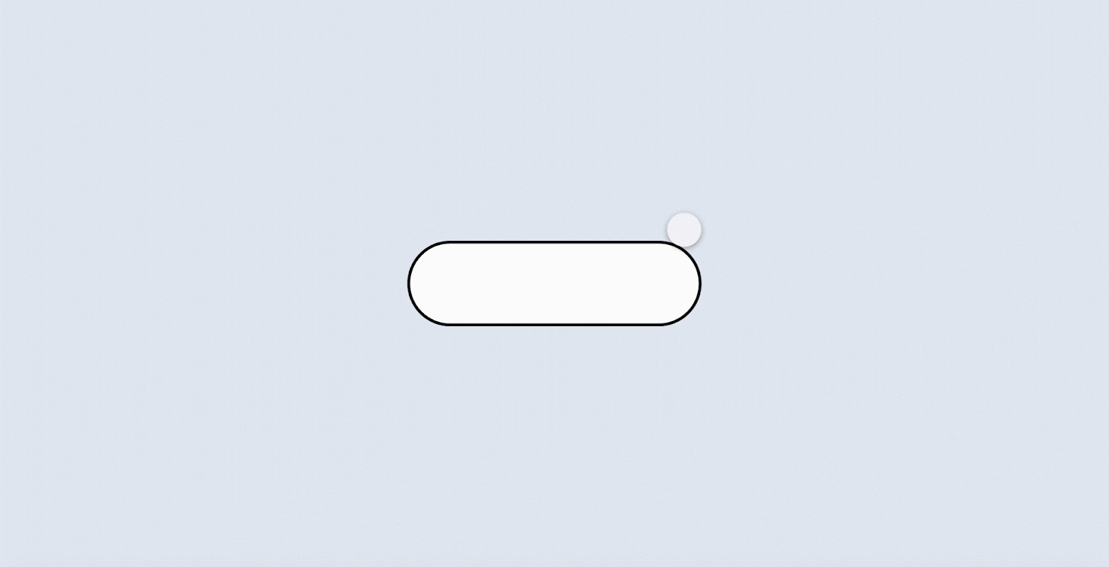
For example, when I designed the “Mark Complete” experience for completing a habit (as seen above), that experience needed to be designed with UI and interaction accounted for simultaneously. To do this, I designed the UI to my liking then dragged it to a corner of my design file and began messing with how the elements would interact when clicked. The interactions forced me to tweak parts of my UI design which saved me from a headache that I would’ve had to address later in the process.
I thought it was important to account for UI and interactions in tandem because their influence on each other was imperative to creating the experience that I envisioned. If I’d designed the UI and then later decided how the elements would be animated, the whole thing would’ve become a confusing mess. By doing interaction and UI design side by side, I was able to create interactions that fit nicely into my interface.

5. Get feedback early
This was another mistake I made: waiting too long to get feedback.
I worked on this project on nights and weekends and didn’t really tell anyone about it. It was a hobby project that I planned to unveil eventually.
When I finally got fresh eyes on the product from family, friends, users, and anonymous internet people (shout out to r/UI_Design), they noticed glaringly obvious things that I’d become blind to. I realized that I easily became engrossed in isolated parts of the experience, so I occasionally missed bigger-picture problems.
In retrospect, I wish I had shown the designs and prototype to people sooner because their feedback added extra time to development later down the line as we amended issues that friends and users found.
6. Being inspired is OK
Designers often think that all their ideas must be original, or they’re a fraud. Imagine that you’re looking at another product. You find a color palette that you like, an interaction that feels just right, or a pixel perfect layout for a landing page. You might be tempted to think, “Well, too bad because someone’s already beaten me to it.”
That mindset is incredibly flawed and limiting to creativity though.
Occasionally, when I was stuck on a missing piece of the design, I would browse the internet for inspiration. I observed how other companies had designed their onboarding flow or how they managed user profiles. I never copied the entire experience, but every so often I would find myself appreciating little details that I would then include in my own designs.
My favorite example is the rotating exit effect that we use in our modals. I found a feature like this on a random website and thought it looked unique, so we decided to add it to Confetti. I also did this for our landing page’s button hover effect and the typeface that we used for the site.
The truth is, everything is a remix. That doesn’t mean you should be blindly copying other people’s work, but don’t be afraid to find bits and pieces that you appreciate and work them into your own projects: a cocktail, if you will.

7. Wear your hats well
As we were designing the product from scratch, my co-founder and I were required to wear a lot of hats. I had to be the UI, UX, interaction, motion, graphic, and marketing designer, as well as taking on all the other roles required to manage and launch the product.
With so many responsibilities, I inevitably ran into aspects of the design that I didn’t have the skills or time to focus on. In these scenarios, I had to admit I was out of my depth and seek outside resources to do the job.
For example, another artist created most of the illustrations, and the iconography is also the work of another designer. I see no issue with focusing on what I’m good at and using resources or hiring outside help to finish the job. Ultimately, I would prefer the product to look and work well than to have inconsistencies because my ego has gotten in the way.
Don’t get me wrong: I used designing this app as a learning opportunity and frequently stepped outside of my comfort zone — but some parts of the experience I didn’t want to stretch too far.

8. Simpler is better
Although having a defined MVP and launch date prevented our scope from being overwhelmed with ambitious features, it didn’t guard against scrupulous refinement to the features we did have.
There’s a Reid Hoffman quote that people like to share: “If you’re not embarrassed by the first version of your product, then you’ve launched too late.” We didn’t think we needed to be embarrassed to launch our product, but we decided that having a simplified version was far better than spending months developing ambitious features.
To launch our product, we had to contemplate two questions:
- Do we believe what we’ve built provides value to the user?
- Is what we’re shipping our best effort?
These questions allowed us to stay aligned with our goal and launch date while avoiding distractions. By focusing on delivering value and giving our best effort to what we deliver, we were able to ship a high-quality product without overloading our scope with features. We had to strive for perfection but be satisfied with great.

9. A good handoff saves time and headache
One thing that I did right from the beginning was managing and organizing design assets for development. I can’t take too much credit, though, since I used Zeplin, which made handing off designs and assets to my cofounder effortless. Zeplin ensured I wasn’t wasting time redlining the designs with specs, measurements, and style guides.
Some steps I took to ensure a clean handoff:
- Organize all screens into sections in Zeplin and same accordingly.
- Name all artboards appropriately.
- Mark assets for export in XD.
- Keep an archive of old screens and ensure all new screens are up to date.

10. Write All the UX Copy at Once
The copy for our product was all written ad hoc while I designed the UI, which resulted in annoying disorganization and inconsistencies in our messages.
I wish I had created a document where I wrote all of the alerts, messages, modals, and explainer text in one go. Since I quickly created messages in my UI design while I was working, the copy in our product lacks quite a bit.
This overall lack of cohesion in our copy led to mixed tones throughout the product and little consistency. We have been doing patch-work on the copy since launch.
Conclusion
I believe that our product would not have reached its full potential had we not addressed mistakes early or prepared in advance to avoid problems down the road. As Giacomo Casanova once said, “One who makes no mistakes makes nothing at all.” I hope you’ll learn from my lessons and avoid my pitfalls in your next design project.
Get the TNW newsletter
Get the most important tech news in your inbox each week.