Surfing the web isn’t what it used to be.
The halcyon era of peaceful browsing on clean sites is now a distant memory. Today’s internet is a digital hellscape of pop-up ads, notification prompts, and paywall blocks.
Navigating these barriers can be more trouble than it’s worth. At times, it’s easier to just hit the back button.
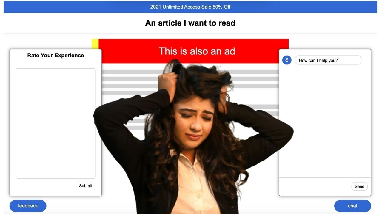
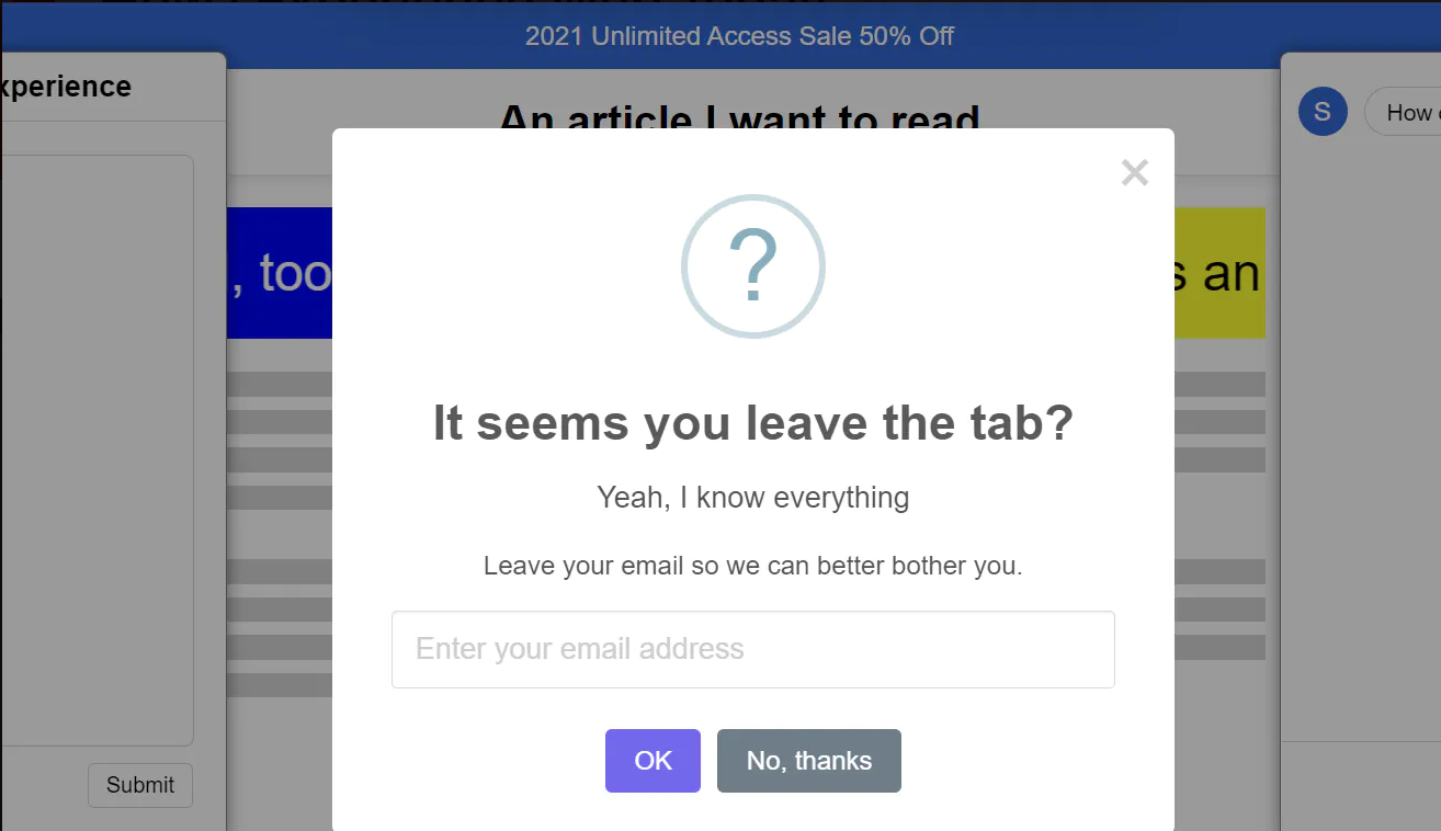
A new parody website encapsulates this harrowing experience. Named “How I Experience Web Today,” the site obscures the content you want behind an interminable stream of crap.
The agony mercifully ends once you leave the page — but not before a final “Leave site?” pops up. It’s the poisonous cherry on top of the nauseating cake.

The site’s creator, a developer called Guangyi Li, has made a valiant attempt to capture the horrors of contemporary browsing.
The reality, however, can be even worse. At least the parody has got no CAPTCHA images or (*shudder*) autoplay videos.
Developers are often unfairly blamed for these infuriating intrusions, but they’re not the real culprits.
The features are primarily ways for businesses and creators to monetize free content. Unfortunately, the quest for cash can create some horrendous user experiences.
I recognize the irony in making these complaints on a site with ads of its own. But TNW is a mere juvenile delinquent compared to the war criminals of web design.
You may disagree, but take solace in the knowledge that even we perpetrators are victims of the transgressions.
Get the TNW newsletter
Get the most important tech news in your inbox each week.


