If you’ve read any of my previous marketing focused articles, you might notice a common, underlying theme: If you’re not measuring, you’re not marketing. In my professional life, this is a credo I live by. Companies live and die by how agile they are and how they’re meeting the demands of their customers. But the age old question is: “How do I know what customers want?” Well, if you’re Steve Jobs, you can make bold statements such as, “It’s not the consumers’ job to know what they want,” but for the rest of us, there’s A/B testing.
A/B what?
A/B, split, or bucket testing, as it’s commonly known is akin to consumer focus groups, in so much as a series of different or refined variations of content are compared against a baseline control. A/B testing has it’s roots in ye olde Direct Mail campaigns, where different versions of the same appeal were presented to target groups, response rates measured, and future appeals modified to adopt these statistical findings. Needless to say, this process took quite some time, with results and fine tunings taking quarters to implement.
Fast-forward to (almost) instantaneous feedback from the Internet, where advertisers and marketers are able to turn on a dime and make adjustments within minutes and not days, and the case for A/B testing becomes quite apparent. Are you and your organization running A/B tests? If not, where do you get started? In my opinion (If you’re not measuring, you’re not marketing), everything deserves it’s spot in the A/B test spotlight, but for the purposes of this article, let’s keep things narrowed down to online advertising, email campaigns, and your website.
But before we get started, let me establish one, and only one, ground rule: Never test more than one variable at a time. The tendency might be to try a different subject line and copy with one group, but in doing so you’ve destroyed your baseline (control), and will only be making guesses.
A/B testing in Online Advertising
Whenever, and wherever you’re advertising online, there should at no point (ever) be “an” ad. Rather, there should be a series of ads and variations that you’re constantly tracking, measuring, and adjusting.
Obviously, there are a number of possibilities with online advertising, but let’s focus on (mainly) text-based ads, something that could apply to both Google and Facebook. Facebook also offers an image option, which I’ll get into in detail below.
Where to start
Before diving into any A/B testing, it’s important to keep your eye on the prize, provided you know what the prize is. What is the main goal of your campaign? Are you gunning for the most clicks? Aiming to get users to join your mailing list? Pulling them “in-store” to redeem a coupon or special offer? Without these clearly defined goals, your A/B testing will become washed out, and further refinements will become increasingly difficult.
Let’s say your photo studio is running a “Back-to-School” special, offering families a 20 percent discount for redeeming your services via a Facebook ad. One headline could be “Back-to-School Special,” Ad A, whereas Ad B might feature the headline “20 percent off until October 1st!”


In this case, you can test to see which ad scores higher on your charts, and begin testing variants against this ad. If Ad A scored higher and you’ll start refining from this one, make no further changes to Ad A, as this will now become your control ad, or baseline reference point against which further variants are measured. Just as a second-opinion, I always like to run at least two more tests of Ad B with variants, just to ensure that it wasn’t a complete dud the first time around.
Now that you’ve narrowed down your control ad, you can really start digging into some serious A/B testing. As mentioned above, the headline for your ad is one that you’ll want to test over and over again. Perhaps “FREE!” doesn’t perform quite as well as you would expect.
Likewise, you’ll want to go through multiple iterations of your ad copy, always keeping your end goal in mind. If C performs better than B, but not quite as good as A, what are the changed elements? Can you dissect and compare A and C, and take the winning ingredients from both to make a killer D? And once D is up and running, it’s time to create ads E and F, further refining your message.
Facebook ads present advertisers and marketers with an interesting third element, namely an image. We all know the power of a good image, particularly when it comes to Facebook. Instead of having two text-only fields to work with, Title and Copy, Facebook gives us the option to insert an image. Similar to the previous two elements, try experimenting with various images to see which one resonates the most with your target group.


I recommend testing at least 5 different images, but if you’re up for it, go crazy and try 20! Perhaps an image of a happy, smiley family would work best with our sample ad. Perhaps your logo? Maybe a 20 percent off image? Intuition is a great thing, and shouldn’t be discounted, but there’s simply no substitute for a solid A/B testing scheme with actionable data to back it up.
How much to test?
This is essential to any A/B testing that you might run: how many samples? The quick and easy answer is: the more, the better. The more data samples you have to work with, the more accurate and reflective your results will be. To simplify the math, at the very least, ensure that each test group receives at least 100 clicks. At the end of this run, you’ll have very clear numbers that will indicate which ad is outperforming the other, in which case, you can pause the underperforming ad and start working on Ad C.
This is hands down the very best way to test and refine your advertising efforts. Google AdWords and Facebook Ads both offer A/B testing services, and I’d be shocked to know if your ad service provider doesn’t. By exposing various groups to different variations of your ad, you can learn exactly what their preferences are, and when they should be shown this ad.
What’s also important to keep in mind is that through A/B testing, you’ll gain some very valuable insights, but you’ll need to keep them in mind throughout the year. Meaning, advertising is a never-fed beast. Once you’ve refined your ad down to it’s peak performance, it’s time to create some new ads, as your target group has already been exposed to multiple variations of this original ad. And as we all know, consumers are a very fickle bunch.
What’s important here is that you don’t let the lessons learned from the original test fly out the window when you create your next series of ads. If the 20 percent off image resonated well with your target group, toss a variation (colors, font, size, etc) of this element into your next ad, and start the measuring and refining process again.
A/B testing in email marketing
 As A/B testing stems from direct mail, it should go without saying that A/B testing in your email marketing campaigns is essential. Whether you’re testing subject lines, sent from addresses, times of day/week/month, HTML vs. Plain Text, etc., if you’re not continually testing and refining any number of these variables, well…please contact me, as I want to learn from you.
Similar to online ad tests, email marketing A/B testing can reveal a great wealth of data about your users. Do they generally respond well to enticing subject line headings such as Free, 20 percent off, or Now on Sale? Or, are they on average more open to a softer intro, perhaps informing them of what to expect in your communication?
If you’re using an email-marketing provider such as MailChimp, AWeber, or any number of other providers, setting up some A/B testing is quite easy. With AWeber, for example, upon clicking on the “Messages > Broadcast” tab, scroll down and look for the “Create Split Test” button. AWeber allows you to create up to four different variants, but only requires two to function. You can enter the percentages of which groups see which variant, provided that the sum is equal to 100 percent.
MailChimp only offers two variants, with the admin specifying which percentage of any given email list will see the variants. Interestingly, MailChimp’s A/B testing tool features a growing trend in A/B testing, automation. If you specify that 20 percent of your total email list will see either variant A or B (10 percent each), based on user definable goals, whichever email comes out as the winner, MailChimp will automatically send the remaining 80 percent of your mailing list the winning email if you wish.
Some common items you’ll want to put to the A/B test in your email marketing include:
Quick and Easy:
- Subject Line
- From
- Time of Day
- Day of the Week
A bit more involved:
- Body Copy
- Layout and Design
- Call to Action
What should you be tracking across all of these variables? Similar to online advertising, it really depends on what your goals are. Do you want someone to click through to a landing page? Redeem an offer? Join you on Facebook? Before testing, always make sure that your goals are in place. With that said, no matter what your goals are, there are three main items you’ll want to make sure are part of your tracking method:
- Open rate
- Click through rate
- Unsubscribes
A/B testing your Website
A/B testing isn’t relegated simply to the ad and email marketing space. Netflix, Amazon, and Google are all huge believers in A/B testing, and to say that you saw Google today isn’t quite true. What you actually saw was a variation of the core Google service, with one element or other being tested.
Now if you’ve been paying attention above, you’ve probably already figured out that either online ads or email marketing campaigns require a modification of the source code that’s being presented to consumers. Either the text of the ad was changed, or the subject line of an email. All relatively light and easy changes to make on the server end. But what do you do when you want to A/B test an item on your website? If you’re recalling the launch of the Google Website Optimizer tool in 2006, you’re on the right track. However, the problem was that the tool required two sets of code to be generated in order to be presented to different users. I.e. non-developers (everyone else in the office) had to put in additional requests to the dev teams to change one or two items. Not exactly ideal.
 Today, there are a host of services that offer not only A/B testing and fine tuning for websites, but a number of other valuable services (heat mapping, evaluation forms, benchmarking studies, etc.). Some of these services might have more features than you’re looking to get started with, but trust me, once you see the light of A/B testing, those “other” features are going to show up on your radar faster than you think.
Where to use A/B testing
The applications and opportunities for A/B testing in your user experience are endless. Got a promotion coming up that’s driving users to a landing page? Can you say A/B test for the first week and then automate the winner to run the remaining three weeks? I can!
 Think that “Buy Now!” button on the homepage is underperforming? Try changing the shape, size, color, or position of the button with a B variant and measure the results. And speaking of your homepage, is it a sales pitch or a welcome sign? If you’re early enough in your stages of development, go big and make some massive changes and see if how your inbound traffic responds.
As strange as it may sound, I worked on a project just over a year ago now, where we changed one very small element (moved the “contact us” tab from the far left to the far right), which resulted in a significant increase in clicks, interest, and ultimately sales. Why? To this day, I have no idea, but data doesn’t lie. Never underestimate the power of your audience, and how just one tiny change can make a huge difference.
But don’t take my word for it, Google’s been known to A/B test over items as simple as the color of a toolbar.
How to use A/B testing
If different variants require different sets of code, how is this accomplished? Again, a few years back, this would be a technical challenge. Today, however, multiple variants require as little as a one time insertion of a line of code, and you’re off to the races.
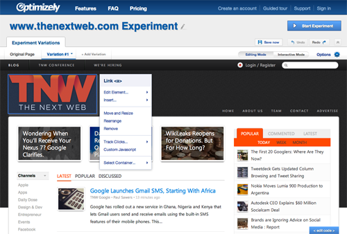
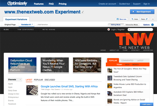
One of my favorite tools to conduct A/B testing is Optimizely. Founded by former Googlers Dan Siroker (also of Obama campaign fame), and Pete Koomen, Optimizely puts the power of A/B testing in your hands at the click of a mouse. As noted above, all that is required is a on-time insertion of a line of Javascript, and marketers can test to their hearts’ delight.
Based on a very simple WYSIWYG editor, anyone who’s used WordPress or a similar CMS/publishing tool is instantly familiar with the interface. Let’s say for example that our fearless leader Zee wants to track if users return to the homepage via the TNW logo more often if the logo is placed on the left or right of the screen. After inserting a line of code from Optimizely, he could easily use the interface to position the logo on the right, define some goals, and click “Start Experiment”. It’s really that easy.


Obviously, this is just an example, but with a service so quick, easy, and affordable, the question you really need to ask yourself is, can your organization afford to not be running A/B tests continually?
The Local Maximum
Hopefully, I’ve managed to convey the benefits and reasoning behind using A/B testing in just about anything you work on. However, as a final thought, I do want to warn against the perils of A/B testing, particularly, the “Local Maximum”. Meaning, with A/B testing, it’s very easy to focus so tightly on the micro, that the macro can sometimes go out the window.
Steve Hasse from HubSpot, directed me towards Josh Porter’s breakdown of the “Local Maximum”. In this article, Porter explains the “Local Maximum” as “… a point in which you’re hit the limit of current design…it is as effective as its ever going to be in its current incarnation. Even if you make 100 tweaks you can only get so much improvement…”
This is applicable to not only our three channels above, but across a broad spectrum of situations that lend themselves well to A/B testing. You can refine and refine and refine again, but ultimately, an arrow can only resist so much wind. Now, if you radically change the shape of the arrow…
So if you’ve refined as far as you can, and have hit the “Local Maximum,” where do you go from there? “…stop optimizing and return to other kinds of analysis to figure out the next steps. Conduct interviews. Do user testing. Give surveys, ask questions,” writes Porter. If these tools are traditionally the beginning of your “what do users want” strategy, than it’s time to rethink your process and start off with some solid A/B testing.
Here, I’ve only scratched the surface of what is possible, and where A/B testing should and can be used. Product design? Oh yes! Driving ecommerce sales? Can do! Determining a solid pricing strategy? A/B it to know the real truth. The beauty of A/B testing is that your consumers will always provide you with the best information, why not make the gathering of this information as easy and painless for them (and you) as possible?
Hands in the air if you can tell if you read version A or version B of this article?
Happy Family Image Credit: StarMama
Test Tubes Image Credit: Jeffrey Roberts
Get the TNW newsletter
Get the most important tech news in your inbox each week.


