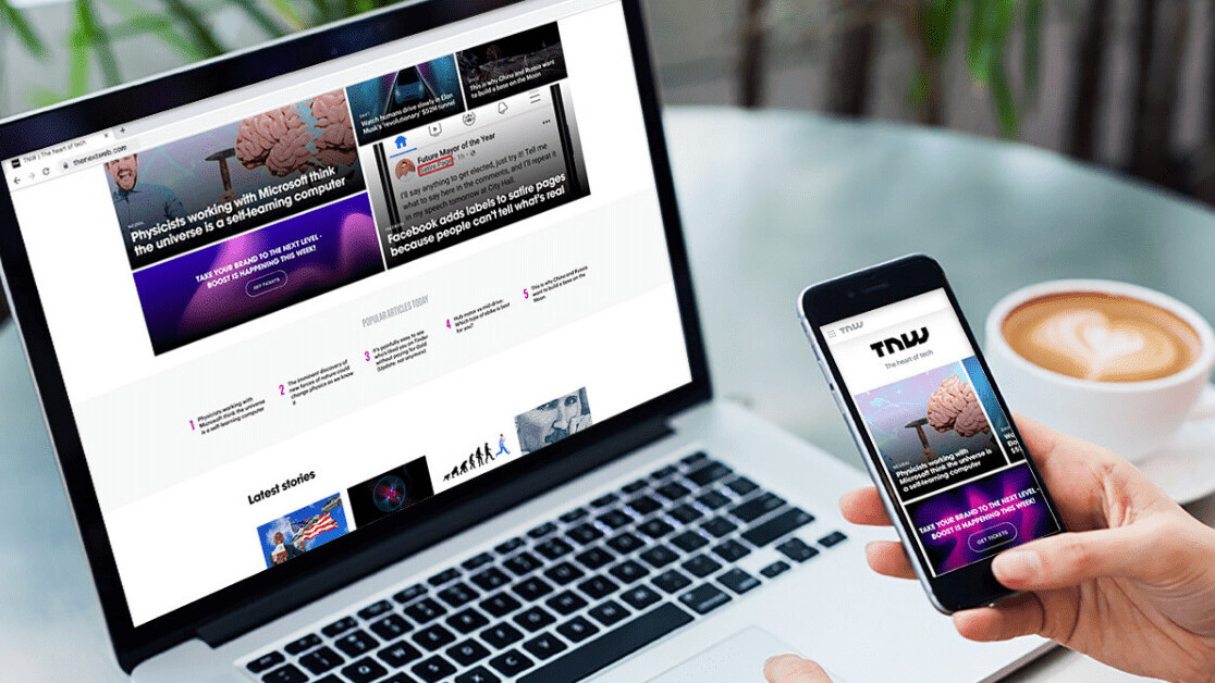
You might have noticed that things are looking a bit different around here. After years of work, The Next Web has launched a gorgeous new website, with faster loading times, better content suggestions, and a more mobile-friendly experience.
The new design provides a more consistent visual and navigation experience. It also offers smoother access to our range of sub-brands, from Plugged’s consumer tech stories to Neural’s human-centric AI reporting.
“The concept behind our visual language is the ‘human and machine’ synergy,” says Alexander Griffioen, our head of design. “Humans represented by an organic element we call the nebula; machines represented by the clean geometric shapes that take subtle inspiration from common UI elements.”
Typographically, we’ve tried to convey TNW’s bold and playful spirit, without sacrificing authority or readability.
[Read: 7 ways design and development teams can work better together]
The new site also gives our design team more creative freedom.
“Under the hood, we’ve decoupled the frontend from the CMS so that we can be much more flexible in how we present content to readers,” says product manager Jelle van Wijhe.
TNW’s design journey
The new site consolidates all of TNW’s services into the same architecture. Over the past four years, we’ve expanded into multiple events, workspaces, and corporate innovation programs.
As we built new mini-sites for all these services, our design system evolved, and we moved ever further away from the style on our homepage and news pages.
“The thought of retroactively aligning all these properties visually was both daunting and absolutely necessary,” says Alexander.
“Then, one day, on a design and dev retreat in Barcelona, our CTO drafted a sketch of what he thought our navigation bar should look like if we were to have a unified navigation bar across all our properties.”
That kicked off a project that would span the next two years and cover a whole gamut of design and branding decisions.
“The fact that we now have a single navigation bar across our entire site is a dream come true,” says Alexander. “Apart from that, I hope people will find our horizontally scrolling article grids a welcome alternative to traditional vertical lists that are much harder to scroll past.”
We’re really excited about the new design — and what’s still to come.
Get the TNW newsletter
Get the most important tech news in your inbox each week.


