Yes, you’re not the only one. All of us logging into Twitter last night had a little shock when we saw a new set of fonts and design changes across the platform.
It might take us a while to get used to it, and we might it hate it for a while. But the company explained in a thread that why it made these changes: the primary reason is accessibility.
First, Twitter’s new fonts are called Chirp (cute name), and the company claims they are designed to make reading easier when you’re scrolling through tweets. These are the company’s first proprietary typeface, and you can read more about it here.
Notice anything different?
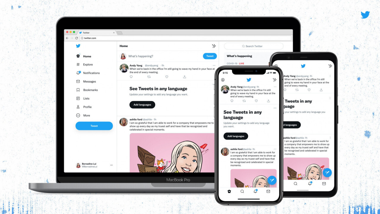
Today, we released a few changes to the way Twitter looks on the web and on your phone. While it might feel weird at first, these updates make us more accessible, unique, and focused on you and what you’re talking about.
Let’s take a deeper look. ? pic.twitter.com/vCUomsgCNA
— Twitter Design (@TwitterDesign) August 11, 2021
There’s a cute easter egg too when you type [CHIRPBIRDICON] in the new interface. Check out what happens in the video below.

The 💜 of EU tech
The latest rumblings from the EU tech scene, a story from our wise ol' founder Boris, and some questionable AI art. It's free, every week, in your inbox. Sign up now!
Twitter’s new “Chirp” font contains a ligature that turns [CHIRPBIRDICON] into the Twitter logo https://t.co/TgCRi804iK pic.twitter.com/SYDczXCBM5
— Jane Manchun Wong (@wongmjane) January 28, 2021
To make the design more accessible, Twitter is also changing its color scheme to feature more contrast, and reduce the amount of blue elements across the interface. That means you’ll spot photos and videos more easily. Plus, the social network will roll out a new color palette for variety soon.
Twitter is changing the colors for the follow button too. However, unlike the current design where the button is filled in when you follow someone, the new button will be filled in if you don’t follow them. This will create some major confusion.
The social network said that to make things seamless, it’s reducing grey backgrounds and divider lines. I can see this effect in tweet threads, where there’s no divider line and things look cleaner.
Franky, I’m okay with most of these changes particularly if they increase accessibility for those with vision impairment. But the follow button rejigging might throw people off for a bit.
Get the TNW newsletter
Get the most important tech news in your inbox each week.