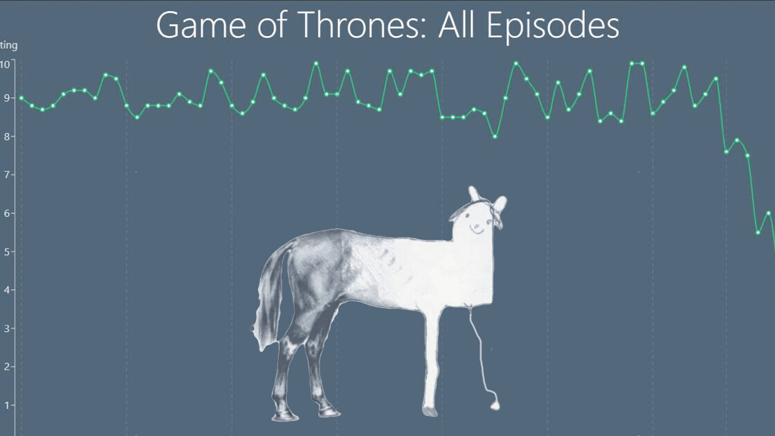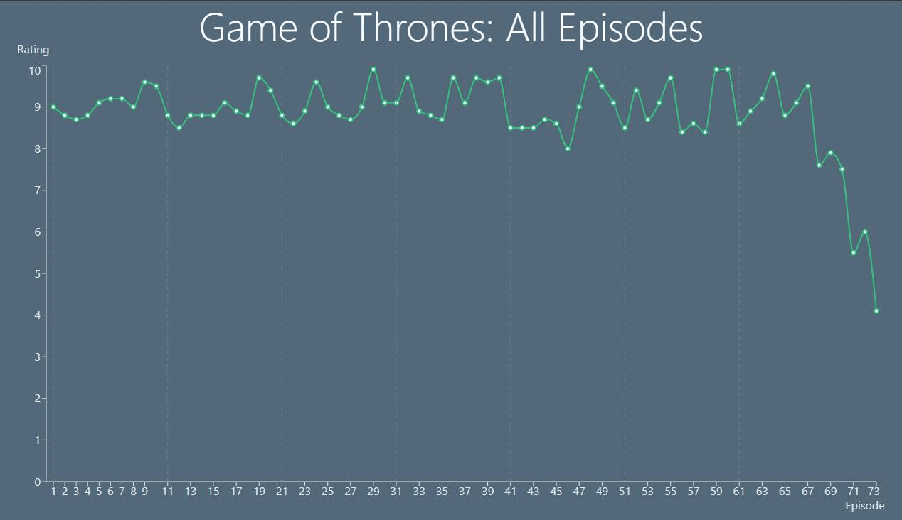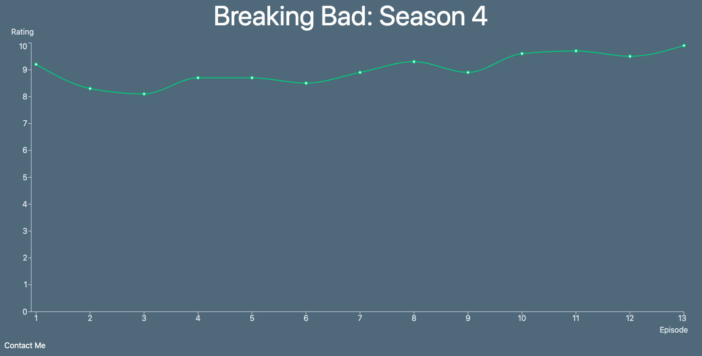
Whenever someone mentions Game of Thrones at a party, the collective feeling in the room is of disappointment and how the final season sucked. Some series like Breaking Bad or Bojack Horseman succeed at maintaining interest and some shows drop off after a season or two.
So, you might want to see how a show fares over various seasons before investing your time into it. A developer named Benjamin Mizrahi came up with a neat solution. He made a web app that rates episodes across all seasons.

The idea is simple: go to this website and type in a show’s name to get its rating. The tool uses rating of each episode from IMDb to plot a chart line.
[Read: Instagram now makes it easy to delete troll comments in bulk]
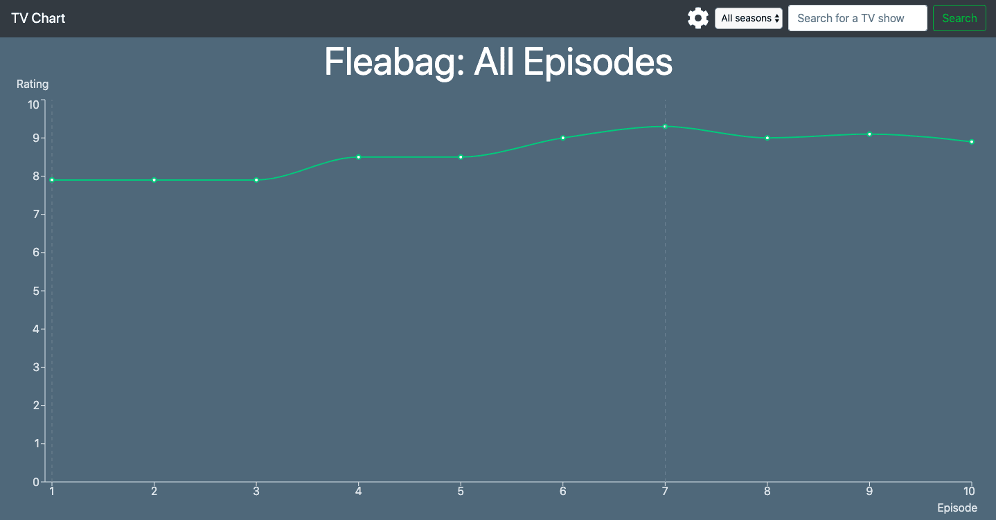
Let’s look at the chart lines for some more shows:

You can even pick a particular season of the show or plot seasons in different colors.

Mizrahi said he’s working to add more stats such as average rating and standard deviation, and a list of the ones with the best and worst trend lines.
You can check out the tool here and @ us on twitter with shows that disappointed you the most.
Get the TNW newsletter
Get the most important tech news in your inbox each week.


