Game trailers are often our first impression on a coming title, so color me surprised when I noticed so many of them are dark, gloomy, and disorienting. Early trailers for AAA games can often be poorly lit and held together by jumpy editing. While these trailers aren’t always the most informative, there’s a reason they’re used to hype up an unfinished game.
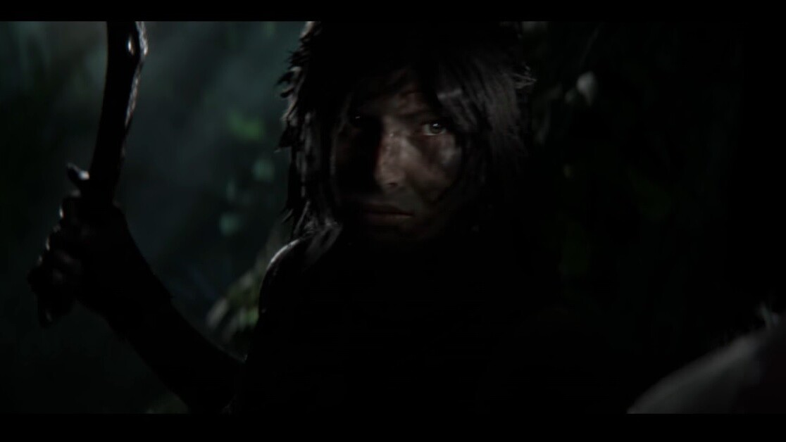
When I saw the trailer for Shadow of the Tomb Raider, I was confused because I couldn’t, for the life of me, tell what was actually happening in the damned thing. Between choppy edits and overwhelming gloom made all the worse by the occasional blots of light, it was very difficult to follow.
Seriously, what’s happening here?
As I pointed out at the time, that’s not by any means unique to Lara Croft’s adventure, either. Further examples of choppy editing can be found in dozens of game trailers from the last 15 years or so.
The most frequent victim of this trend is the CGI trailer, which is one not made with the same software with which the game was made. This is also called a “pre-rendered” trailer. Confusingly, that term can also mean a trailer made within the game’s engine, but with tools that aren’t used to create the game’s actual environment. But, while those are two different kinds of trailer, they amount to the same thing: They’re trailers that don’t look like what you’ll see in a game.
Pre-rendered trailers are usually released early in the game’s development cycle, to build up hype for a game that might not be far enough along for in-game footage to be viable. To see an example of how this is done well, look at this pre-rendered teaser for Mass Effect: Andromeda, which creates an intriguing picture of gameplay based on concept art.
In both that trailer and the Tomb Raider one above, the player is looking at something that almost surely isn’t in the game. Sure, it may be based on stuff the game designers are planning to put in the game, but the actual things you’re looking at on screen — character models, environments, objects — aren’t actually going to be in the final product.
So why do some trailers end up looking so hyper? One possible explanation lies in the way we watch trailers and other online videos. According to analytics company Visible Measures, the average online video loses 10 percent of its audience within the first 10 seconds. The audience shrinks the longer the trailer goes on, meaning a large percentage of the audience won’t make it to the end of a two-minute trailer.
If you want to keep as many fleeting attention spans engaged as possible, but you don’t actually have in-game assets to work with, what do you do? You could always try to engage the viewer’s confused brain by feeding it jittery cuts and hard-to-see footage.
There is also some evidence to suggest a video with abrupt cuts is harder to remember accurately. So the footage these trailers show gets across tone and style of the game, but it’s simultaneously harder to remember exactly what you’re seeing. So it keeps the product in your mind — which is key because these trailers often come out months or even years before a game does. But when you see the final product, your brain won’t remember the pre-rendered trailer enough to know how different it is from the game.
When game publishers want to advertise an unfinished product, they want to make the most out of what assets they have and can show the viewer without misleading them. While jittery trailer edits aren’t comfortable to watch, they do serve a purpose in a game’s advertising cycle.
Get the TNW newsletter
Get the most important tech news in your inbox each week.


