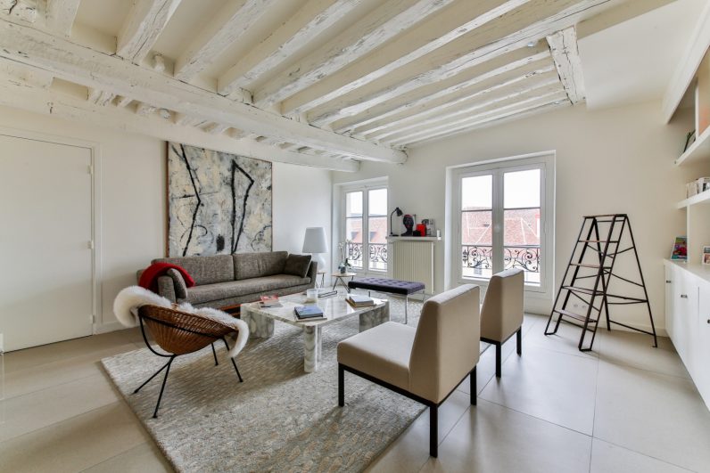
Have you heard maximalism is in and minimalism is out? Rooms bursting at the seams with clashing florals, colorful furniture, and innumerable knick-knacks, this is what defines the new interiors trend ‘cluttercore’ (or bricabracomania).
Some say it’s a war between generation Z (born 1997-2012) and minimal millennials (born 1981-1996), symptomatic of bigger differences. Others say it’s a pandemic response, where our domestic prisons became cuddly cocoons, stimulating our senses, connecting us with other people and places. But what really lays behind the choice to clutter or cull?
Why do some people revel in collections of novelty eggcups? Or have so many framed pictures you can barely see the (ferociously busy) wallpaper? And why do those at the other end of the spectrum refuse to have even the essential stuff visible in the home, hiding it behind thousands of pounds’ of incognito cupboards?
One important reason for the clash between minimalism and maximalism is simple: the relentless pendulum swing of fashion. Whatever psychological or cultural rationale pundits may suggest, fashion is always about the love of what strikes us as new or different.
This struggle might seem new but it is just history repeating itself, encapsulated in the interior struggle between less and more that began between class-ridden Victorian commodity culture and modernism’s seemingly healthy and egalitarian dream.
A lot of stuff
Victorians liked stuff that they could put on display. These things communicated their status through solid evidence of capital, connectedness, signs of exotic travel and colonial power. Think inherited antique cabinets and Chinese ivory animals. Then imagine the labor required to not only create, but polish, dust, manage and maintain these myriad possessions.
But this deluge of stuff was made possible for more people as mass-produced commodities – especially those created from synthetic materials – became cheaper.
All this created a novel and lasting problem: how to choose and how to organize a world with so much aesthetic possibility – how to make things “go together”. The 19th and 20th-century guardians of culture and the “public good” were just as concerned about the spiritual chaos of too much clutter as modern “organizational consultants” like Marie Kondo.
In response, they set up design schools and educational showcases, like the Great Exhibition of 1851, the 1930 New York World’s Fair, and the Festival of Britain in 1951.
Very little stuff
The minimalist mantra “less is more”, courtesy of German art school the Bauhaus was established in the 1920s. For some modernists, “needless decoration” was a sign of an “uncivilized” (read feminine and non-white) mind. They nevertheless also looked to “primitive” cultures for bold aesthetics and authenticity superior to western excess.
Modernists believed that simplicity and elegant functionality, enabled by mass production and cost-effective new materials (like tubular steel and plywood), could promote social equality in interior design. They had a point. Without staff, what working person can, realistically, keep “curated” clutter looking cool (and clean)?

But, what about “coziness”? That feeling, described in the 1990s as “cocooning or providing a “warm welcome” to guests?
A 1980s American study found that the “homeyness” desired in interiors was achieved by successive circles of stuff – from the white picket fence, to the wisteria on the exterior walls, the wallpaper, pictures, and bookshelves lining the interior walls and then furniture arranged also in roughly circular formations.
These layers would then be overlaid with decorations and texture, making symbolic entry points as well as enclosures. “Homey” was aesthetically the total opposite of modern minimalism, whose “functionality” was perceived as cold, unsympathetic, and unwelcoming.
Despite this popular rejection, modernism was the postwar default for European “good taste”, seen in design HQs and high-end interior magazines. But wasn’t it all not just uncomfortable, but also a bit boring? And, unfortunately, every bit as unforgiving without a lot of cash and a team of cleaners?
Modernism on the cheap is just depressing (see the concrete blocks of 1960s UK council flats). Sleek built-in cupboards cost a lot. And smooth, unadorned surfaces show every speck of dirt.
Rebelling against modernist mantras, 1980s design sought to put “the fun back into function” for sophisticates. However, ordinary people were always buying fun stuff, from plastic pineapples to granny chic knick-knacks.
The impossibility of it all
Nowadays, the “safe” and default mainstream option is a broadly-defined “modern” look characterized by Ikea. But it’s not really minimalist. This look encourages an accumulation of stuff that never quite functions or fits together and which still fills a room according to the ethos of homeyness – even though each object may “look modern”.
It fails to tell a convincing story of the self or remain tidy, prompting further purchases of “storage solutions”. Minimalists strip this back to a minimum of objects with a neutral palette. Fewer mistakes equals less chucking out. Less stuff equals less to change when you tire of it.
But minimalism is more difficult than ever. We are powerless against the tides of half-wanted incoming consumer stuff – especially if you have children – which makes achieving minimalism all the more impressive. People who do achieve it frame their shots with care and they chuck a lot of stuff away.
Making a more elastic aesthetic look good is also difficult, maybe more difficult. Clutter lovers range from sub-pathological hoarders, to upper-middle-class apers of aristocratic eclecticism, to ethical “keepers”. An aesthetic mess can look like an accidental loss of human control, identity or hope. It takes a lot to make harmony out of all that potential noise – and keep it tidy.
Cluttercore is perfect for now, a vehicle to display the curated self, the “interesting” and “authentic” self so demanded by social media. And it hides behind the idea that anything goes, when in fact, maybe some things must.![]()
This article by Vanessa Brown, Course Leader MA Culture, Style and Fashion, Nottingham Trent University is republished from The Conversation under a Creative Commons license. Read the original article.
Get the TNW newsletter
Get the most important tech news in your inbox each week.


