As designers, we want the products we build to be satisfying and easy to use, but how can we know that’s the case? We start by measuring the user experience with evidence rather than opinions. But can UX really be measured? Absolutely. By evaluating products with qualitative and quantitative methods, we gain access to a host of illuminating UX metrics.
There’s nothing like completing a UX project. It takes an incredible amount of time, effort, and skill to travel from design problem to solution. Crossing the finish line is a great feeling, but seasoned UX designers know that there’s always more to be done…
A C-level executive calls with a question. “Now that the project is over, how do we track the results we’re trying to achieve?”
It’s a fair concern — one that leads to a bigger topic. How can UX designers measure success and prove that their work is worth the investment? Understanding project and business goals is a good start, but there’s more to it.

The 💜 of EU tech
The latest rumblings from the EU tech scene, a story from our wise ol' founder Boris, and some questionable AI art. It's free, every week, in your inbox. Sign up now!
To determine the success of a UX project, we need to know how and why people use products and evaluate the outcomes with UX metrics.

User experience evaluation
What do we mean when we say that a product is usable?
According to the International Organization for Standardization, usability is “the extent to which a product can be used by specified users to achieve specific goals with effectiveness, efficiency, and satisfaction in a specified context of use.”
There’s a lot going on there. Let’s pull out the important parts.
- Users: The people that products are designed for
- Goals: The objectives that products should help users complete
- Context: The use cases that products are intended for
If we were to oversimplify, we might say that usability is “the extent to which a product helps users achieve goals in a specific use case.” But we’d be making a major omission.
- Satisfaction: User satisfaction is a key aspect of usability. Functionality and ease of use are important, but products should also be aesthetically pleasing and delightful to use.
Why measure usability?
When products aren’t satisfying or they make it hard to accomplish goals, users look elsewhere. The only way we can know if we’re really solving design problems (and not causing them) is to test the usability of the products we create.
We use metrics to measure success so that we can refine products and impact users for good.
[Read: 5 things to know when you’re buying your first electric vehicle]
Measuring UX success with usability
Before collecting data, it’s a good idea to outline a basic measurement strategy.
- Decide which metrics to measure.
- Use both qualitative and quantitative metrics.
- Establish clear timeframes in order to understand the trends that emerge. The metrics gathered in a single day may tell a much different story than those gathered over the course of a week.
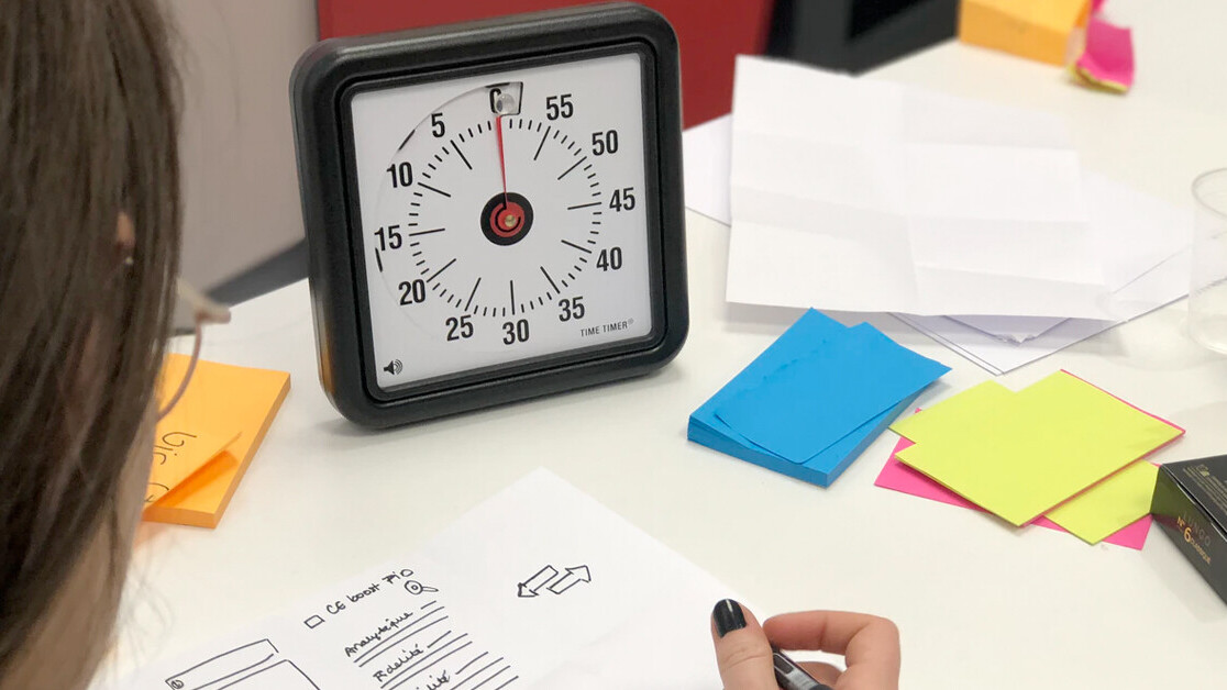
1. Task success rate
Task success rate is one of the most widely used and easily understood UX metrics. It shows the percentage of participants that successfully complete a task and helps designers identify user experience issues. As long as tasks have clearly defined goals, success rates can be measured.
Tasks like completing a signup process or adding a specific item to a shopping cart are well-suited for this metric. Keep in mind, success rate doesn’t explain how well users perform tasks or why they fail them.

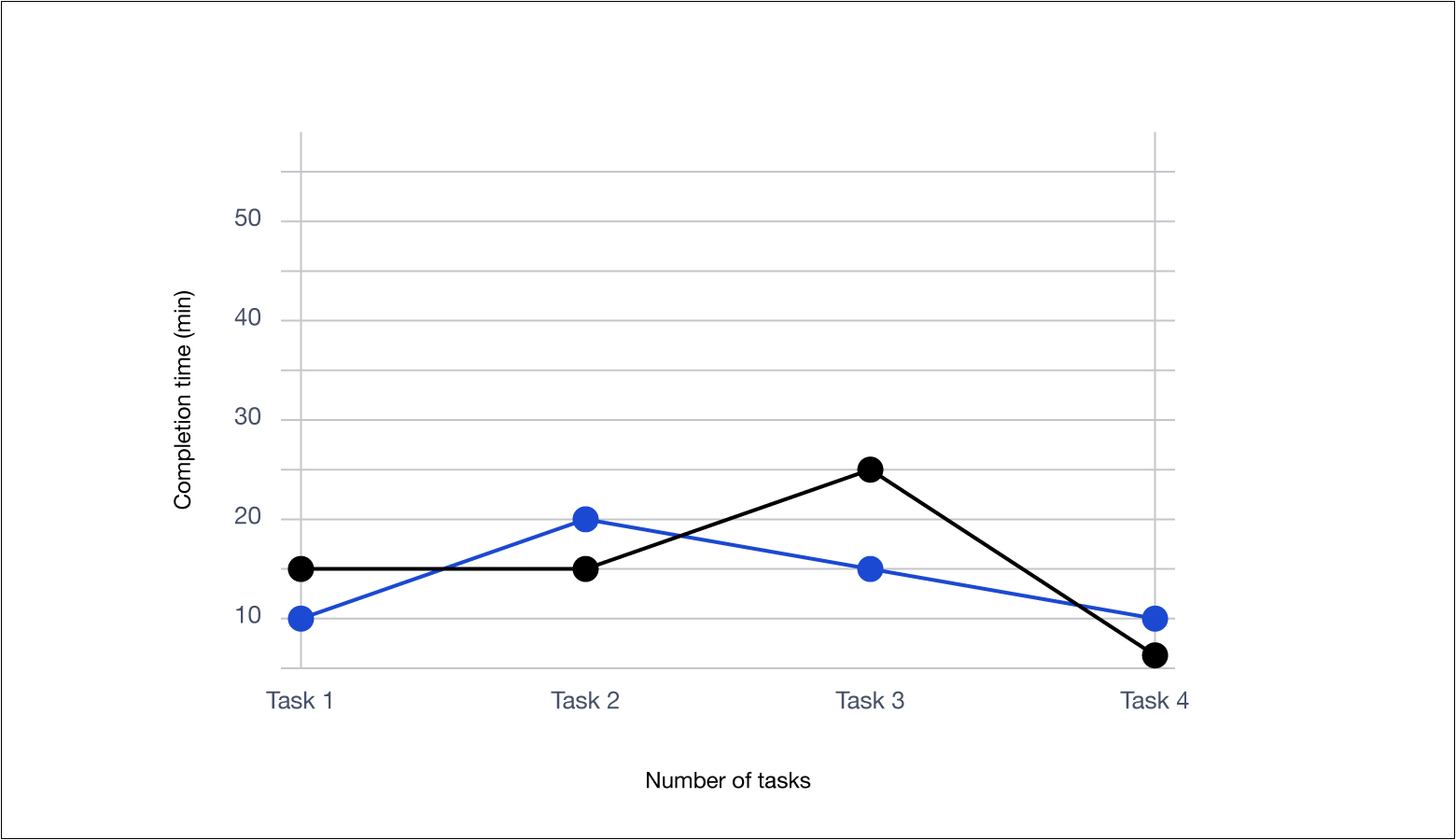
2. Task completion time
This metric measures the amount of time it takes a user to complete a task. Due to varying factors, different users will have different completion times for the same task. In general, the less time a user spends on a task, the better the UX.
Depending on the evaluation method and type of project, there are multiple ways to determine task completion time.
- Average Completion Time: Only tallies users who actually complete the task
- Mean Time to Failure: The average amount of time that it takes users to give up or complete a task incorrectly
- Average Time on Task: The total average time that users spend on a task
3. Retention rate
Broadly speaking, the retention rate is the percentage of users that continue to use a product over time. But to measure the retention rate of a product accurately, there must be a clear definition of what actions and activity levels constitute use.
Actions may include logging in, visiting a web page, downloading/uploading files, using a key product feature, etc. Measuring retention is an excellent way to understand the long-term usefulness of a product.
4. Conversion rate
Conversion rate measures the percentage of users who perform a desired action. Desired actions link to product goals and cover everything from completing a registration process to making a purchase.
It’s important to note that percentages can be misleading. For example, a website may experience a spike in traffic due to a marketing campaign. Even if sales increase, the site’s conversion rate could plunge because of the increased traffic.
5. Error rate
The error rate identifies the percentage of bad entries made by users. It’s calculated by dividing the number of errors by the number of attempts made. High error rates indicate usability problems. As with other UX metrics, it’s crucial to define what erroneous actions are.
6. Satisfaction
Customer satisfaction measures users’ overall fulfillment levels, and it can be tracked in various ways.
- Satisfaction surveys: Surveys allow companies to ask customers questions that gauge their happiness levels.
- CSAT (Customer Satisfaction Score): At the end of surveys, many companies obtain this score by asking customers to rate their overall satisfaction on a scale from 1-5.
- NPS (Net Promoter Score): NPS is calculated by asking users how likely they are to recommend a brand or a product on a scale from 1-10.
- CES (Customer Effort Score): CES is found by asking users to rate their effort levels. For example, “On a scale from extremely easy to extremely difficult, how would you rate your experience?”
- Social Media Monitoring: Tools like Mention and Google Alerts allow companies to see what people are saying about them on social platforms, blogs, and review sites.

7. Heuristic evaluation
Heuristics are predefined usability principles (empirical rules of thumb, standards, and conventions) that have been observed and tested over an extended period of time.
In a heuristic analysis, expert evaluators identify the usability issues of digital products and rate their severity, thereby allowing UX designers to quickly learn about and address shortcomings.

Quantifying the user experience
The AARRR framework
Created in 2007, the AARRR framework is focused on company growth. It monitors a customer’s life cycle with a company and allows designers to track Acquisition, Activation, Retention, Referral, and Revenue (AARRR).
- Acquisition: What channels do new users come to a product from?
- Activation: What percentage of new users have a satisfying initial experience?
- Retention: Do users continue to come back over time?
- Referral: Do users like the product enough to recommend it to their friends?
- Revenue: Can user behavior be monetized?
The RARRA framework
The RARRA framework is virtually identical to AARRR, but due to fierce competition among digital products, it prioritizes Retention over Acquisition. The thinking is that if an app fails to make a good first impression, users may never come back.
The customer experience index (CX index)
The CX Index was introduced by Forrester in 2016 as a way to monitor brand touchpoints, measure customer loyalty, and learn how each affects revenue. The framework has two key indicators:
- CSAT (Customer Satisfaction)
- NPS (Net Promoter Score)
As a company’s CX Index score increases, so does its ability to win and retain customers.

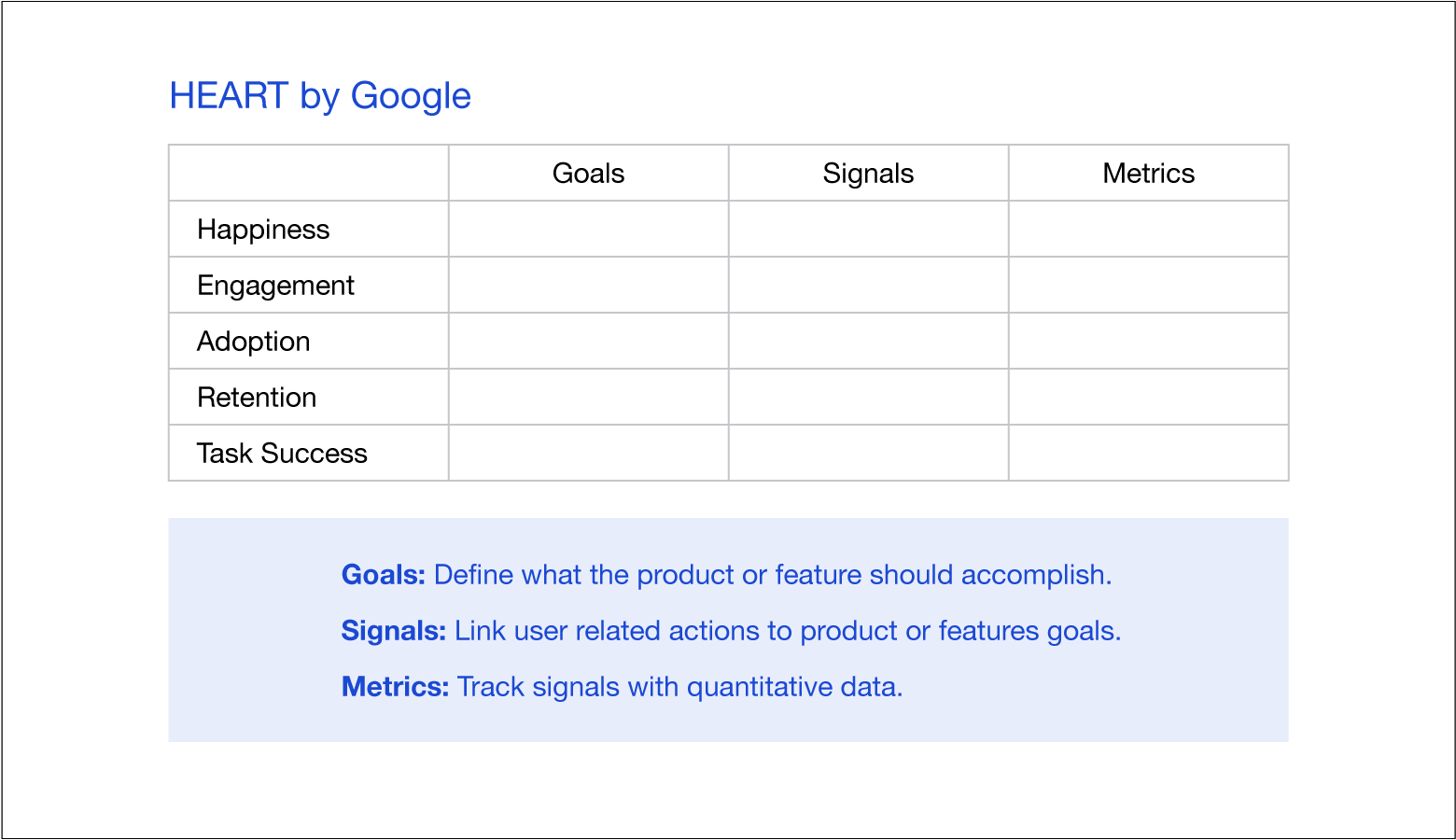
HEART by Google
In 2010, the Google Research Team developed a framework to measure the success of products and features. The framework’s user-focused metrics form an easy-to-remember acronym.
- Happiness: How do people feel about a product? What’s their level of satisfaction with it?
- Engagement: How much and how often do people choose to interact with a product?
- Adoption: How many new users are acquired over a specific amount of time?
- Retention: How many existing users are retained over a specific amount of time?
- Task Success: What percentage of users are able to successfully complete a task?
Measuring the user experience makes a difference
UX metrics provide data that allows designers to measure and compare the usability of digital products over time. They reveal areas of products that need to be improved and help designers evaluate decisions based on evidence rather than opinions.
Like all tools, metrics and frameworks should be used in the right context. UX designers must strategically link metrics to client objectives and user needs.
For designers looking to build products that are both easy and satisfying to use, measuring the user experience makes all the difference.
The Toptal Design Blog is a hub for advanced design studies by professional designers in the Toptal network on all facets of digital design, ranging from detailed design tutorials to in-depth coverage of new design trends, tools, and techniques. You can read the original piece written by Kayode Osinusi here. Follow the Toptal Design Blog on Twitter, Dribbble, Behance, LinkedIn, Facebook, and Instagram.
Get the TNW newsletter
Get the most important tech news in your inbox each week.