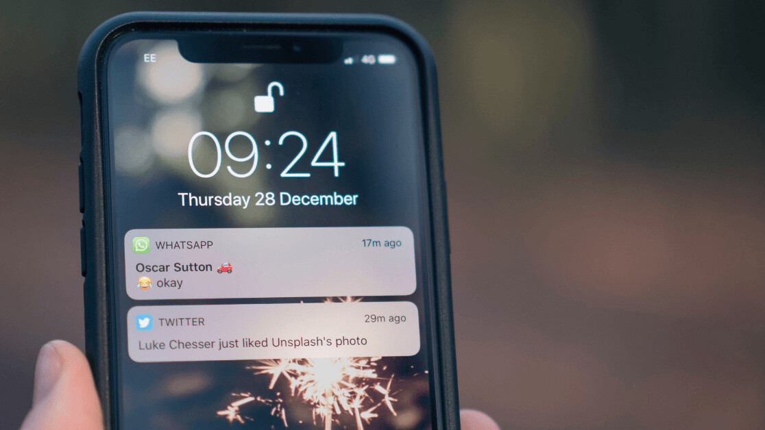
Few inventions affected our relationship with technology as much as push notifications have. Before modern-day notifications, most of us felt in charge of deciding when we want to use and interact with technology, but now, technology is largely making that decision for us.
It’s easy to blame technology, but it’s important to note that it isn’t technology at the heart of the problem—it’s our own inability to handle it. After all, not all notifications are created equal. And in order to better understand the evolution from relevance to noise, we need to talk about how we got to where we are.
In 1971, Raymond Tomlinson, a computer programmer from Massachusetts, had a daunting task that would become a critical cornerstone of modern-day digital culture. While working on ARPANET, the first version of the internet subsidized by the U.S. government, Tomlinson needed to figure out a way to let users send messages to one another.
Before his invention, messages could only be sent to users who had their accounts on the same computer. This changed when Tomlinson added the now ubiquitous @ symbol. This ingenious addition allowed users to separate the recipient’s name from the name of the machine they were using.
One of the first users of this new system famously described it as a “nice hack.” This hack stayed and soon led email to make up 75 percent of all early internet traffic.
The high demand of email subsequently led to the creation of the simple mail transfer protocol (SMTP), which soon became the global standard for sending and receiving emails.
Surprisingly enough, SMTP already had push-style networking baked into it. But it wasn’t used widely because so few users were permanently connected to the internet at the time.
This changed when the first internet-capable phones, aka smartphones, reached the market.
Over time, the bell icon’s meaning quickly became representative of a simple idea: “There is something new for you. You. You. You.”
In 2003, Research In Motion (RIM) was the first company to successfully commercialize push notification in an end-user product.
Their flagship phone, the BlackBerry, was the first smartphone with the ability to immediately notify users when they received a new email. This wasn’t just a handy feature—it became a critical reason for BlackBerry’s mass adoption in the business world.
It didn’t take long for competitors to realize the potential of a push-driven network architecture—in particular on a device people always have with them.
In 2008, after soaring interest in the developer community, Apple opened up notifications to the general public and made it available under the name Apple Push Notification Service (APNS). This was one of the most significant changes to mobile operating systems since the iPhone itself.
Notifications didn’t just become an essential part of the phone. The infamous bell icon soon appeared everywhere: from operating systems to apps and, ultimately, websites themselves. Over time, the bell icon’s meaning quickly became representative of a simple idea: There is something new for you.
You. You. You.
“You” coupled with the notion of “new” made one of the most potent dopamine cocktails in tech’s history. Unsurprisingly, users were exhilarated. This highly personal system would ring in a radical change in the attention economy: delivering highly personalized content on the fly.
Soon, everyone wanted to be in our information streams.
Today, the most random websites ask us for permission to bombard us with content. The amount of incoming information left many people frustrated and overwhelmed. It wasn’t just the fault of the companies generating the notifications though. People had an inability to say no.
Then a new type of notification entered the scene.
As competition for attention became more and more fierce, big players started to use new tactics to increase engagement on their platforms. Where we used to be notified about things that were all about us, now we were notified when random friends liked each other’s avocado toast pictures.
We ignore a shepherd who always sows panic just like we ignore a bell that always rings.
This new type of notification is unlike any type we’ve seen before, and I call these “anti-notifications.” They aren’t meant for you; they’re meant for everybody else. Their sole purpose isn’t increasing value, but optimizing for short-term engagement.
The bell that was once used to keep us in the loop is now mostly used to bring us back into the loop instead.
Through variable rewards, notifications became one of the most potent ways to keep people hooked. And while some people teach designers and product managers how to create addictive products, others are helping and advising companies on how to create products that respect people’s time.
There is an end in sight. The moment we become aware of how increasingly noisy notifications are, they’ll lose their efficacy.
Anti-notifications are like the Aesop fable where a shepherd boy repeatedly tricked villagers into believing a wolf was attacking the sheep. When a wolf finally did appear, the boy desperately tried to warn everyone, but no one listened. Needless to say, it didn’t end well for the sheep.
We ignore a shepherd who always sows panic just like we ignore a bell that always rings. Anti-notifications that solely aim at increasing engagement without providing personal value work the same way.
They’re a powerful tool to increase engagement in the short-term, but they might very well be what makes the entire notification bubble burst.
Time will tell. And we’ll probably hear about it through the sound of a notification popping up on our screens.
This article was published by Adrian Zumbrunnen, a designer at Google. You can read the original article here.
Get the TNW newsletter
Get the most important tech news in your inbox each week.


