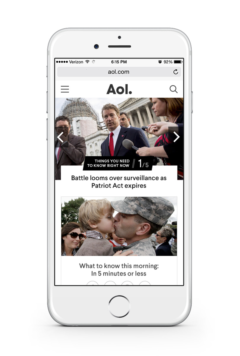
You might not visit AOL.com much, but a lot of people still do. While brands like Engadget, TechCrunch and The Huffington Post are more frequently discussed, it’s still a monster.
According to comScore, the site had 31.3 million unique views in April 2015, and it’s just revealed a radical redesign in the hopes of pushing those numbers even higher.

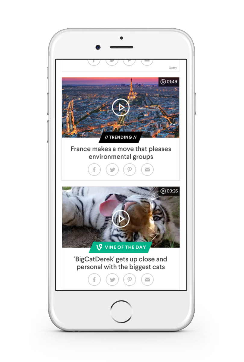
One of the biggest reasons quoted for Verizon’s recent acquisition of AOL was betting on the company’s video ad tech. Video is also at the heart of the strategy for AOL.com with a 93.8 percent growth in views between April 2014 and April 2015.
Maureen Sullivan, AOL’s President of AOL.com and Lifestyle Brands, told me:
The growth in video views for us has been incredible. It’s down to us attaching video to everything we cover and publish.
But who are the audience watching all those clips? One of the most common criticisms of AOL has been that its core market is made up of legacy customers who haven’t switched since the days of the company’s ubiquitous CD-ROM promotions.
Sullivan is obviously quick to counter that suggestion:
There are assumptions about our audience that just aren’t true. 14 percent are under 25. When you’re you’re programming at the scale that we are, you’re always going to have that kind of mix.
AOL Mail and AOL.com are one and the same for a lot our users. The only way to wow our loyal audience is to keep delivering great innovations. If they don’t like the new AOL.com today, they can stick with the old experience.
For folks that love AOL and have remained loyal to us, the brand is part of their daily life.
The picture she paints of the brand’s audience – average household income of $90,000, median age of 48.1, 56 percent female – is definitely appealing to advertisers.
But there’s still a note of caution. She admits that if people “don’t use AOL.com or AOL Mail, they probably haven’t thought of us in a while.”
The focus on social traffic with the AOL homepage’s new modular design is about bringing in more of those visitors who haven’t thought of the brand “in a while.”
I suggest to Sullivan that refreshing a site’s homepage – the front door – isn’t quite as important now with so many people arriving from Facebook, Twitter and other social sites. She agrees… up to a point:
For us, we’re very fortunate to have a loyal audience that loves that start page experience. The side doors are bringing in new audiences. This relaunch, for us, is about creating social first content.
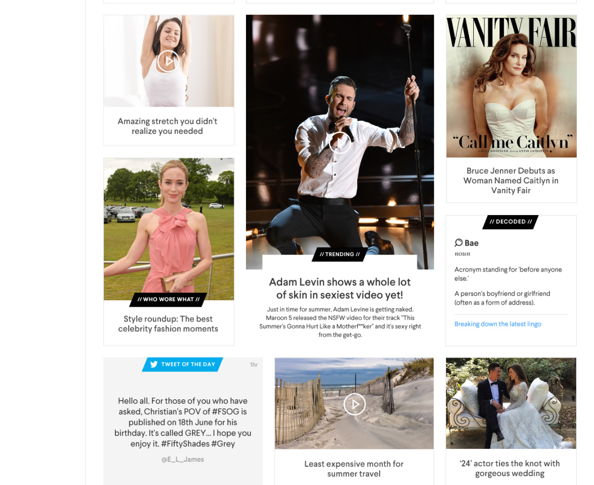
The modular format essentially creates atoms of content. They’re like puzzle pieces that come together on the desktop but they’re designed to stand alone on social and mobile.
Don’t expect to see AOL signing up for Facebook’s Instant Articles programme any time soon though. While Sullivan doesn’t outright rule it out, her answer makes it pretty clear that the company wants to keep control of its audience, despite the social network’s power:
All publishers understand how important social is for content discovery and growing audience. Everyone is trying to balance the value of that and encouraging people to show up at your front door, that’s not a challenge that’s going away any time soon.
The new, modular AOL.com is built on a real-time, agile model – a combination of personalization and hand curation. The big question is whether it will convert those passing social visitors into members of that loyal audience Sullivan talks about so proudly.
➤ AOL
Read next: Those old AOL CD-ROMs aren’t junk, they’re history and this guy wants yours
Get the TNW newsletter
Get the most important tech news in your inbox each week.

