From authors and designers, to coders and writers – and everyone in between – personal websites are a new concept that is likely here to stay.
For those of us who are self-employed, well known on the internet, or trying to build an online persona, personal websites help us further our career goals and act as a universal “about me” go-to on the web.
This is your personal internet billboard, so it should reflect your personality and highlight your work.
Share content you’ve written (original or previously published), showcase the creations you’ve been working on, post event videos in which you’re speaking, or just have an elegant way to talk about you, your story, and your background.
Personal websites are what you make of them, and there’s really no right or wrong way to go about creating one, but there are some general things you should consider before getting started.
All personal sites should have:
- A clear and easy to spell domain name
- An about me page that really is all about you
- Easy to find contact information… why have a site for people to find you if they can’t contact you
Additionally, websites aren’t static, they’re dynamic. For that reason, you must always be sure to update your site whenever you accomplish something.
If you’ve been thinking of getting your personal website together, here are some great examples of personal websites that hit all of the right points in making them effective and outstanding in their own right.
Share your potential

One aspect of her personal site that stands out the most is her portfolio and the fact that she outlines her creative process. The “process” section of her site helps visitors easily and quickly understand what she does and the process by which she does it.
Endorsements paint a prettier picture

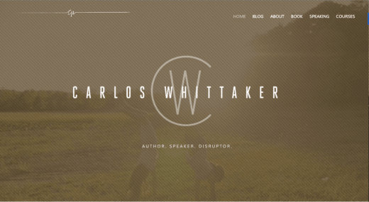
One area of Carlos’ website that works particularly well for a personal website is the testimonials section he has scrolling at the bottom. It’s one thing to talk about yourself, it’s quite another to showcase words written from other people about you. Testimonials carry significant weight, so showcasing them on your personal website is definitely a plus.
Exploit exhibitions

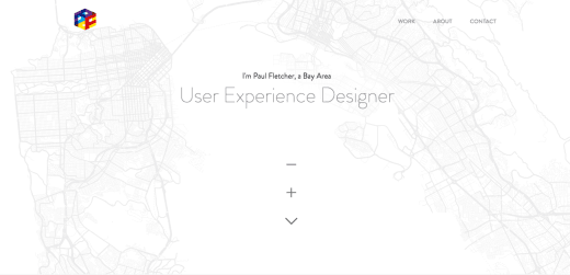
Another spectacular element on his site is the custom videos he has that demo his work. Not only are the videos a nice touch, the placement of those videos to make them look like a tablet or laptop is a very unique touch. Both the map and the videos are both very well done and give the user a lasting impression — exactly what he aims for not only on his site but for projects he works on as well.
Authenticity is captivating

Not only is the self portrait well done, her site is organized in a very clean and straightforward manner. It’s not hard at all to find the work that she’s done or how to contact her. To showcase her work, she designed it so that it feels immersive and is very well put together.
Let your design do the work

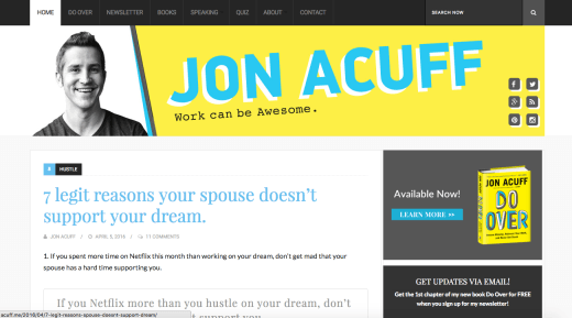
Jon’s website in particular is a great example of how to make the design flow with what you’re known for. Jon’s published a best-selling book that has a very distinctive yellow, blue, and black color scheme. His site works well with this book in that he carries that color theme in other parts of his site as well, even in the main hero image of his site where it is the first thing visitors see when they come to the site.
Less is more

Some of the highlights of his site includes a very clean and crisp design, a concise but complete about section, and his social media networks. With these tidbits of info, you can follow more of what he’s currently working on, reach out to him to chat, or just keep up with his updates.
Conclusion
Personal websites are a great way to showcase you and your career, and are becoming increasingly popular ways to do so. If you’re thinking of launching your own personal website, or revamping your current one, the ones above are great inspiration examples to help you get started.
Get the TNW newsletter
Get the most important tech news in your inbox each week.


