
You may think Halloween is the time for trick-or-treating, dressing up as a Fortnite character, or carving pumpkins. But you’re wrong, it’s the time to face death.
Despite fearing death, humans have always been weirdly obsessed with anticipating their final day on earth. Now in the digital age, this morbid fascination with predicting death has taken form in digital death clocks. Death countdown tools are often used as a joke but some financial institutions, health organizations, and insurers are using its data as a life expectancy calculator.
If you could, would you want to find out when you’re going to die? Here’s a list of sites that could work out when you’re doing to die, because you are going to die:
1. The Death Clock
The Death Clock is the internet’s friendly reminder that life is slipping away, second by second.
To estimate the amount of seconds you have left to live, the site uses a handful of questions: Date of birth, gender, BMI (body mass index), smoking habits, and general outlook on life — that for some reason are categorized as pessimistic, optimistic, and sadistic. The Death Clock’s calculations are based on a study that estimated the expected number of years lost due to obesity across the lifespan of an adult.
Before finding out the rough date of your funeral, the tool asks for your BMI information emphasizing the dangers of excessive weight gain — as they so eloquently put it “The Lethal Danger of Being Fat.”
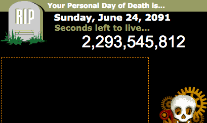
Answering the questions honestly, The Death Clock announced my “Personal Day of Death” to happen on Sunday, June 24 2091 — giving me 2,293,545,812 seconds of life (tick tock, tick tock.)
Testing its (basic) knowledge, I adjusted my lifestyle choices. If I were a smoker, the Death Clock knocked seven years off my life, if I were obese, another five off, and if I had a “sadistic” view on life, another two. Although it may not be the most scientifically accurate tool to predict your last day breathing, it is a wake up call to how you live your life today.
2. Big Life: Life Expectancy Calculator
After not fully relying on my death-day given to me by The Death Clock, I took my morbid fascination with my own mortality to another dark side of the web. Here lies Big Life’s Life Expectancy Calculator.
This death countdown’s mission is to provide meaningful health risk information by estimating the rise of death associated with certain unhealthy lifestyle traits.
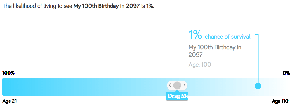
The test starts by asking what life event you’d like to experience alongside an estimation of the year it will most likely happen. This could be events such as your grandchild getting married, your retirement, or your grandchild’s graduation. I chose my 100th birthday which should happen in 2097.
… one percent chance I’ll make it to my 100th birthday.
The researchers behind Project Big Life developed the calculator after a recent study examined the health behaviors and health care records of nearly 80,000 Ontario residents. They found people with the unhealthiest behavior spent 42 more days in the hospital compared to people with the healthiest behaviors.
This website has made the inevitability of my death seem real and for that reason, I will never return to it.
3. DeathClock.io
DeathClock.io reminds you of the importance of living each moment to the fullest by casually reminding you that your life is ending soon, one second at a time.
After providing my age, gender, BMI, drinking habits, and the amount of times per week I exercise it greeted me with: “Sooner than you’ll know, you will die. More exactly on the 6th of August 2081.”
Using various epidemiological studies and data I had previously inputted, it calculated that I will live to the ripe old age of 84 — which means 26 percent of my life is already over.To put this data into perspective, it visualized all of the weeks of my life. Each box represents one week and each row is 52 weeks wide, or about a year of my life.
The filled boxes have already passed, and the non-filled ones have yet to come. It feels like my life is loading until it eventually meets death.
If you love your parents, it also makes you question how much time you have left with your family. It explains how most people, myself included, leave home around 20 years old. As a consequence, you suddenly go from spending time with your parents on a daily basis to, on average, seeing them maybe twice per month.
Put in another way, this means the majority of time you will spend with your parents, you’ve already spent.
Given your age and a few assumptions about your parents, you could have as little as 26 years left together, maybe even less, which with an average of two visits per month, would mean only 676 more days together.
4. SunLife Death Clock
Ah, another website to remind me of my mortality (I can’t get enough). This time it’s SunLife’s Death Clock, a site that estimates the age you will die if you’re living in the UK.
Firstly, the test requires your age, gender, and location. It then asks more in depth questions about your lifestyle including: How much alcohol you drink, smoking habits, whether you look both ways when crossing the road, if you sit down all day in an office, how much TV you watch, your sleeping habits, your diet, how often you exercise, how much tea you drink, and how often you brush your teeth. Basically, a lot of information.
As you answer the questions, your life expectancy jumps between ages depending on your answers. I’ve never felt more judged.
5. Years You Have to Live, Probably
Nathan Yau, the creator of this life expectancy tool uses wisdom from Forest Gump: “Momma always said dyin’ was a part of life.”
FlowingData’s estimations use visual data to show how long you’ll live based on an average age, but reality is people die at various ages which Yau admits is a major flaw to the design — which inspired it’s name… probably.
It animates your probability of dying from now until the age 110 (which was the age of the oldest person to die in the United States). After entering your age and sex, the interactive graphic uses data from the Social Security Administration to simulate your possible lifetimes.
It’s both depressing and hypnotic to see your chances of living to a certain age in this way. In the gif below, the line shows the probability you’ll live to see the next year (which decreases as you age) and each running dot represents a possibility of you dropping off the face of planet before your time naturally comes to an end.
As well as their estimation of the age you’ll die, FlowingData also provides data on how you will most likely die and how other people tend to die — fun.
Using information from the Centers for Disease Control and Prevention, Yau has designed a beautiful and sobering visualization detailing when and how you are most likely to die based on your sex, race, and age.
“Each dot represents one of your simulated lives, and as each year passes, more of your simulated selves pass away. Color corresponds to cause of death, and the bars on the right keep track of the cumulative percentages. By the end, you’re left with the chances that you will die of each cause,” Yau wrote.
Once you’ve seen how you’re most likely going to die, scroll the age back down to zero and watch how many diseases and ways you’ve survived so far — good job, but death is coming.
According to the average of these five death clocks, I’m going to die at around 86 years old — and this will probably be down to a “circulatory” issue. When will you die?
Get the TNW newsletter
Get the most important tech news in your inbox each week.